Piano Content is an on-site content recommendation module builder that can help drive engagement by increasing the number of articles a visitor reads, and in turn, their active time and the variation of articles a visitor is exposed to. Piano Content is part of Composer, so, once a content module is created, it is available from the Show Recommendations action card within a Composer experience. Piano offers its clients access to a library of best practices, including strategies on using Piano Content recommendations effectively. This guide will show you how to build Piano Content modules, use them as part of a Composer experience and work with Piano Content reports.
Configuring a content module
-
Create a content module
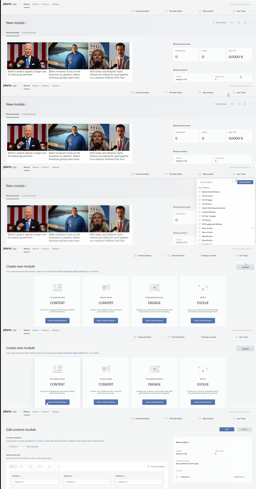
Open your dashboard and click the module dropdown to either select an existing Content module or create a new one.
Note that Piano Content items are marked with a special sign.
-
Configure a content collection
After opening (creating) a module you get to the Edit module menu.
The first thing to do here is to configure collection(s). Find detailed instructions on it here.
-
Configure module format
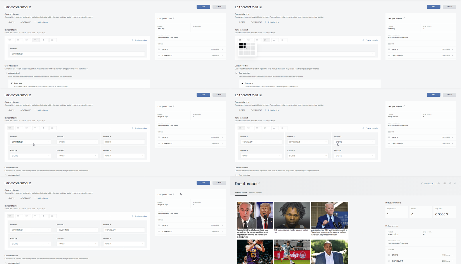
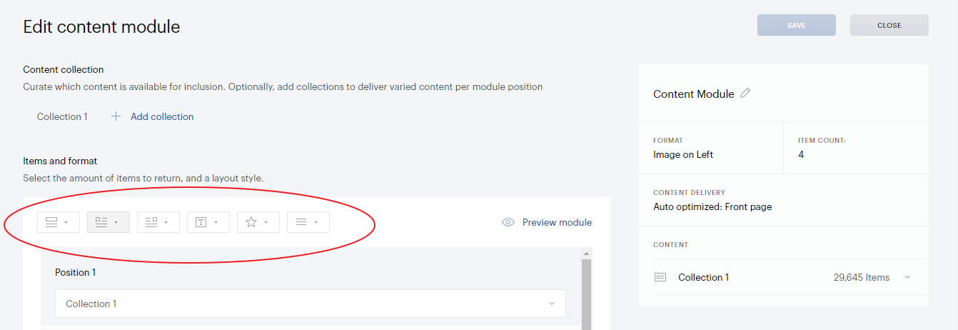
When done with collections, you return to the Edit module menu, where you can choose 1) one of the format templates and 2) the number of placements your content module should contain. Note that the name of the currently selected format template is given in the right-hand panel ("Image on top", "Text only" etc.).
The main use case supposes using one collection per module. However, you may need to set up multiple collections, for example, to dynamically switch between generally similar collections with just some different settings (for example, different max age); or if you want a blended module (for example, a two-row module with "government" items in the upper row and "sports" articles - in the lower one).
Click Preview module against the template icons to see the module templated as you selected.
After you close the Edit module menu, formatting can further be adjusted and customized to fit your required visual theme under Presentation and display.
-
Configure content selection
Below the module formatting options is the Content selection section with options to personalize article delivery for your audience. There are three types of delivery formats available:
-
Auto optimized: This is the recommended option. Piano applies machine learning to auto-optimize the matching mode settings for your module. The weights of the matching modes are continuously tuned to find the right settings for the placement. If your audience changes their behavior on your site, the settings change to match it. Indicate if the new module is placed on the front page or an article page of your site; this will help us apply the best possible starting point settings.
-
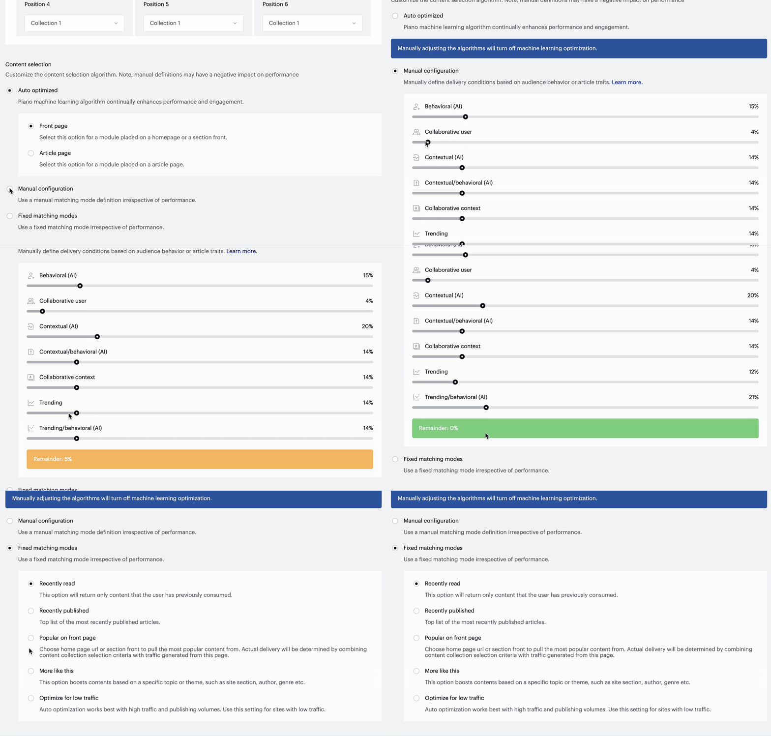
Manual configuration: Applicable to rather few use cases (consult our support). Manually adjust the matching mode setup of your module by dragging and dropping the weights of the following settings:
-
Behavioral (AI): Articles similar to those the user has read in the past.
-
Collaborative user: Articles read by other users with similar interests as the current user.
-
Contextual (AI): Articles similar to the article on the page where the recommendation is to be placed.
-
Contextual/behavioral (AI): Articles similar to the current one, ranked according to the user’s previous interests.
-
Collaborative context: Articles read by other users who have also read this article.
-
Trending: Articles popular right now.
-
Trending/behavioral (AI): Trending articles ranked according to the user’s previous interests.
-
-
Fixed matching modes: There are fixed use cases that require a different way of ranking. The selection of fixed delivery options will provide the articles to users based on a fixed rank. Applicable to rather few use cases (consult our support):
-
Recently read: This option will return only content that the user has previously consumed.
-
Recently published: Top list of the most recently published articles.
-
Popular on front page: Loads up the front pages with the most traffic and lets you pick from the list. The actual delivery will be determined by combining content collection selection criteria with traffic generated from this page.
-
More like this: This option boosts content based on a specific topic or theme, such as site section, author, genre etc.:
-
More from the author
-
More about this category
-
More news from the region etc.
-
-
The Piano crawler parses article content into categories and <meta> tags. By choosing this option would be displayed the list of parsed content and the count of associated articles. In the example below, you can see that including More like this for the Category our system currently could pick 227 articles.
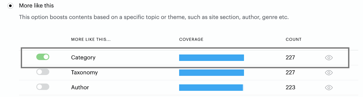
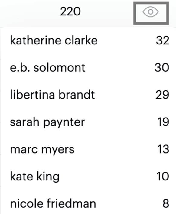
The platform will dynamically recommend a specific type of similar content based on the selections you toggle on, more from this category, more from this author, more on this company. Use the Preview eye icon to see some example aspects for each selectable option, e.g. categories. authors, or companies that would be used as the content lookup/matching context.

Here is an example preview of the Author option:
-
And the last of the Fixed matching modes is:
-
Optimize for low traffic: Specifically beneficial for sites with very little traffic and/or very few published articles. In such cases, the ranking tends to be impacted in a negative way, and in general, there's not enough data for the default auto-optimization.
-
Clicking the Save button will take you to the main menu of your module.
Module menu
Overview of the module menu
The module menu automatically opens after you save the configurations of a new module. You can also navigate here by selecting an existing module on the top row navigation bar. The menu includes two tabs:
Module preview, previewing the module you have just set up, and
Content preview, listing all the items this module can present.
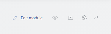
In the top right corner of the menu, next to the Edit module button, you will see four buttons allowing to:
Live preview: view the URL of the site to become a live environment for your module preview.
Presentation and display: edit the HTML and JavaScript of your module and preview the changes. Read more below.
Advanced module settings: Define more module settings.
Share module: Get a shareable link to your module.
Presentation and display
To add presentation logic and visual styling to your module, open the Presentation & display window by clicking the relevant icon on the top right panel of the module menu.
You will see your module and three buttons enabling fields where you can modify your template, style, and custom JavaScript. Every time after editing, click Update preview to see your changes. When done, click Save in the top right corner to accept all your changes (or Close to discard) and return to the module menu.

Template
The template of your module is the layout you have selected in Items and format of the Edit module menu.
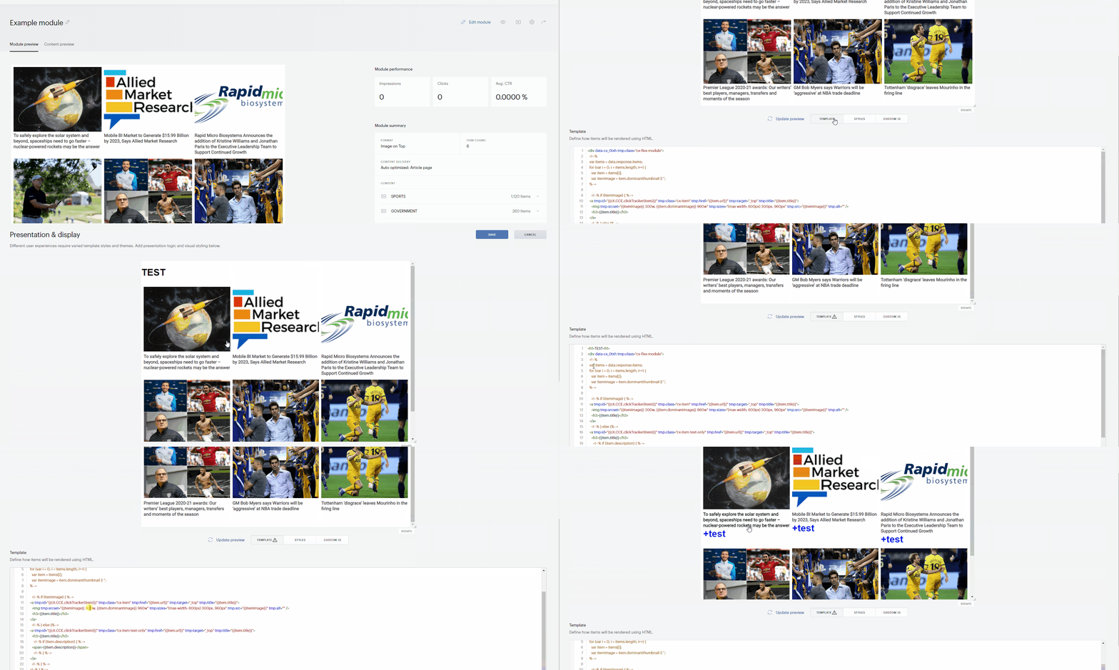
In the Template field, you edit the HTML of your module. For example, you can add a heading to your module or change parameters that will apply to all the module items (consult developers for more details).
If needed, you can add the attribute loading="lazy" to the img tag if you want to lazyload images for content recommendations.
Styles
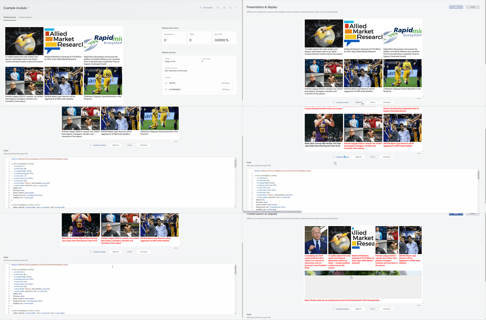
Here you can customize the appearence of your module by modifying some CSS parameters (in the below example, lines 4 to 17 of the code). The code below this first block (in our example, below line 17) should be modified by developers only. The scope of available CSS parameters depends on the template of your module (for example, "--cx-columns" is not relevant for single-column templates).
Custom JS
The place to enter any JavaScript; for example, a script comparing how many users came to a target page from particular modules.
Advanced module settings
The advanced settings of your module are configured on three tabs: Module configuration, Versions and history, and Module scripts (legacy).
Module configuration
In Module configuration you will find:
Widget ID: The identifier of your module.
Live preview: Contains two fields; enter the URL of your live preview environment in the first field. This URL will be available behind the Live preview button in the module menu.
The second field ("new" by default) is a legacy feature: you defined the class or ID of the HTML element to hold your module on the live preview page. Now it is implemented within the Show recommendations card in Composer 1x. Igonre this field.
External includes: Your webpage already has style settings. When you add a module there, its styles are determined by 1) the page settings and 2) the settings you defined in Presentation and display→Styles. To see the module with the real styles of your site in a preview environment, add a link to the CSS file of your site page to the External includes field. Besides CSS, it works for JS and FONTS as well.
Versions and history
Roll back to a previous version of the module when you need it.
Module scripts (legacy)
The script here was to be pasted in the website page code. A legacy feature, redundant due to the integration with Composer 1x. Just follow the main flow of your Composer 1x experience.
Deploying a Piano Content module to Composer 1x
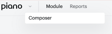
Piano Content is fully integrated with Composer 1x. Once you have a module created, navigate to Composer from the top left-hand corner of the content dashboard:
From a new or existing experience, content integration is contained in the Show Recommendation action card.
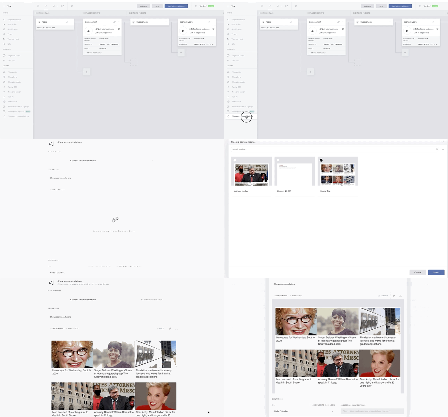
From the action card, you can select the recommendation module you have created from the Piano Content dashboard.
Delivering Content natively into web pages
For most cases, content will be delivered through a Show Recommendations card within a Composer experience. However, there are cases where it is beneficial to deliver content directly into the pages without using any targeting rules or other conditions.
Such use cases may be appropriate if the delivered recommendations are to be blended with editorially delivered content or if specific frameworks are in use that require a tighter API level integration.
Adding personalized content into a web page
Content is inserted into the page invoking cX.CCE.run(), specifying at least a widget id and a target div:
cX.CCE.run({
    widgetId: '189f829ad43b558e45cfd2a2ae9e618721f8696a',
    targetElementId : 'cx-frame-target'
});
Working with callbacks
By default, the Piano Content platform will deliver the complete visual presentation of a recommendations result into the web page and instrument the click links to allow for deep reporting.
Sometimes it is desired to have external control of how to present the results. In such cases, the platform provides an impression callback that can be used either in addition or in place of the Piano Content presentation.
It is also common to want to have more control over what happens when a recommended item is clicked by a user. In such cases, it is both possible to append dynamic or static URL parameters to the destination links, or to implement a custom click handled to be invoked in place of opening a web link.
Do NOT use the native browser onclick handlers or similar mechanisms to override the behavior when an item is clicked.
Impression callbacks
cX.CCE.run({
   widgetId: '123'
}, undefined, function(res) {
   // Result items come back as an array from res.response.items
   console.log('***** res ', res);
});
When using impression callback - visibility tracking may not be supported.
Click callbacks
As seen in Content recommendations templates and styles, the clickTracker helper function should be used in the anchor element, for example:
<!--%
var items = data.response.items;
for (var i = 0; i < items.length; i++) {
  var item = items[i];
  %-->
  <div class="item">
    <a tmp:id="{{cX.CCE.clickTracker(item)}}" tmp:href="{{item.url}}" tmp:target="_top">
      <!--%
      cX.renderContainedImage({
        container: { width: 321, height: 160 },
        image: { src: item.dominantthumbnail, dimensions: item.dominantthumbnaildimensions }
      });
      %-->
      <h3>{{item.title}}</h3>
    </a>
  </div>
  <!--%
}
%-->
The client-side library cx.cce.js extends cx.js's native click tracking functionality to also support Ajax style applications where clicks may not trigger page navigation.
If you would like to add URL parameters to the target URL, you can pass key-value pairs to the helper function:
<!--%
var items = data.response.items;
for (var i = 0; i < items.length; i++) {
  var item = items[i];
  var param = {'key1': 'value1'};
  %-->
  <div class="item">
    <a tmp:id="{{cX.CCE.clickTracker(item, undefined, param)}}" tmp:href="{{item.url}}" tmp:target="_top">
[...]
When a user clicks on the link, the URL the user gets redirected to will have the parameter like this:
https://www.example.com/article/cxense_announces_new_product_offerings.html?key1=value1#cxrecs_s
When you click on the anchor elements like the sample codes above, it first takes you to a click tracking URL then immediately redirects you to the recommended article. If you would like to avoid this redirect (but still would like to track clicks), use the clickTracker with a callback (the second parameter):
<!--%
var items = data.response.items;
for (var i = 0; i < items.length; i++) {
  var item = items[i];
  %-->
  <div class="item">
    <a tmp:id="{{cX.CCE.clickTracker(item, onClick)}}" tmp:href="{{item.url}}" tmp:target="_top">
[...]
Then you should write the callback function in the Custom JavaScript section at the Presentation & display part of the Content module:
function onClick(item) {
  window.location.href = item.url;
}

Piano Content reports
Reports overview
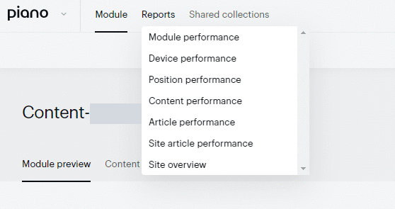
Piano Content's reports offer effective tools to get insight of how your content really works. To open Reports, find the dropdown in the top navigation bar.
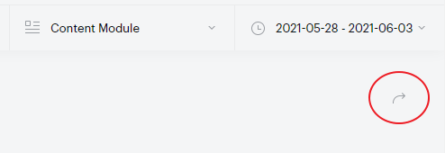
All the reports can be exported: use the button in the top right corner of the window.
There are 10 report types in Piano Content.
Module performance: Shows how a deployed module works by displaying impressions, clicks, and CTR readings.
Device performance: Provides exactly the same metrics as Module performance but broken down by device.
Position performance: Visualizes how does content perform at first/last positions inside chosen items’ layout.
Content performance: Shows statistics concerning selected content items and groups. Find more information below.
Article performance: Lists all the content selected and delivered from this module (top 100 articles). Use Search article to see, for example, how many times a particular article was recommended by this module.
Site article performance: Shows the same information as Article performance but for all modules of this site.
Site overview: Presents a high-level overview of the performance for all of your modules.
Site group overview (legacy): "site groups" are not relevant for Composer 1x.
Monthly overview: Groups all activity for the entire site per month (the last 12 months are covered). The "Campaigns" and "Site groups" tabs are legacy since not relevant for Composer 1x.
Collection quality: Shows a list of collections with potential crawling issues/failures.
Content performance
Probably the most powerful report, Content performance provides information about how your content has been working and what content is the most demanded at the moment; information that can be useful for making tactical decisions concerning your editorial policy.
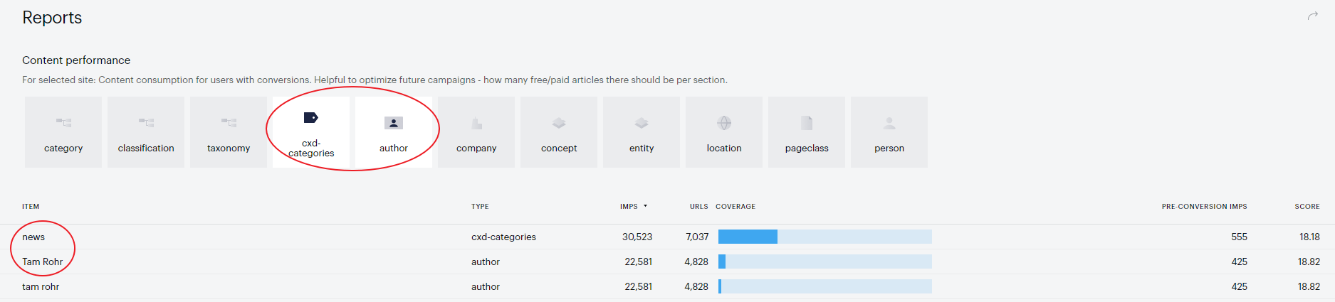
The scope of the available groups presented on the top of the table depends on the filter parameters you defined when setting up your collections. If you select multiple groups here (for example, "cxd-categories" and "author"), you will get a blended report and the below list will rank values from all groups together.
The values of the selected parameters are given in table rows. The metrics shown in the table (column names) are:
Item: Values available for the filter(s) selected. If there are multiple parameters selected (for example, "cxd-categories" and "author"), ranked items of all parameter types are listed.
Type: Groups selected in the top panel, parameters.
Impressions: Number of impressions (pageviews) the content generated over the period you specified.
URLs: Unique URLs published containing the value in question.
Coverage: Percentage of all articles published containing the value in question.
Pre-conversion impressions: How many pageviews users generated before they subscribed or registered (provided that they subscribed/registered within the same session).
Score: How many pageviews ("impressions") the value in question (for example, a specific author or cxd-category) generated against the number of articles (URLs) it is related to. You see what (or who) produces more traffic with less effort. The best indicator of effectiveness.
On the basis of this "score" value you can decide, for example:
Which of your authors should get a bonus this month (select the "authors" parameter and compare their "scores").
Which of your teams has been more productive ("URLs") or effective ("Scores") and probably need more authors.
What your audience actually wants to read and what your authors should write about next (combine, for example, "company", "person", and "location" recorded over the last month).
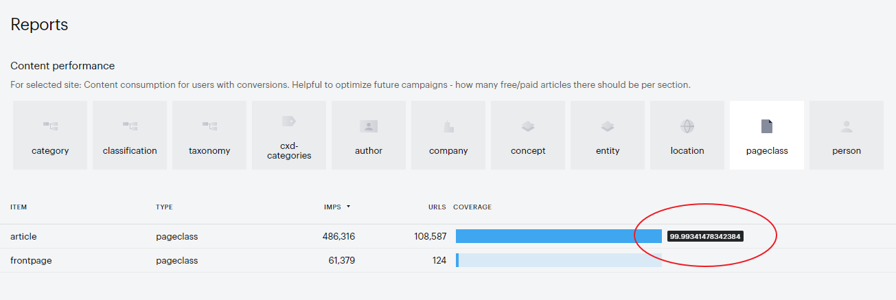
Another interesting use case is checking the "pageclass" parameter to confirm that your content is tagged correctly.
There are two pageclasses: article and frontpage. In this report, you can view their percentage by hovering over their coverage bars. Usually, there is one frontpage and hundreds of articles. What is important here is that together they must give 100%. "No value given" is not allowed. Otherwise, some articles might be excluded from all recommendations (which is wrong) or frontpages without the proper tag might get into recommendations (which is no less wrong).
These are only several cases of how Content performance can help a publisher make tactical and strategic decisions concerning not only content but also technology and staff.
Position performance
This report helps to identify the reasonableness of chosen items' layout and understand if a module has a sensible number of items. A number of clicks for each position give an idea if you should add more items (steep and sudden drop) or remove items that take attention away from the next thing on the page (long-tail).
Also, the report provides understanding when the content presentation is poor - either when the first positions don’t get most of the clicks or some of the positions get no clicks.
Furthermore, it allows to compare position performance by device type - not always responsive design works well on all device types, so such issues could be highlighted.
NOTE: This report is only available for Personalized content modules.
To retrieve such statistics you should choose a module with a Personalized content type → Click on the tab Reports → Select Position performance report:
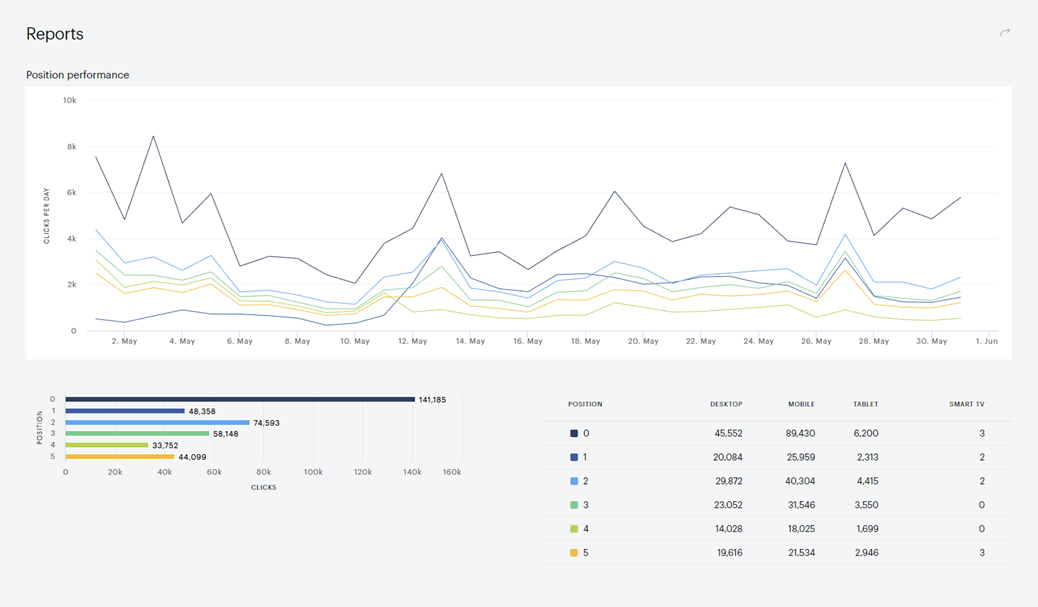
NOTE: the position count in the report starts from 0, which means that 0 – is actually 1st position, 1 – is 2nd position, and so on.
Collection quality
This is not a report in the classical sense of the word, but rather a tool that visually shows the list of collections and related content bugs/failures on your website. Such a tool provides you with information on what needs to be changed/added to the HTML code on your site in order for the crawling of articles to be successful.
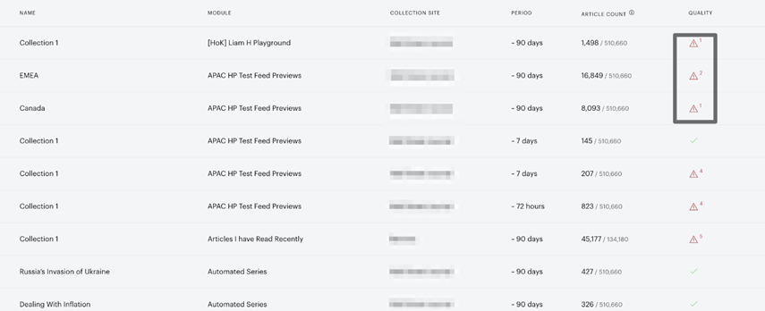
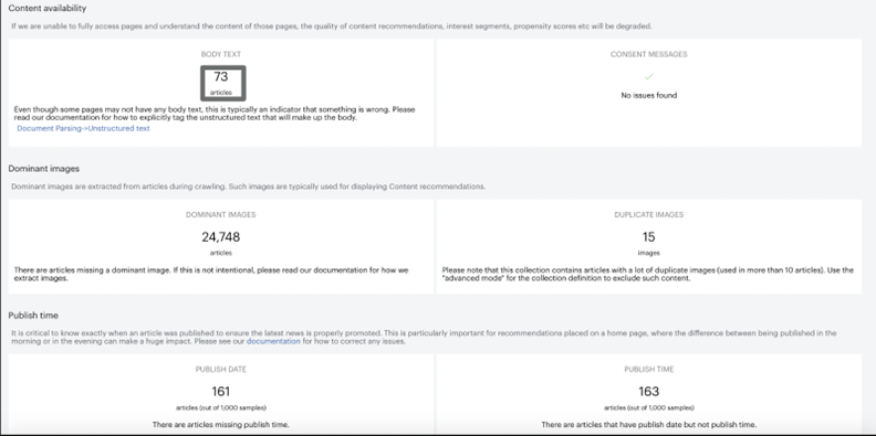
Navigating to the Quality column and clicking on the warning sign you will see a modal window with 3 classes of issues:
-
Content availability - based on the data science consent + empty
<body>tags. This highlights example pages with problems. Also here you can find the link to the documentation on how to explicitly tag the unstructured text that will make up the body. -
Dominant images - shows the list of pages with missing dominant images. Such images are typically used for displaying Content recommendations, so we advise you to add them to the articles. Also, we show you the list with duplicate images, and this gives you an idea of which images should be excluded.
-
Publish time - gives examples of pages that do not have a publish date/time. It is critical to know precisely when an article was published to ensure the latest news is properly promoted. So we recommend you add this data to the articles page.
To retrieve the list with problematic URLs – just click on the number of articles/images:
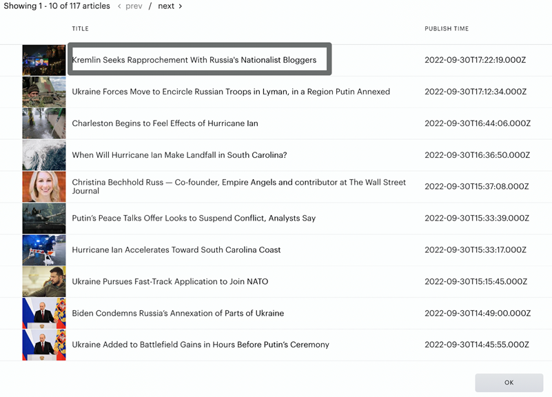
And to get aggregated info related to the specific link – just click on it:
Shared collections
This allows you to reuse a collection definition across modules or across campaigns.
One of the main powers of collection definitions is that you can easily get maximum exposure out of the published content.
Using only content with a certain tag or type you typically expose a very small portion of the content. By setting up “everything except what is identified to be non-content” instead, you also get to recommend relevant content that for some reason was not published or came from sections with markup inconsistencies, etc.
Having once paid careful attention to setting up Shared collections you would enjoy the benefits over and over for each placement you get.
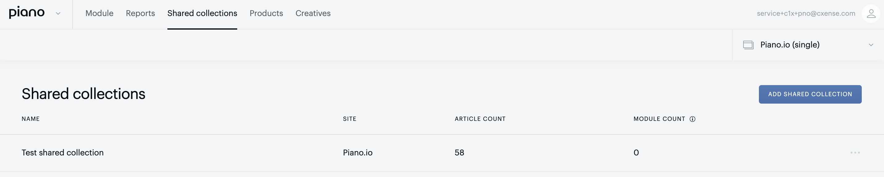
To set up a Shared collection choose the appropriate tab in the Piano Content dashboard and click the Add shared collection button:
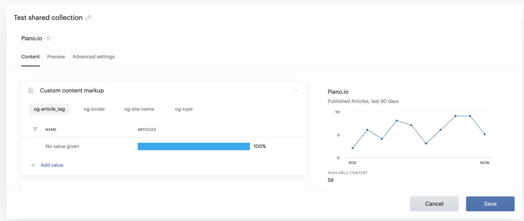
You will see an editing modal window with settings, the same as for a regular collection:
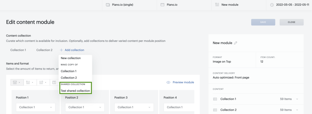
But then you can reuse this collection within all modules you have: