
Once you’ve integrated ESP with your website, you will need to create opt-in forms that allow your end-users to sign up to receive your newsletters.
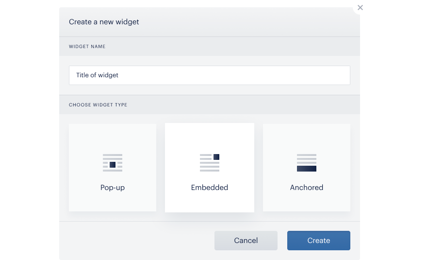
Click Create widget. Enter in a name and select the type:
-
Pop-up: a modal that appears in the center of the page, dimming the background
-
Embedded: define a specific inline location on your site for your widget
-
Anchored: appears at the top or bottom of the page
Once you have created your widget, customize the look and behavior within the widget settings by going to the [...] menu and clicking Settings.
Pop-up opt-in form widget
Appearance
Customize the design of your pop-up opt-in form within this tab.
-
General: select a background color
-
Content: adjust the width and paddings for your modal
-
Desktop image: select which type of image you’d like to display: icon, image, or none, and configure how you’d like to display it
-
Mobile image: select an image, icon, or neither for the image on the mobile version of your pop-up opt-in form
-
Button colors: customize the color of your button, the text, and the hover color
-
Text colors: customize the color of your general text and the text below the button
-
Input field colors: adjust the text color inside the field including the default text color (when input field is not active, ie cursor has not been placed inside of input field), active text color (when input field is active, ie cursor has been placed inside of input field), and the color of the text when there is an error with their email address entry.
-
Input border colors: color of the border in a normal state, in active state (when cursor is in input field), and when there is an error.
Content
-
Title: enter in the first line, second line, and the description of your pop-up opt-in form
-
Input field placeholder: enter in a default message for the input field, as well as an input hint, which will appear when a user hovers over the field.
-
Subscribe button: enter in the text contained in the subscribe button, and a button hint, which will appear when a user hovers over the field.
-
User consent checkbox: decide if you’d like to show a checkbox, whether to make it required, enter in the content of the consent text, and select an indent
-
Additional user consent checkbox: configure additional user consents
-
Subscribe button: customize the text below the subscribe button
Success page
Once a user has successfully subscribed to your newsletter, customize the confirmation message text and colors.
Behavior
-
Enable widget: configure if you’d like to enable the widget in desktop and/or mobile browsers
-
When to display: configure when and how the pop-up opt-in form will appear, disappear, and reappear
-
By timeout: how much time your site visitor be on your site before the widget appears
-
By scroll: how many pixels your site visitor should scroll through before the widget appears
-
-
Exit intent: whether to show the widget after a user has moved the mouse out of the browser window, as well as how many seconds should go by before the widget appears
-
Reopen on mouse out: whether to show the opt-in form again after the user has already dismissed it, as well as how much time should pass before the form is re-shown
-
Start loading on: specify how many pages the user should view before being shown the widget
-
-
Showing again in: specify the amount of days to wait before showing the widget to the same visitor
-
Advanced: configure further advanced settings here
-
Fade in: duration of fade in animation
-
Fade out: duration of fade out animation
-
Transition: how many seconds after email submission should the success page appear
-
Display success page: how many seconds the success page will appear on the site
-
Skip if subscribed: do not show widget to users who have already subscribed
-
No need mailing lists: by default, the opt-in form will not appear on a site if there is no mailing list attached to it. If this option is enabled, the form will be displayed despite not having a mailing list attached to it.
-
Load anyway: this will display the widget to any user who enters the site, even if they are already part of the mailing list attached to this widget
-
-
URL rules: By default, the opt-in form will be shown on every page of your website, that contains the ESP Integration code. If you'd like to show the form only on a specific page or section, you would need to first add a rule which would contain your website's homepage, the type "Start with" and the mode "Excludes". Then as another rule, you would add the article's URL or section, select the type and mode "Includes". If you would like to test which pages are going to show the opt-in form, you can type in the URL for testing in the box at the bottom of this section, and the response "True" or "False" will indicate if the opt-in form will be shown or not.
When both Skip if subscribed on any mailing list and Load anyway options are selected - the Opt-in form will be loaded. The Load anyway rule has more value than Skip if subscribed on any mailing list.
Anchored opt-in form settings
Appearance
Customize the design of your anchored opt-in form within this tab.
-
General: select a background color
-
Position: customize the offset of your anchored form (ie, distance from the bottom of the page)
-
Input form: specify the width of the input box
-
Input field: adjust the height, margin, color, width, and radius of the input field
-
Submit button: customize your submit button’s width and colors
Content
-
Title: enter in the first line, second line, and description of your pop-up opt-in form
-
Input field placeholder: enter in a default message for the input field, as well as an input hint, which will appear when a user hovers over the field.
-
Subscribe button: enter in the text contained in the subscribe button, and a button hint, which will appear when a user hovers over the field.
-
User consent checkbox: decide if you’d like to show a checkbox, whether to make it required, enter in the content of the consent text, and select an indent
-
Additional user consent checkbox: configure additional user consents
Success page
Once a user has successfully subscribed to your newsletter, customize the confirmation message text and colors.
Behavior
-
Enable widget: configure if you’d like to enable the widget in desktop and/or mobile browsers
-
When to display: configure when and how the pop-up opt-in form will appear, disappear, and reappear
-
By timeout: how much time your site visitor be on your site before the widget appears
-
By scroll: how many pixels your site visitor should scroll through before the widget appears
-
-
Exit intent: whether to show the widget after a user has moved the mouse out of the browser window, as well as how many seconds should go by before the widget appears
-
Reopen on mouse out: show the opt-in form again after the configured amount of time, even if the user dismissed it earlier
-
Start loading on: specify how many pages the user should view before being shown the widget
-
Showing again in: specify the amount of days to wait before showing the widget to the same visitor
-
Advanced: configure further advanced settings here
-
Fade in: duration of fade in animation
-
Fade out: duration of fade out animation
-
Transition: how many seconds after email submission should the success page appear
-
Display success page: how many seconds the success page will appear on the site
-
Skip if subscribed: do not show widget to users who have already subscribed
-
No need mailing lists: by default, the opt-in form will not appear on a site if there is no mailing list attached to it. If this option is enabled, the form will be displayed despite not having a mailing list attached to it.
-
Load anyway: this will display the widget to any user who enters the site, even if they are already part of the mailing list attached to this widget
-
-
URL rules: By default, the opt-in form will be shown on every page of your website, that contains the ESP Integration code. If you'd like to show the form only on a specific page or section, you would need to first add a rule which would contain your website's homepage, the type "Start with" and the mode "Excludes". Then as another rule, you would add the article's URL or section, select the type and mode "Includes". If you would like to test which pages are going to show the opt-in form, you can type in the URL for testing in the box at the bottom of this section, and the response "True" or "False" will indicate if the opt-in form will be shown or not.
Embedded opt-in form settings
Appearance
-
General: customize general settings including background color, outer paddings, whether or not the widget is responsive (meaning it will appear on mobile devices), and the width of the widget
-
Content: customize the paddings within the content of the widget
-
Desktop image: select which type of image you’d like to display: icon, image, or none, and configure how you’d like to display it
-
Mobile image: select an image, icon, or neither for the image on the mobile version of your embedded opt-in form
-
Input form: customize the width of the input form
-
Input field: customize the input field height, bottom margin, and text colors
-
Input border: customize the width and radius of your input border, as well as the colors of the border
-
Submit button: customize the appearance of the Submit button
Content
-
Title: enter in the first line, second line, and description of your pop-up opt-in form
-
Input field placeholder: enter in a default message for the input field, as well as an input hint, which will appear when a user hovers over the field.
-
Subscribe button: enter in the text contained in the subscribe button, and a button hint, which will appear when a user hovers over the field.
-
User consent checkbox: decide if you’d like to show a checkbox, whether to make it required, enter in the content of the consent text, and select an indent
-
Additional user consent checkbox: configure additional user consents
-
Subscribe button: customize the text below the subscribe button
Success page
Once a user has successfully subscribed to your newsletter, customize the confirmation message text and colors.
Behavior
-
Enable widget: configure if you’d like to enable the widget in desktop and/or mobile browsers
-
When to display: configure when and how the pop-up opt-in form will appear, disappear, and reappear
-
By timeout: how much time your site visitor be on your site before the widget appears
-
By scroll: how many pixels your site visitor should scroll through before the widget appears
-
Exit intent: whether to show the widget after a user has moved the mouse out of the browser window, as well as how many seconds should go by before the widget appears
-
Reopen on mouse out: show the opt-in form again after the configured amount of time, even if the user dismissed it earlier
-
Start loading on: specify how many pages the user should view before being shown the widget
-
Showing again in: specify the amount of days to wait before showing the widget to the same visitor
-
-
Advanced: configure further advanced settings here
-
Fade in: duration of fade in animation
-
Fade out: duration of fade out animation
-
Transition: how many seconds after email submission should the success page appear
-
Display success page: how many seconds the success page will appear on the site
-
Skip if subscribed: do not show widget to users who have already subscribed
-
No need mailing lists: by default, the opt-in form will not appear on a site if there is no mailing list attached to it. If this option is enabled, the form will be displayed despite not having a mailing list attached to it.
-
Load anyway: this will display the widget to any user who enters the site, even if they are already part of the mailing list attached to this widget
-
-
URL rules: By default, the opt-in form will be shown on every page of your website, that contains the ESP Integration code. If you'd like to show the form only on a specific page or section, you would need to first add a rule which would contain your website's homepage, the type "Start with" and the mode "Excludes". Then as another rule, you would add the article's URL or section, select the type and mode "Includes". If you would like to test which pages are going to show the opt-in form, you can type in the URL for testing in the box at the bottom of this section, and the response "True" or "False" will indicate if the opt-in form will be shown or not.
Placeholder
Copy/paste the provided code into your page’s HTML, wherever you want your opt-in form to be.
Groups configuration
Each created Opt-in form has the Opt-in default group attached automatically. In case no custom groups are selected for this opt-in form, the user’s email gets added to the default group of mailing lists (provided that you specified at least 1 Main mailing list in the Opt-in default group).
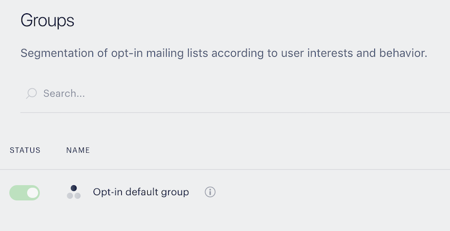
You can additionally create custom groups for the Opt-in form. These groups segment users into mailing lists of a certain category of your choosing.
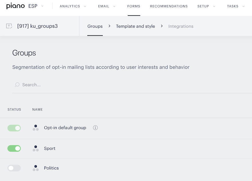
You can configure the appearance of the opt-in form and specify which custom groups checkboxes should be shown in the form. For this, you should go to Template and style → Content → Groups subscribers checkboxes and activate the corresponding groups. The switch toggle position displays the status of this group (on or off).
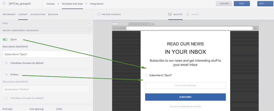
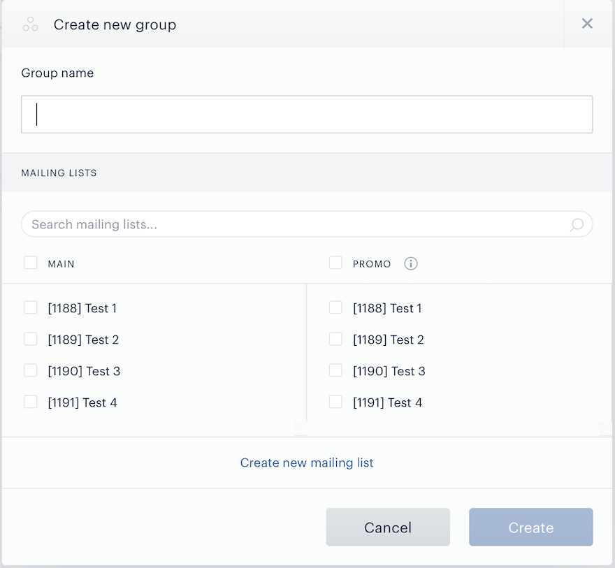
Each Opt-in group (default or custom) has 2 sets of mailing lists – Main and Promo.
If the user has agreed to receive promo/additional content, the user's email gets into the Promo set of mailing lists. In another case, the user’s email gets into the Main set of mailing lists.
To configure a checkbox for the Promo set of mailing lists, you should go to Template and style → Content → Promo/additional content checkbox. By default, this checkbox is disabled.
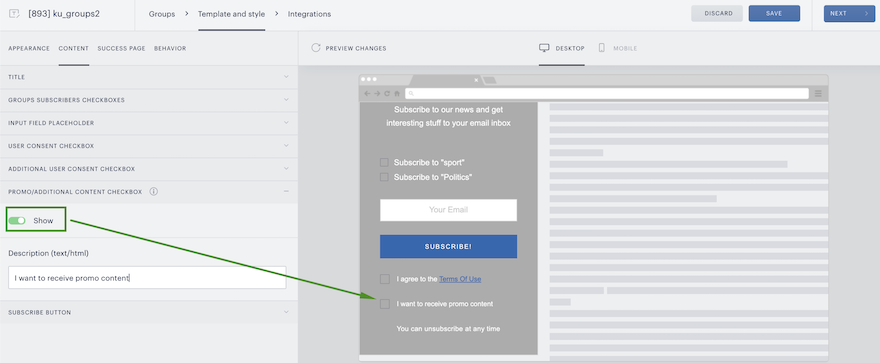
Hence, two campaigns can be created: the first one for users who have agreed to receive advertising, the second one for those who want to receive just a basic newsletter.
The logic of adding a user to the mailing list
|
Scenarios |
Result |
|
User selects a checkbox to receive newsletters from a custom group, but doesn’t agree to receive promo mails. |
The user's email gets added to the main set of mailing lists |
|
User selects a checkbox on receiving newsletters from a custom group and agrees to receive promo emails. |
The user's email gets added to the promo set of mailing lists |
|
The user doesn’t select a checkbox on receiving newsletters from a custom group and doesn’t agree to receive promo mails |
The user's email gets added to the main set of mailing lists at Opt-in default group (provided that you have specified at least 1 main mailing list in the Opt-in default group) |
|
The user doesn’t set a checkbox on receiving newsletters from a custom group but agrees to receive promo emails. |
The user's email gets added to the promo set of mailing lists at Opt-in default group (provided that you have specified at least 1 promo mailing list in the Opt-in default group) |
Integration with Composer
ESP newsletter signup via Composer card
You can use the Composer experience Newsletter sign-up card for collecting users' emails to ESP Mailing lists.
-
Create a mailing list in ESP
-
In order to make it possible to collect emails via Composer, you should edit the Integration code at Composer and add the ESP integration code ID (the Composer integration code should be previously placed in the site’s HTML)
window.PianoESPConfig = {
  id: ::ID::
}
::ID:: - ESP integration code ID, which you can find at Setup → Integrations → Choose necessary integration → Copy code and paste it into the Composer integration code.
-
You should also configure a newsletter signup template via Composer:
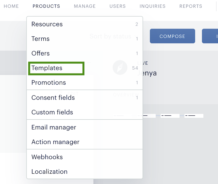
-
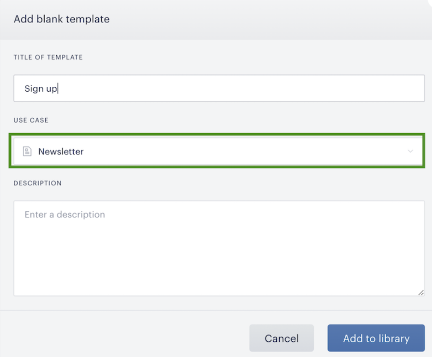
Create a new template with a ‘Newsletter’ use case and configure it with content fields and CSS
-
After this, you should create an experience via Composer:
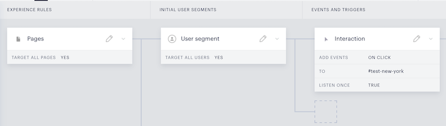
Select experience rules, user segments, and set the condition for the event that should happen on your website (for example: click on the specified link/button):
-
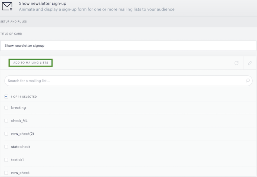
To start collecting user emails, you should add an action card 'Show newsletter signup':

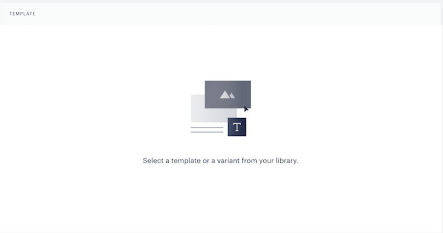
In the action card settings, you should attach a mailing list (you can choose among all active mailing lists from ESP) and also select the newsletter signup template previously created in Composer:
Custom CSS
Each ESP opt-in form consists of elements that you can customize. To configure a custom opt-in form, you should go to Opt-In → Groups → Template and Style → Custom CSS and add CSS selectors that you want to customize.
-
Form wrapper
.main-wrapper {
    border: 1px solid powderblue;
    padding: 5px;
}
.main-wrapper - class attribute for general form wrapper
2. First header selector
#header_text_1 {
text-shadow: 3px 1px 3px orange;
}
#header_text_1 - main header selector in the anchored form and first header selector in pop-up and embedded forms
3. Second header selector
#header_text_2 {
    text-shadow: 1px 1px 3px green;
}
#header_text_2 - second header selector in pop-up and embedded forms (not provided in the anchored forms)
4. Third header selector
#header_text_3 {
    text-shadow: 1px 1px 3px pink;
}
#header_text_3 - third header selector in pop-up and embedded forms (not provided in the anchored forms)
5. Input selector
.main-wrapper form input#emailinput {
    border-radius: 15px;
}
.main-wrapper form input#emailinput - email input selector
6. Button selector
.main-wrapper form input#emailgo {
    border-radius: 10px;
    color: green;
}
.main-wrapper form input#emailgo - subscribe button selector
7. Close button selector
#closebtn {
    color: red;
}
#closebtn - close button selector
8. Group subscribers checkbox input selector
.sections-for-subscribing input[type=checkbox]+label:before {
    border-color: green;
}
.sections-for-subscribing input[type=checkbox]+label:before - checkbox input selector for custom opt-in groups
9. Group subscribers checkmark selector
.sections-for-subscribing input[type=checkbox]:checked+label:before {
    font-size: 46px;
    color: #eee;
}
.sections-for-subscribing input[type=checkbox]:checked+label:before - group subscribers checkmark selector
10. Group subscribers text formatting
.sections-for-subscribing label span {
    text-shadow: 3px 1px 3px orange;
}
.sections-for-subscribing label span - selector for group subscribers text formatting
11. Consent checkbox input selector
.accept_terms input[type=checkbox]+label:before {
    border-color: green;
    width: 20px;
    height: 20px;
}
.accept_terms input[type=checkbox]+label:before - consent checkbox input selector
12. Consent checkmark selector
.accept_terms input[type=checkbox]:checked+label:before{
        content: '\e902';
    font-size: 36px;
    color: #d48d8d;
}
.accept_terms input[type=checkbox]:checked+label:before - consent checkmark selector
13. User consent text formatting
#emailform > div > span {
    text-shadow: 3px 1px 3px orange;
}
#emailform > div > span - selector for user consent text formatting
14. Bottom text selector
.w #text_bottom {
    color: red
}
.w #text_bottom - bottom text selector
Double opt-in setup
Double opt-in has users confirm that they would like to receive your newsletters by clicking a link in their inbox, ensuring an engaged audience.
Double Opt-In Setup
To set up double opt-in, follow these steps:
-
First, you should create a mailing list to collect signups from the opt-in form. It would be a transitional mailing list for subscribers who have not yet confirmed that they would like to receive your newsletters (we recommend calling the list ‘Double Opt-In’)
-
Then, create an email campaign for confirmation emails:
-
Choose Triggered campaign type
-
Select the Confirmation email template
-
-
Customize the look and feel of the template
-
Select the target mailing list in the settings of the Confirmation button. Subscribers who confirmed they would like to receive your newsletters will get added to this mailing list. You should attach this mailing list to your regular campaign in the next steps.
-
Create a main newsletter campaign with a Recurring type, for example.
-
Attach the target mailing list with subscribers who have already confirmed they would like to receive your newsletters