
Email campaigns
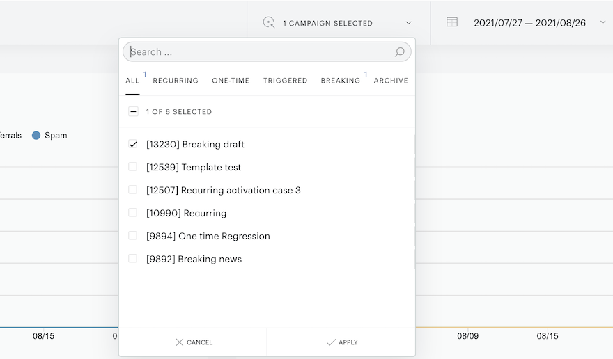
Monitor the performance of your campaign(s) by date go to Analytics → Email performance → Campaigns by date. Select the specific campaign you would like to look at by clicking on the campaign name to open the dropdown with a list of all campaigns. Please note, there will be available grouping tabs, that provide an option for you to filter email campaigns by their type:
From here you will see the following data:
-
Total subscribers: the total number of users who have subscribed to your newsletter at some point (including those who unsubscribed at a later point in time)
-
Active subscribers: the number of subscribers who have remained subscribed to your newsletter
-
Total sent emails the total number of emails sent since the campaign launch
-
[bolder]Total opens: the number of times the email was opened by a subscriber*
-
Total clicks: the number of clicks made by subscribers of newsletters*
* Note that you will see data with reference to the date and it does not matter whether the events refer to an older or new newsletter sending. (So opens resp. clicks from older emails are included in this analytics data)
If a user is not active and not subscribed to a mailing list attached to a campaign, they won't receive the newsletter.
If you deactivate users from the mailing list via the ESP dashboard, your Active subscribers' count will be reduced. To filter our inactive or active subscribers, you can go to Audience → under Basic filters select Mailing list → select all or specific Mailing List(s) → select the status Active / Inactive.
The current way our Analytics work is that they show data related to the date of the event (email open/click) regardless of when the email was sent. This means that, if on a given day an email is opened, it will count towards the "Total opens" of that day, even if the email was sent days ago.
Test emails also increment the "Total opens" data. Also, if the same email is opened more than once by the same user, that will also increment the "Total opens" number (but you can change the mode of how performance statistics are displayed, which we are going to talk about a bit later).
Lastly, the "Total opens" also counts users who are not subscribers.
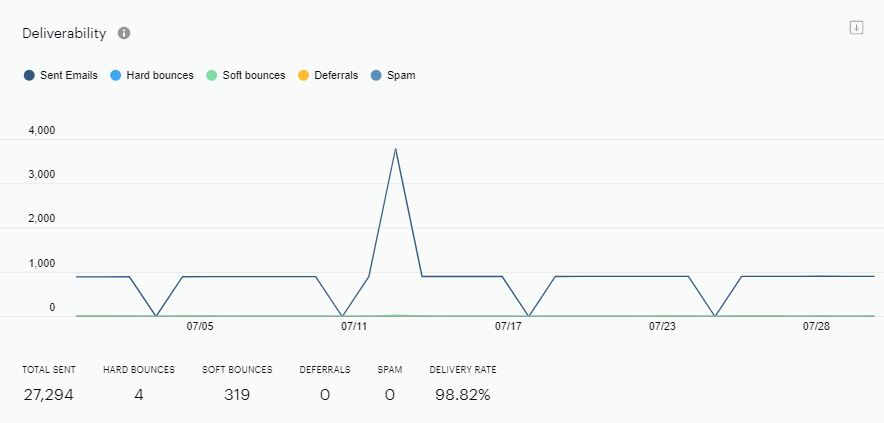
A soft bounce is a retriable deliverability error. E.g. receiving email server was not reachable at the moment delivery was attempted. It's not considered fatal immediately, so the attempt will be retried several times. Hence, a "soft" bounce (each time such an attempt fails).
Hard bounce, on the opposite, is the one that will not be retried, a "final error". For instance: "no such mailbox exists" reply from receiving mail server will likely result in a hard bounce.
Usually receiving the same soft bounces a number of times in a row will result in a permanent "hard bounce" eventually. But it's done heuristically and is handled differently for each specific case.
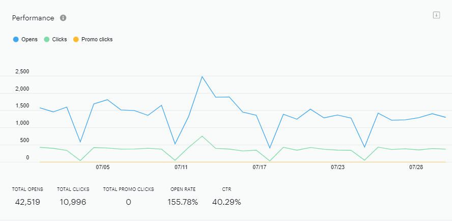
If you choose Aggregate of campaigns mode - you get summary statistics for all selected campaigns.
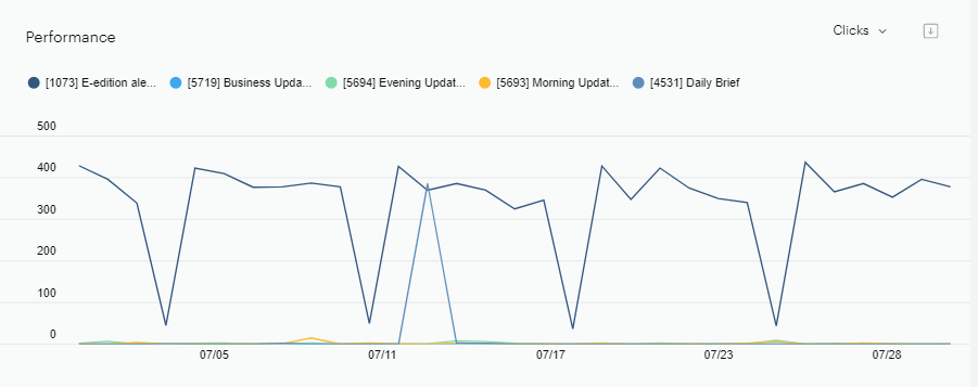
If you choose Separated by campaign mode - you get statistics for each campaign on one diagram.
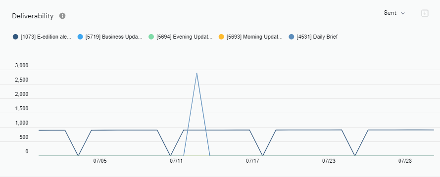
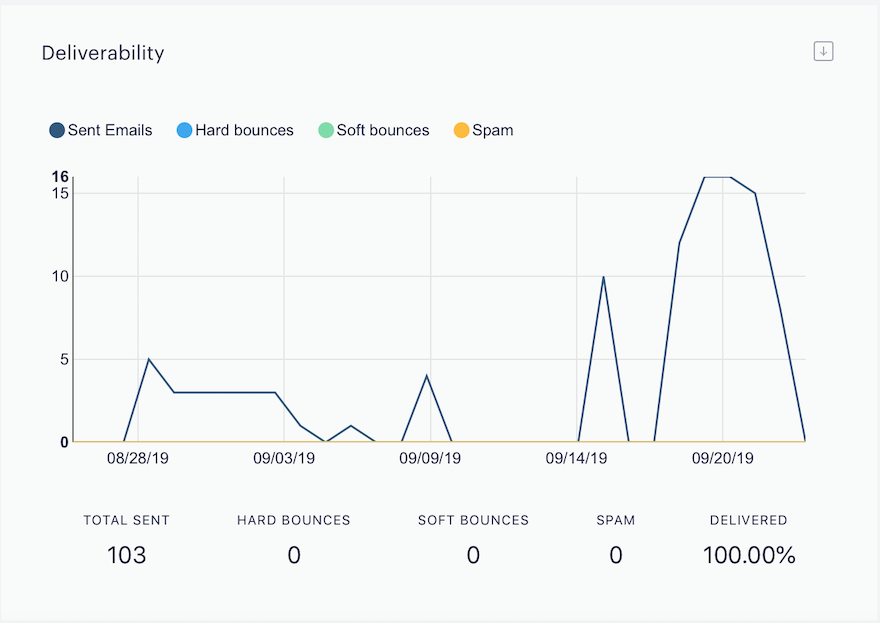
The Deliverability graph visually represents the number of emails sent during a specified period of time.
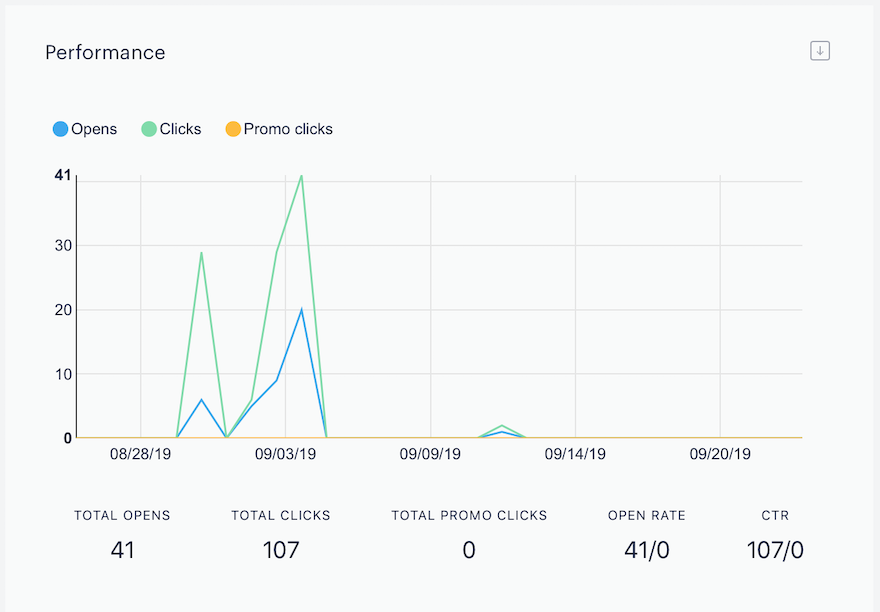
The Performance graph visually represents how many times your subscribers have opened your newsletter, as well as how many clicked on the links within the newsletter during a specified period of time.
Note that you will see data with reference to the date and it does not matter whether the events refer to an older or new newsletter sending. (So opens resp. clicks from older emails that are sent outside of the defined time range are included in this analytics data as well)
Performance statistics can be displayed in two modes:
Total - shows the sum of all users' interactions with an email
-
Opens metric - shows the sum of open events if the newsletter has been opened several times by a particular user.
-
Clicks metric - shows the sum of click events if the user has made several clicks in the same newsletter.
Unique - counts users' first interaction with an email
-
Opens metric - shows only one open event per user even if the newsletter has been opened several times by a particular user.
-
Clicks metric - shows only one click event per user even if the user has made several clicks in the same newsletter.
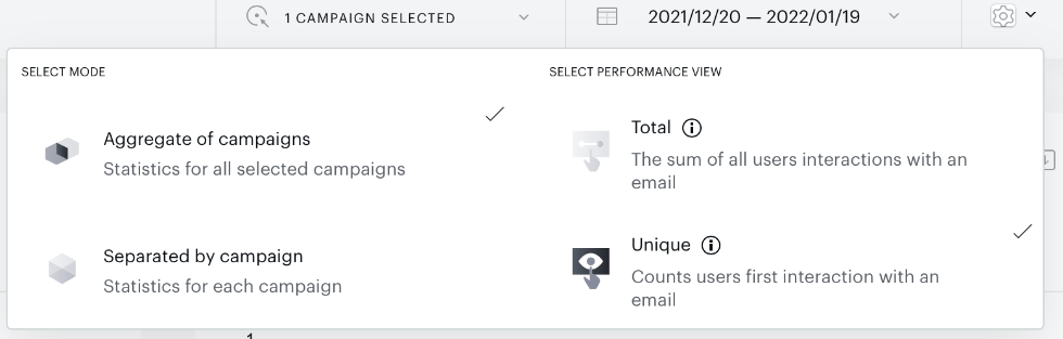
This means, that if you set the view to "Unique" you will only see the count of first clicks on any of the items from your newsletter. If a user clicks on two different links in a newsletter, these two clicks will be counted only once, so for that user the "Unique" view will show ONE click and not two.
A unique open is determined using a combination of four parameters: sendBucketID, date, userID, and the user's geolocation. If all four remain the same, the open is recorded only once. However, if any one of these parameters changes, for example, the email is opened on a different day or from a different location, it is counted as a new unique open.
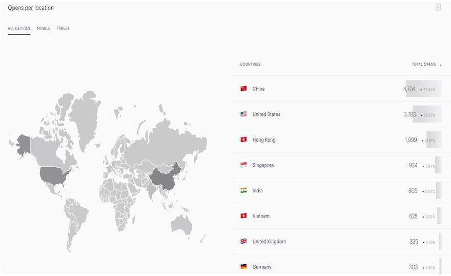
Opens per location map chart visually represents in which countries your subscribers have opened your newsletter. You can get these statistics as a total for all device types, as well as separately by desktop or mobile. This information is based on the data received from the HTTP request (i.e. IP address) of the individual subscriber who opened the newsletter. These statistics only show data for know countries that we detected. We don't show opens in this report, if we can not detect the country.
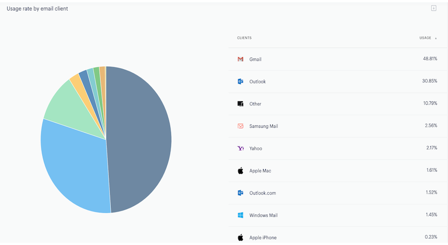
Usage rate by email client chart visually represents on which email clients your subscribers have opened your newsletter.
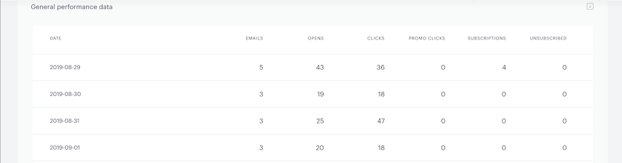
View the General performance data table for general information about a campaign’s daily performance.
Email Campaigns by sendings
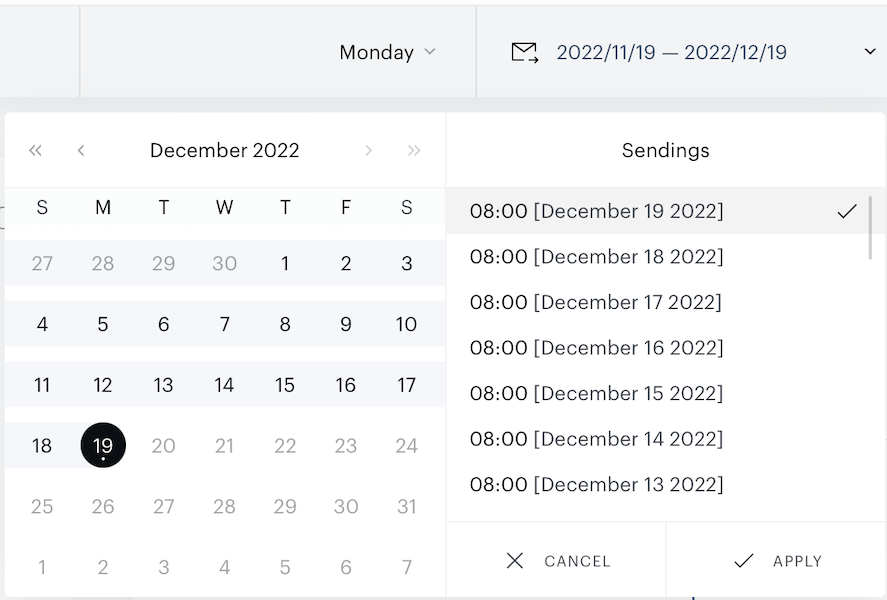
Campaigns by sendings section allows you to get the performance of a specific newsletter sending without mixing up with other batches that may have been sent in the same email campaign. Besides, it also allows you to compare the performance of one sending to another over variations of the date range.
To monitor the performance of your campaign(s) by separate sendings go to Analytics → Email performance → Campaigns by sending.
Select the specific campaign you would like to look at by clicking on the campaign name to open the dropdown with a list of all campaigns. Please note, there will be available grouping tabs, that provide an option for you to filter email campaigns by their type (e.g. All, Recurring, One-time, Triggered, Breaking news, Archive).
Set the date range to select Send Package(s) to monitor. Click on date picker icon, set the date range and choose available sending(s) that are visualized right near the date picker frame.
The deliverabilty, performance, and general performance data graphs are available and present the same metrics as the Campaigh by date section.
Mailing list activity
Go to Analytics → Mailing list activity page to check the subscribe/unsubscribe events associated with a specific mailing list. At the drop-down, you could select one or several mailing lists and retrieve the total and comparison data for the chosen mailing lists.
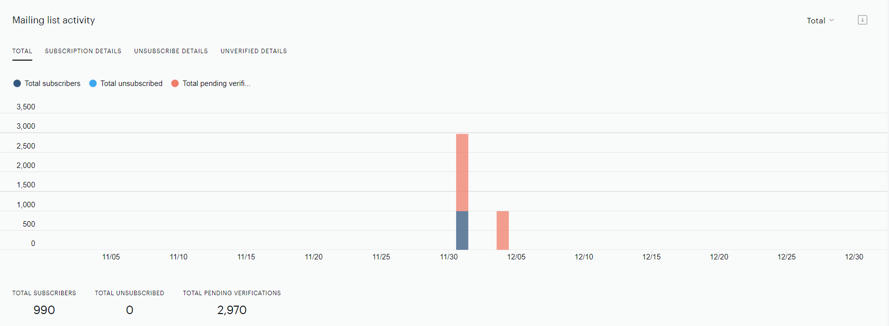
The Total tab of the Mailing list activity graph shows aggregated statistics on new subscriptions, subscriptions, and pending events for the selected mailing lists.
Metrics
Total subscribers - the total number of users who have subscribed to your newsletter at some point.
Total unsubscribed - the total number of users who have unsubscribed from your newsletter at some point.
Total pending verifications enable you to examine the total count of subscribers who are currently in the process of verification. This encompasses both DOI (Double-Opt-In) and automatic verification methods.
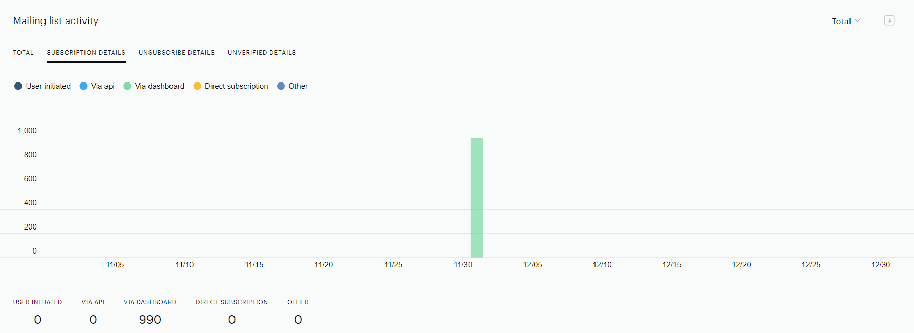
Subscription details tab of the Mailing list activity graph represents detailed subscription statistics in the context of event reasons.
Such as:
-
User-initiated - user subscribed to mailing list directly via the opt-in form at the publisher’s site
-
Via API - user’s email is added to the mailing list via API
-
Via dashboard - user’s email is added manually or via CSV file in the dashboard
-
Direct subscription - a resubscribe action by the user via the Manage Subscription page.
-
Other - unknown for ESP events
Unsubscribe details tab of the Mailing list activity graph represents unsubscribe statistics in the context of event reasons.
Such as:
-
User-initiated - user unsubscribed from the mailing list via the "Unsubscribe" link at the email
-
Via API - user’s email is deleted from the mailing list via API
-
Bad email address - ESP server received a hard bounce on the user’s email
-
Spam complaint - Email is marked as spam
-
Via dashboard - user’s email is deleted manually via the dashboard
-
ESP blacklisted - indicates that the email address has been flagged due to potential spam or untrusted sources, including automated disposable email systems
-
Mailgun verification - shows the number of unsuccessful verifications
-
Other - unknown for ESP events
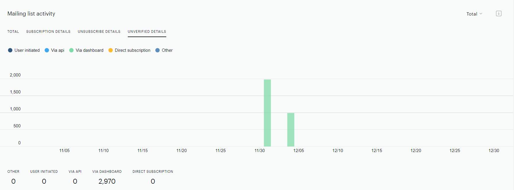
Unverified details tab of the Mailing list activity graph shows the number of pending verifications (meaning the email address has been added to the mailing list but the subscription status has not been confirmed yet).
Such as:
-
User-initiated - user subscribed to mailing list directly via the opt-in form at the publisher’s site
-
Via API - user’s email is added to the mailing list via API
-
Via dashboard - user’s email is added manually or via CSV file in the dashboard
-
Direct subscription - a resubscribe action by the user via the Manage Subscription page.
-
Other - unknown for ESP events
Mailing list comparison
The Mailing list comparison graph provides an option to compare subscribe/unsubscribe events for different mailing lists in the context of total/unique/new subscribers.
Mailing list verification
The Mailing list verification graph provides you with the capability to analyze the activities within the mailing list, particularly focusing on verification processes.
More details are available under the following link.
Click map
Go to Analytics → Click map to monitor the activity of clicks for each template block within your newsletter. Select the specific campaign you would like to look at by clicking on the campaign name to open the dropdown of all campaign options.
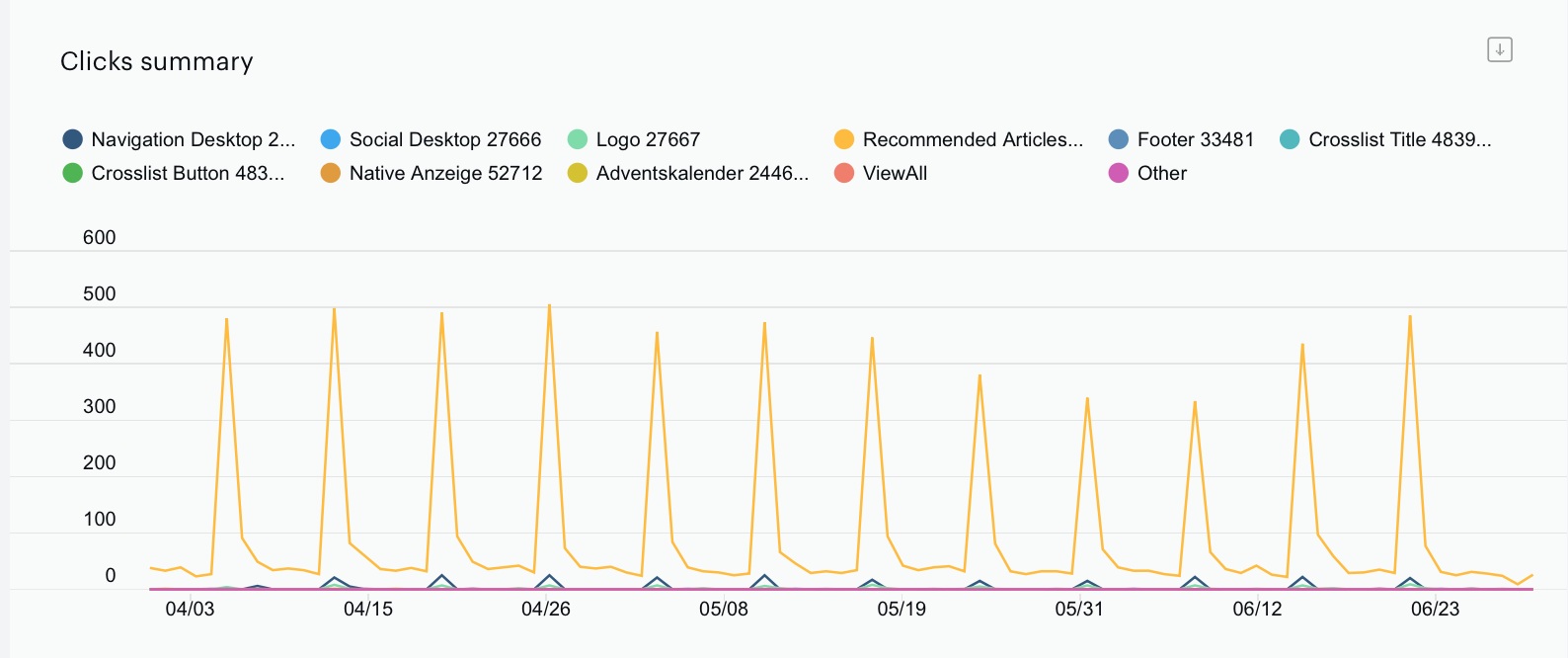
The Clicks summary graph shows the number of times your subscribers clicked on links in each block of your newsletter within a defined period of time.
The Click map report is only available for the last 2 years.
Hover your mouse on a particular day to view more detailed information.
The Most used blocks graph shows the percentage of clicks on the most-clicked blocks in your email.
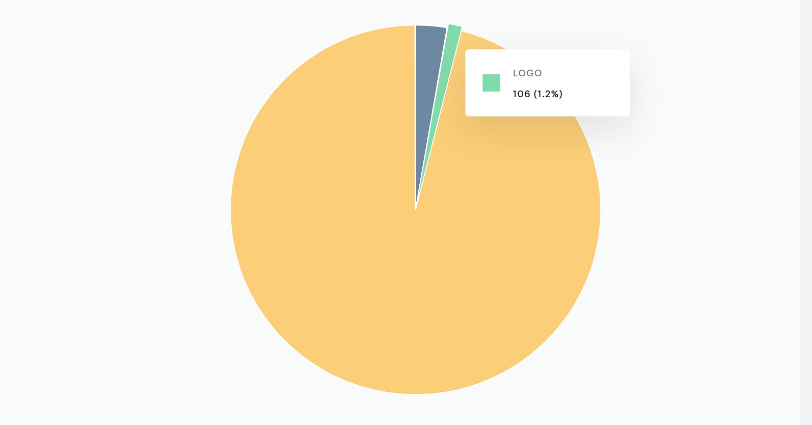
Please note, you can change your view mode to By link. 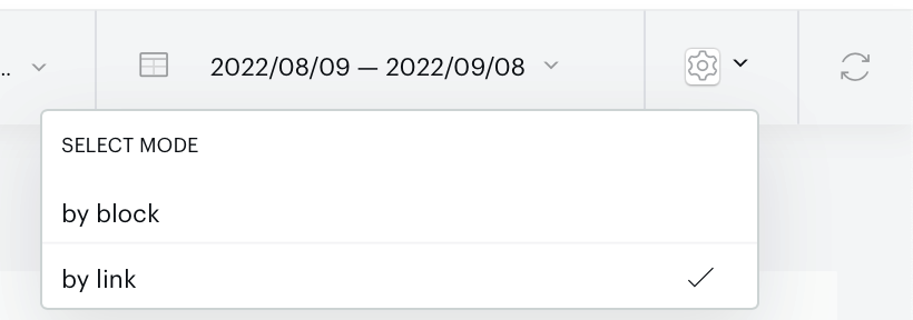
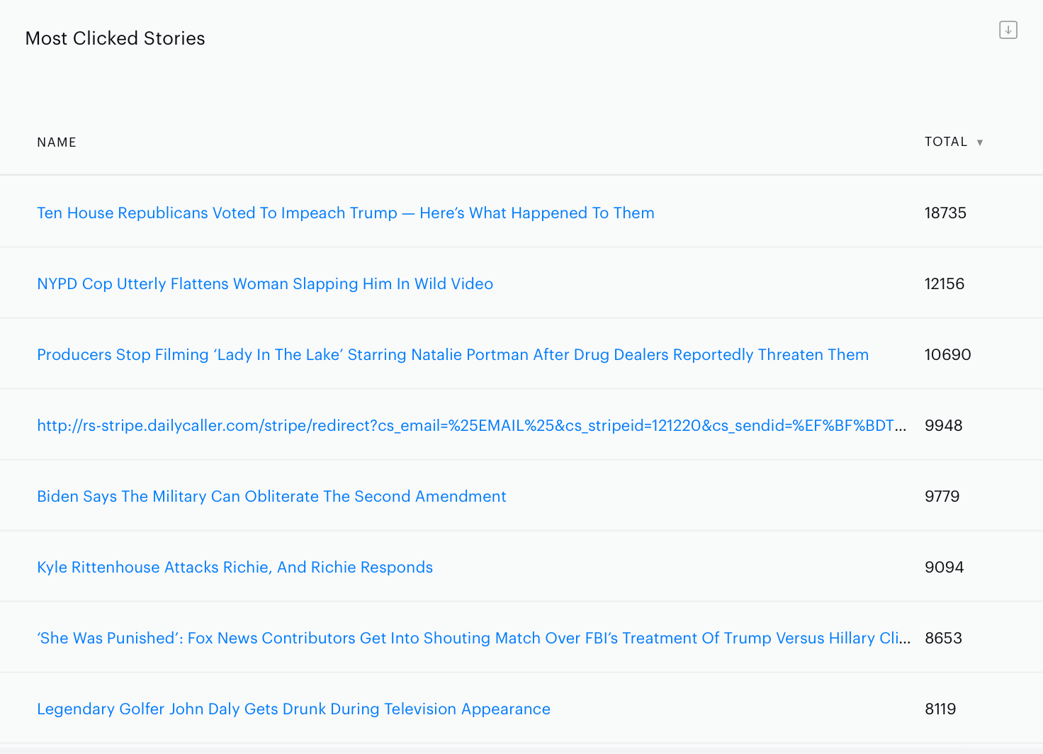
Once the By link view is selected, the Most Clicked Stories graph will be available to you. It shows which stories of a specific newsletter have been clicked most and provides an accurate number of clicks within a specific timeframe.
Opt-in performance
Monitor the performance of your opt-in widgets by going to Analytics → Opt-in performance. Select the widget you would like to view in the upper right-hand corner of the screen.
The Opt-in forms activity graph, when on the KPIs by widget tab, represents all key performance indicators for the selected widget during the pre-defined date range. Hover your mouse over a particular day to see a box with more detailed information.
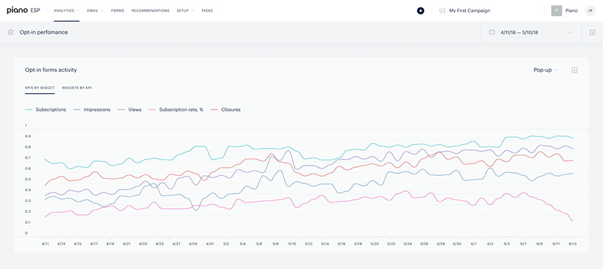
The Widgets by KPIs graph allows a comparative analysis between widgets. If you are running more than one widget on different pages, you can compare the number of subscriptions and impressions, subscription rates, views, or clicks between all of your widgets.
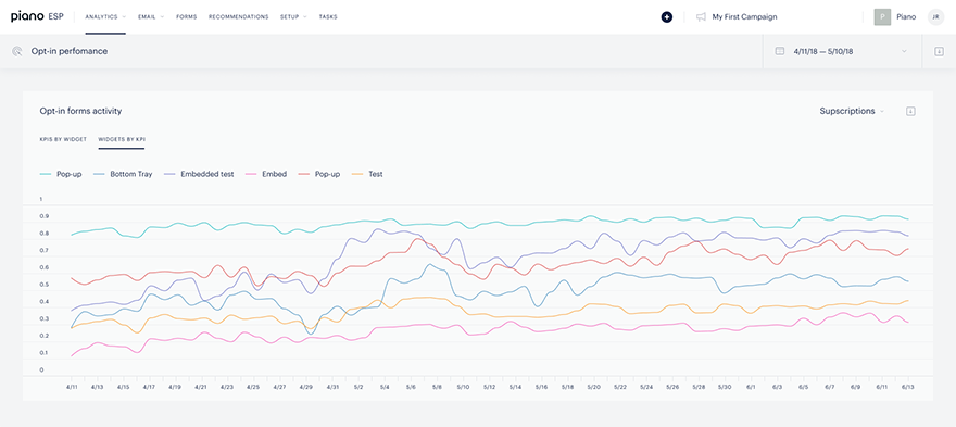
Finally, view the General performance data table for general information about a widget’s daily performance.
Push Campaign Analytics
Push Campaigns by date
To monitor the performance of your push campaigns by date go to Analtyics → Push Campaigns → Campaigns by date .
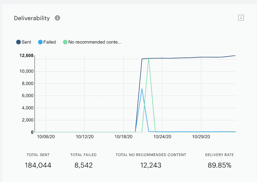
From here you can view the following data:
-
Sent: The number of successfully sent notifications.
-
Failed: The number of notifications that were not sent. This happens because users have either unsubscribed or there was an error.
-
No Recommended Content: The number of notifications that failed to send because there was no relevant content for the user. This can happen when ESP picks an article for a user, but the user has already visited that article.
-
Delivery rate: The ratio of successfully sent notifications to the total number of sending attempts.
Performance report
The Performance report will show you how notifications go from displayed all the way to actually being clicked or closed. 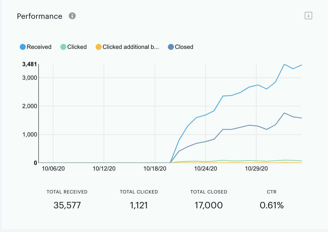
From here you can view the following data:
-
Received: The number of notifications that were actually delivered to the user’s device, but not necessarily seen by the user. Note: Received metric doesn’t account for Safari browsers.
-
Clicked: The number of clicks that result in a user navigating to the article.
-
Closed: The number of notifications that are closed.
-
Clicked additional buttons: If you have enabled additional buttons in your push notification settings, this metric will show the number of times one of the additional buttons was clicked. This metric is only for Chromium browsers.
-
CTR: Clickthrough rate.Note: Displayed metrics do not account for Safari browsers
Performance by browser
The Performance by browser report will display push campaign performance across different browsers.
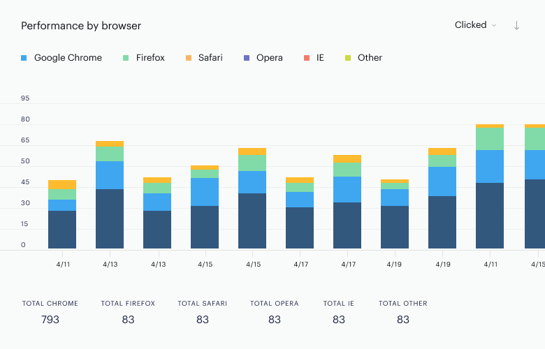
This report, similar to the Performance report, allows you to sort browser engagement by the following metrics:
-
Displayed: The number of successfully shown notifications on users' devices.
-
Clicked: The number of clicks that result in a user navigating to the article.
-
Closed: The number of notifications that are closed.
-
Clicked additional buttons: If you have enabled additional buttons in your push notification settings, this metric will show the number of times one of the additional buttons was clicked. This metric is only for Chromium browsers.
Performance by device
The Performance by device report will display push campaign performance across different devices.
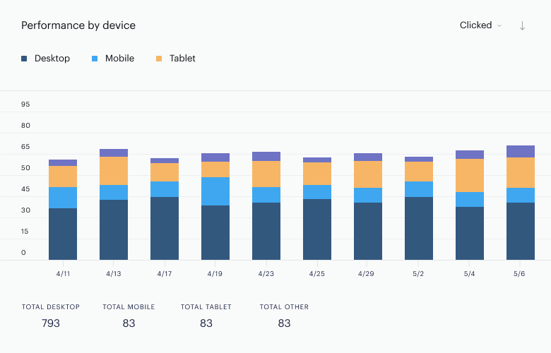
This report, similar to the Performance report, allows you to sort device engagement by the following metrics:
-
Displayed: The number of successfully shown notifications on users' devices.
-
Clicked: The number of clicks that result in a user navigating to the article.
-
Closed: The number of notifications that are closed.
-
Clicked additional buttons: If you have enabled additional buttons in your push notification settings, this metric will show the number of times one of the additional buttons was clicked. This metric is only for Chromium browsers.
Performance by location
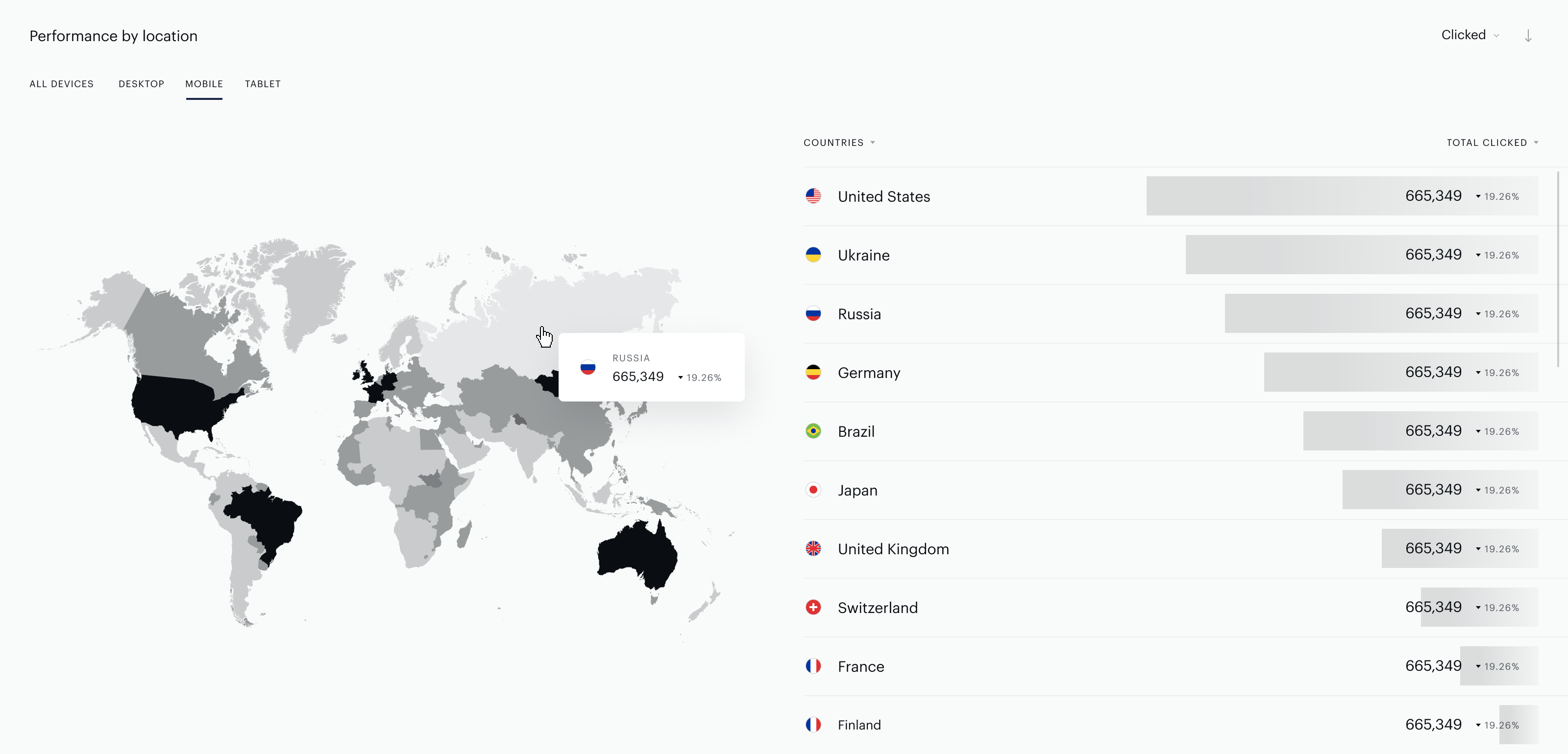
The performance by location is a visual representation of the location of users who have received your push campaign. This map can display devices and countries. The information is based on the data received from the HTTP-request (i.e. IP address) of the individual subscriber who were exposed to the push campaign.
Summary of Campaigns
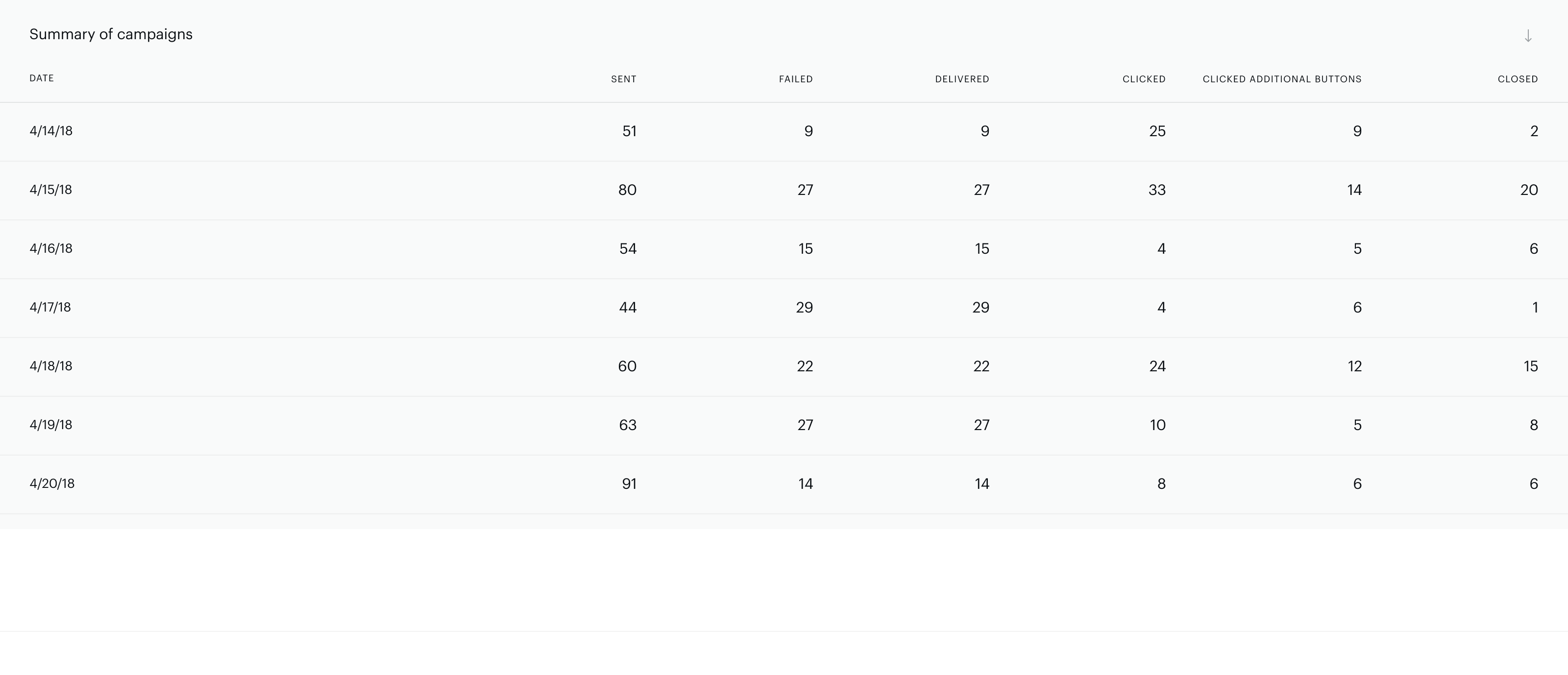
The Summary of Campaigns report shows you the daily performance data.
Note, that all Analytics data is displayed in the UTC time zone. So for example, if your campaign is set to send emails between 20:00 - 20:59 UTC-6:00, the time shown in our Analytics overview will be 2:00 - 2:59 UTC the next day.
Push Campaigns by Sendings
Campaigns by sendings section allows you to get the performance of a specific push sending without mixing up with other batches that may have been sent in the same push campaign. Besides, it also allows you to compare the performance of one sending to another over variations of the date range.
To monitor the performance of your campaign(s) by separate sendings go to Analytics → Push performance → Campaigns by sending.
Select the specific campaign you would like to look at by clicking on the campaign name to open the dropdown with a list of all campaigns. Please note, there will be available grouping tabs, that provide an option for you to filter push campaigns by their type (e.g. All, Recurring, One-time, Triggered, Breaking news, Archive).
Set the date range to select Send Package(s) to monitor. Click on date picker icon, set the date range and choose available sending(s) that are visualized right near the date picker frame.
Push Lists
Push Lists are sets of customers and their response to the terms of a push campaign.
The Permission prompt report will show you how the users opt in to push notifications. When a user sees a push notification they will have the option to allow, block, or close it. If they close the notification, you will be able to display the notification again.
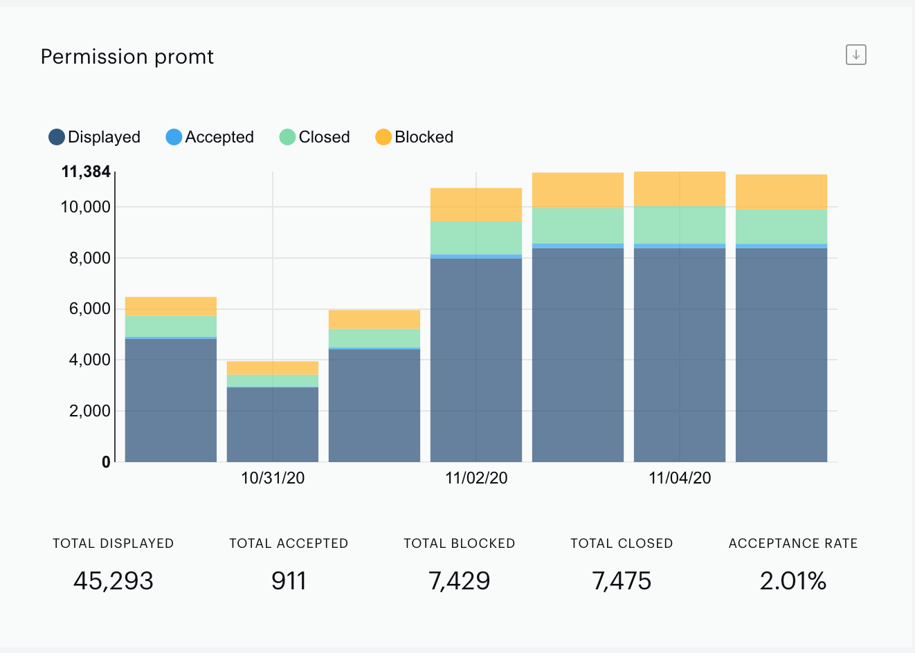
From here you can view the following data:
-
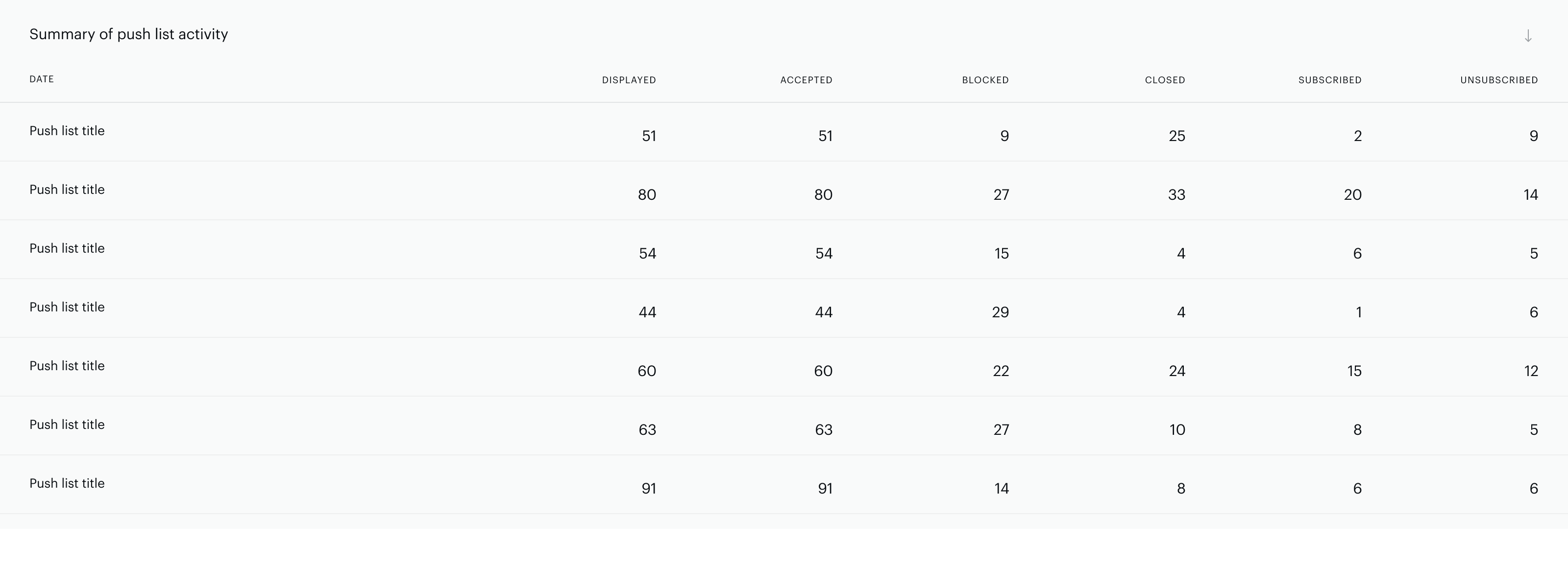
Displayed: How many times the push notification permissions prompt was displayed.
-
Accepted: How many times the push notification permissions prompt was accepted.
-
Blocked: How many times a user has opted to block your site from sending push notifications.
-
Closed: How many times a user has simply closed the push notification permissions prompt.
The Subscription events report will display the number of users who have subscribed to and unsubscribed from the selected push notification campaigns within a specified time period. This report can help you identify churn rates and patterns.
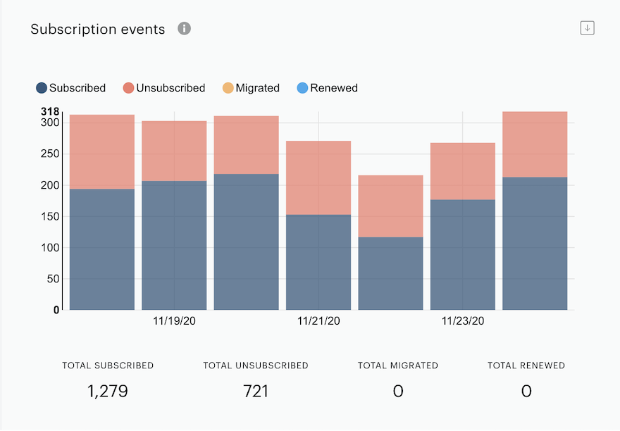
From here you can view the following data:
-
Subscribed: A user has subscribed to push notifications from your site and will begin to receive push notifications from your site.
-
Unsubscribed: A user has unsubscribed and will no longer receive push notifications from your site. If a user unsubscribes, this means that they will become an inactive (unsubscribed) user. Users can unsubscribe either manually in their browser's notification settings, clean their browser settings which will automatically unsubscribe them from a push notification or choose the option to not receive any push notifications.
-
Migrated: Users that have been migrated to Piano ESP from your previous push notification provider.
-
Renewed: Users who have updated their browser subscription to your site's push notifications.
The Summary of Push List activity report contains information about your individual campaigns and the number of users who have seen them, and what their response was.
Composer reports
In case you are a Composer client, you can enhance push notification capabilities using Composer Experiences to drive push campaign enrollment. Also, you have an option to use a push sign-up template that is a fully configurable message that can be shown before the system browser prompts. The main purpose here is to enroll a user in a push campaign with a remarkable call to action. You can find more details here.
In addition to that, you can find conversion and flow reports that provide a way for you to compare push notification campaign enrollment template shown (exposures) with push notification opt-ins (conversions), and also allow you to understand how showing the push notification opt-in template affects the flow of the Experience.
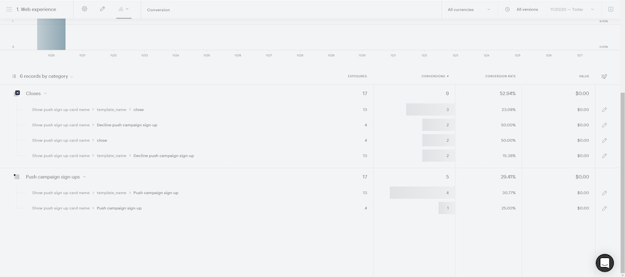
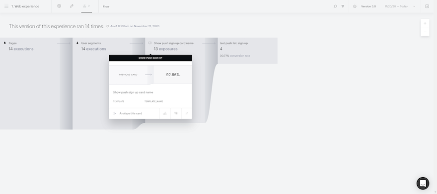
For more information about the Composer Conversion and flow reports, please click here.