
The password removal feature allows stored passwords to be removed from user accounts. When Possibility of removing password is enabled in the Piano Identity Management settings, Piano administrators can remove a user's password from the Users section, and users can remove their own password from the My Account page.
This feature is useful when invalidating credentials for security reasons or when allowing users to use passwordless login.
This feature can only be enabled if Passwordless login is activated.
Required Template Changes
Piano ID profile in My Account
Step 1: Update CSS
In the CSS tab of this template, add the following styles for the Remove password button (displayed inline next to the password field):
.remove-password-controls {
  display: flex;
  align-items: center;
}
.remove-password-controls input {
  flex: 1;
}
.remove-password-controls .remove-password-btn {
  margin-left: 8px;
}
.remove-password-btn {
  width: 20px;
  height: 20px;
  min-width: 20px;
  padding: 0;
  border: none;
  background: transparent;
  cursor: pointer;
  /* inline SVG trash icon */
  background-image: url("data:image/svg+xml;base64,...");
  background-repeat: no-repeat;
  background-size: contain;
  box-shadow: none;
  outline: none;
  line-height: normal;
  opacity: .3;
}
.remove-password-btn:hover {
  opacity: 1;
}
.remove-password-btn:focus-visible {
  outline: 1px solid #3b67b2;
  outline-offset: 2px;
  border-radius: 4px;
}
Add the Global mode warning banner CSS:
.remove-password-global-mode-warning {
  display: flex;
  align-items: center;
  padding: 10px;
  background: #fdf5e6;
  border-radius: 4px;
  color: #333333;
  font-size: 13px;
  line-height: 20px;
}
.remove-password-global-mode-warning-icon {
  min-width: 20px;
  min-height: 20px;
  display: block;
  margin-right: 15px;
  background-repeat: no-repeat;
  background-size: contain;
  vertical-align: middle;
  /* inline SVG info icon, color #b8960c */
  background-image: url("data:image/svg+xml;base64,...");
}
The styles are extended from the existing delete-account-* patterns, with shared styles added to both selectors:
/* Confirmation panel container */
.delete-account-container,
.remove-password-container { margin-top: 20px; border: 1px solid rgba(0,0,0,.1); padding: 20px; min-height: 170px; }
/* Inner content */
.delete-account-content,
.remove-password-content { min-height: 130px; display: flex; flex-direction: column; justify-content: center; }
/* Confirm-action controls row (input + button) */
.delete-account-controls,
.remove-password-controls-confirm { display: grid; grid-template-columns: 1fr auto; gap: 10px; }
/* Lock icon wrapper & icon */
.delete-account-password-icon-wrapper,
.remove-password-password-icon-wrapper { position: absolute; }
.delete-account-password-icon,
.remove-password-password-icon { position: relative; width: 20px; height: 20px; /* lock SVG */ }
/* Password input */
.delete-account-container input,
.remove-password-container input { height: 40px; min-width: 307px; padding: 0 40px; }
/* Hint and error text */
.delete-account-hint,
.remove-password-hint { color: #878787; }
.delete-account-failed,
.remove-password-failed { color: #f86a6a; }
/* Close button */
.delete-account-confirmation-close,
.remove-password-confirmation-close { position: relative; }
.delete-account-confirmation-close .delete-account-confirmation-close-btn,
.remove-password-confirmation-close .remove-password-confirmation-close-btn { position: absolute; right: 0; width: 20px; /* ... */ }
.remove-password-confirmation-close .remove-password-confirmation-close-btn:focus-visible { outline: 1px solid #3b67b2; outline-offset: 2px; border-radius: 4px; }
.remove-password-confirmation-close .remove-password-confirmation-close-btn:hover { opacity: 1; }
Step 2: Restructure the password tp-data-block header and flash messages
The "Password" heading and the flashProfilePasswordUpdated block previously lived inside *showIfCanAddPassword. Move them above it, and add the new flashProfilePasswordRemoved block.
Before:
<div class="tp-data-block">
  <div *showIfPasswordless>
    ...
  </div>
  <div *showIfCanAddPassword>
    <div class="tp-data-block-header">
      <t>Password</t>
    </div>
    <profile-password-errors-list></profile-password-errors-list>
    <div flashProfilePasswordUpdated>
      <div class="complete-msg" data-e2e="password-updated-msg">
        <i class="complete-msg-icon"></i>
        <t>Password has been changed.</t>
      </div>
    </div>
    ...
After:
<div class="tp-data-block">
  <div class="tp-data-block-header">
    <t>Password</t>
  </div>
  <div flashProfilePasswordRemoved>
    <div class="complete-msg" data-e2e="password-removed-msg">
      <i class="complete-msg-icon"></i>
      <t>Password has been removed.</t>
    </div>
  </div>
  <div flashProfilePasswordUpdated>
    <div class="complete-msg" data-e2e="password-updated-msg">
      <i class="complete-msg-icon"></i>
      <t>Password has been changed.</t>
    </div>
  </div>
  <div *showIfPasswordless>
    ...
  </div>
  <div *showIfCanAddPassword>
    <profile-password-errors-list></profile-password-errors-list>
    ...
Step 3: Add the remove-password button next to the password field
Before:
<div class="controls">
  <input
    disabled
    id="password"
    name="password"
    type="password"
    value="********"
  />
</div>
After:
<div class="controls remove-password-controls">
  <input
    disabled
    id="password"
    name="password"
    type="password"
    value="********"
  />
  <button *showIfRemovePasswordEnabled actionInitiateRemovePassword class="remove-password-btn"
          tooltipText="{{ 'Remove password' | t }}" type="button">
  </button>
</div>
Step 4: Hide the "Change Password" link row when remove-password is active
Before:
<div class="control-group">
  <div class="controls help">
    <div>
      <a *onChangePassword class="btn btn-link" data-e2e="onChangePassword">
After:
<div class="control-group" *hideIfRemovePasswordInitiated>
  <div class="controls help">
    <div>
      <a *onChangePassword class="btn btn-link" data-e2e="onChangePassword">
Step 5: Add the remove-password confirmation panel
Add the following block immediately after the closing </div> of *hideIfChangePassword:
After (new block to insert):
<div *showIfRemovePasswordInitiated class="remove-password-container">
  <div class="remove-password-confirmation-close">
    <button class="remove-password-confirmation-close-btn" actionCloseRemovePassword></button>
  </div>
  <div class="remove-password-content">
    <div *showIfGlobalMode class="remove-password-global-mode-warning">
      <i class="remove-password-global-mode-warning-icon"></i>
      <t>Password will be removed from all applications in global mode</t>
    </div>
    <div>
      <div *hideIfRemovePasswordFailed>
        <p class="remove-password-hint">
          <t>Enter the password to confirm your decision to remove password.</t>
        </p>
      </div>
      <p *showIfRemovePasswordFailed class="remove-password-failed">
        <t>Failed to remove password. Please, make sure that password is valid.</t>
      </p>
    </div>
    <div class="remove-password-controls-confirm">
      <div class="remove-password-password-icon-wrapper">
        <i class="remove-password-password-icon"></i>
      </div>
      <input fieldProfileConfirmRemovePassword id="confirm_remove_password"
             placeholder="{{ 'Password' | t }}" type="password">
      <button actionRemovePassword class="btn">
        <t>Confirm</t>
      </button>
    </div>
  </div>
</div>
Step 6: Hide the Save button row when remove-password is active
Before:
<div class="tp-data-block-actions">
  <button actionUpdateProfilePassword class="btn btn-small btn-primary">
    <t>Save</t>
  </button>
After:
<div *hideIfRemovePasswordInitiated class="tp-data-block-actions">
  <button actionUpdateProfilePassword class="btn btn-small btn-primary">
    <t>Save</t>
  </button>
Breaking Changes
None. The remove-password button (*showIfRemovePasswordEnabled) only renders when the feature is enabled in the application settings. Existing templates without the new blocks will not show the feature.
Notes
-
Global mode: When the feature is enabled on an application with Global Mode, a warning banner appears inside the confirmation panel, informing the user that their password will be removed across all applications sharing that global mode.
Remove a user’s password as a Piano administrator
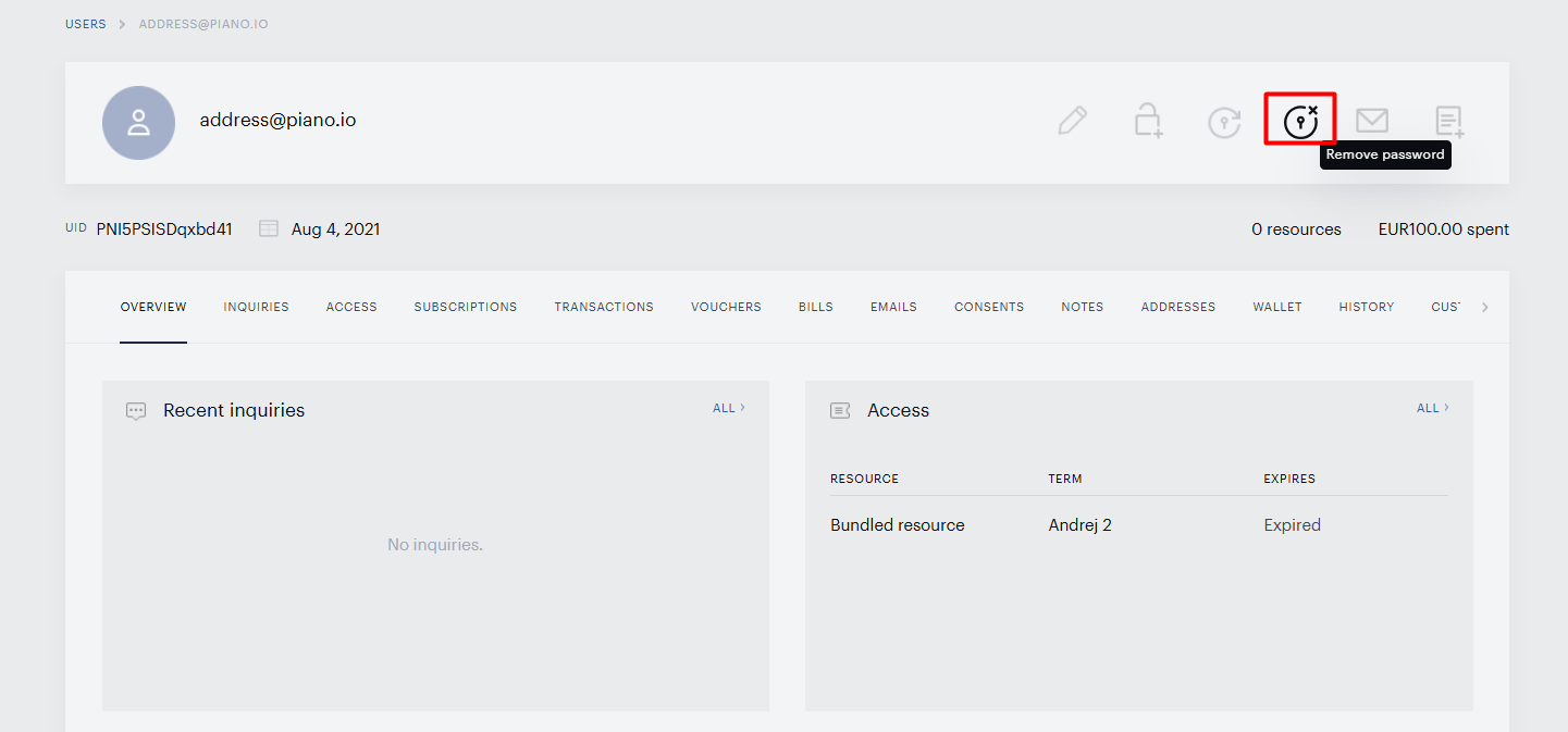
To remove a user’s password, navigate to Users and search for and open the user account you want to update.
In the top-right icon bar, click Remove password (next to the Reset password icon).
Confirm the action when prompted.
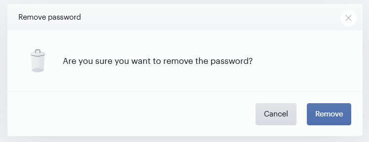
This action cannot be undone. The user will not be able to log in with their previous credentials.
After the password is removed, the user can log in using passwordless login. For more information about this login type, see here.
Removing a password as an end user
End users can remove their own password from the My Account page to switch to passwordless login.
To remove your password:
-
Log in and navigate to My Account.
-
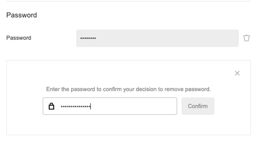
In the Password section, click Remove password.

-
Confirm the removal by re-entering your password and selecting Confirm:
If passwordless login is not enabled for all apps in the same global mode, the Remove password option will not be available, and a warning will explain why.