Security, Privacy, AI and CSR information for all Piano products now lives in one place. Explore our Compliance Center.
Audience
English French
English French

Piano Content Recommendation CSS Style Tutorial

Introduction

This tutorial will show how one goes about modifying the layout of Piano Content Recommendations using the Piano Content UI. The tutorial is part of a series of tutorials on Piano Content Recommendations. The two other tutorials in the series are:

  • Piano Content Recommendation Tutorial

  • Piano Content Recommendation Config Tutorial

This tutorial assumes some basic understanding of CSS and that you have completed the first tutorial listed above or already posses the knowledge.

Generating the Javascript Code from the Default Javascript Template

Before we start editing CSS, we will generate the HTML that we will use as our target output. Start with the default JavaScript template and review the HTML generated from that template in the HTML tab.

We will use the default JavaScript template below as the starting point for generating the recommendation HTML.

<!-- Example template (change width and height to reasonable values) -->
<!--%
var items = data.response.items;
for (var i = 0; i < items.length; i++) {
  var item = items[i];
  %-->
  <div class="item">
    <a class="allclick" tmp:id="{{cX.clickTracker(item.click_url)}}" tmp:href="{{item.url}}" tmp:target="_top">
      <!--%
      cX.renderContainedImage({
        container: { width: 321, height: 160 },
        image: { src: item.dominantthumbnail, dimensions: item.dominantthumbnaildimensions }
      });
      %-->
      <h3>{{item.title}}</h3>
    </a>
  </div>
  <!--%
}
%-->

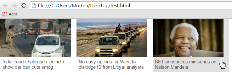
Below, we have integrated the generated HTML into a complete HTML web page and swapped the click and image URLs for test files on our local computer. The item structure (the div with the class attribute set to "item") repeats three times because we set the widget size to 3:

<!DOCTYPE HTML>
<html>
    <head>
        <style type="text/css">
            html, body { margin: 0; padding: 0; outline: 0; border: 0; }
            #templateElement { display: none; }
            #targetElement { float: left; }
        </style>
        <style type="text/css">
         
            // HERE IS WHERE YOUR CSS STYLE WILL END UP
             
        </style>
    </head>
    <body>
        <div id="targetElement">
            <div class="item">
                <a class="allclick" id="1234" href="india-story.html" target="_top">
                    <div style="width: 321px; height: 160px;  overflow: hidden; position: relative;">
                        <img style="position: relative; left: 0px; top: 0px;" src="india.jpg" width="300" height="200" alt="">
                    </div>
                    <h3>India court challenges Delhi to show car ban cuts smog</h3>
                </a>
            </div>
            <div class="item">
                <a class="allclick" id="2345" href="libya-story.html" target="_top">
                    <div style="width: 321px; height: 160px;  overflow: hidden; position: relative;">
                        <img style="position: relative; left: 0px; top: 0px;" src="libya.jpg" width="300" height="200" alt="">
                    </div>
                    <h3>No easy options for West to dislodge IS from Libya: analysts</h3>
                </a>
            </div>
            <div class="item">
                <a class="allclick" id="3456" href="mandela-story.html" target="_top">
                    <div style="width: 321px; height: 160px;  overflow: hidden; position: relative;">
                        <img style="position: relative; left: 0px; top: 0px;" src="mandela.jpg" width="300" height="200" alt="">
                    </div>
                    <h3>BET announces miniseries on Nelson Mandela</h3>
                </a>
            </div>
        </div>
    </body>
</html>

Whatever CSS we were to enter under the Styles tab in the UI can now be tested here by inserting in the html code above where it says // HERE IS WHERE YOUR CSS STYLE WILL END UP.

Incremental CSS Changes

Starting with no CSS at all, we will, step by step, do increasingly more and more sophisticated modification to the widget layout using the html code above as our test framework.

Not Applying any CSS Style at all

Let's start by not doing any change. That is, by not adding any CSS at all. The result can be seen below.
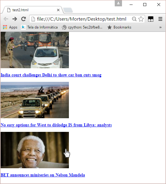
image-20211217-130521.png

Notice how the items were displayed vertically, that there are no action upon hoovering the mouse above any of the items, and the links are underlined and have the browser's default font type and size.

Going from Nothing to the Default CSS Style

Below we see how we can make the items be listed horizontally rather then vertically. The key here is the left floating.

/* Horizontal items listing */
.item {
    float: left;
    width: 321px;
    height: 223px;
    padding: 1px;
}

Below we see how one can make the background change when hoovering the mouse above one of the items.

/* Dark grey background when mouse hoover over item */
.item:hover {
    background: #e0e0e0;
}

Below we remove the underlining of the link with the anchor text (text-decoration: none) and set the text font type, size and color of the title (the title appear within a h3 element, hence why we do the settings for this element).

/* Remove link underline and define the title text style (h3 eleme
a {
    text-decoration: none;
}
h3 {
    font-family: arial, helvetica, sans-serif;
    font-size: 20px;
    font-weight: normal;
    font-style: normal;
    color: #555;
    padding: 9px;
    margin: 0;
}
image-20211217-130541.png


Last updated: