
Introduction
This tutorial is the first in a series of three that covers Piano Content Recommendation. The two other ones are:
-
Piano Content Recommendation CSS Style Tutorial
-
Piano Content Recommendation Config Tutorial
Content Recommendation is the science of knowing what the user, as well as all the other visitors to the site, is currently reading, as well as what they have been reading in the past, and the art of acting upon that data in such a way that we can stimulate the user to spend more time and to consume more content at the site.
There are 3 questions we need to answer before deploying a Piano Content Recommendation widget:
-
Where do we place the widget?
-
What is the widget to look like?
-
What type of recommendation is the widget to display?
Answering these three questions is not an exact science, as this tutorial will show. It will provide plenty of guidance. Before we begin, we’ll first answer a straightforward technical question: How do we create a content recommendation widget?
How do we Create a Content Recommendation Widget?
A Content Recommendation widget is created, deployed, and used through a short workflow. First, an operator uses the Piano Dashboard to create the widget and define its three subcomponents: a content config, a JavaScript template, and a CSS stylesheet. Next, the resulting widget tag is obtained and deployed on the site’s web pages. When a user opens a page, the tag runs, sends a request for content recommendations, and returns an iframe containing matching recommendations.
Prerequisites
These are the prerequisites for being able to create and deploy a content recommendation:
-
Create a site group (if it does not already exist)
-
Add a site to the site group (if it does not already exist)
-
Obtain write access for the site in the site group
-
While not necessary for creating a training widget, for well-performing production widgets:
-
the site must be whitelisted
-
meta tags must be added if current data quality deems it necessary
-
Creation and Deployment Procedure
-
Create a new widget: Open the widget creation form from the Create Module menu option. Fill out the Name field, select the Site where the recommendation will appear, and set the Items and Format to the number of recommendations to show. Leave the remaining fields blank for now, then click Save at the top of the form.
-
Add the default content configuration to the widget: Click Content collections and then the New collection button. When the form appears, fill in the available settings as needed and then click the OK button. Return to the widget form, select the newly created collection from the Content collection dropdown, and click Save.
-
Add the default template to the widget: Click the Templates tab and then the Create new template configuration button. When the form appears, fill in the Description field and then click the Create button without making any changes to the form. Return to the widget form, select the newly created template from the Template dropdown, and click Save changes.
-
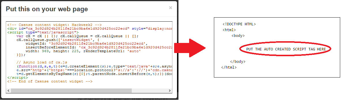
Add the widget to a web page: Click the Widgets tab and go back to the widget form. Click the Script tag button. Cut and paste the JavaScript code that appears in the pop-up window into a web page of yours as shown below (click on image to enlarge) and save the file to your computer as test.html.
-
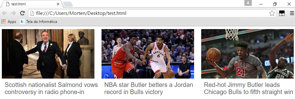
See the recommendations in your browser: Open the test.html web page in a browser and voila, you have the recommendations appearing in your browser window.
-
Replace the default content configuration with a meaningful one: Ok, we must admit, these were not very useful recommendations, as the very same hard-coded recommendations will be shown every single time and they don't even have anything to do with either the article on the page or with the content of pages the user has visited before. Ok, we will fix that by replacing the default content configuration we have been using with the one below. Just make sure to insert your site id on line 4 before doing so.
{
  "type": "recs",
  "siteIds": [
    "<ADD YOUR SITE ID HERE>"
  ],
  "matchingMode": {
    "trend": {
      "weight": 10,
      "period": 86400
    },
    "behavioral": {
      "weight": 5
    },
	"contextual": {
	  "weight": 5
	}
  },
  "resultFields": [
    "url",
    "title",
    "dominantthumbnail",
    "dominantthumbnaildimensions"
  ],
  "maxAge": 10080,
  "query": "query(dominantimagedimensions:\"*\")"
}
The configuration above will recommend a combination of content that has been popular (matching mode set to trend) during the last 24 hours (period set to 86400 seconds) with content similar to what the user has read before (matching mode set to behavioral) and to similar content of the current page (matching mode set to contextual). None of the recommendations will contain articles older than 7 days (maxAge set to 10080 minutes), and only articles with an image (dominantimagedimensions) will be recommended. We also made sure that resultFields contain all the fields our template code makes references to. Here we see an example of the result after having updated to the configuration above:
Where do we Place a Content Recommendation Widget?
To the right is a typical online news article: a headline, a large photo near the top, and the story. Below it is the increasingly common commentary area where readers can share opinions.
We marked the story with colored content-recommendation placeholder boxes. Below we review each area, its usefulness for recommendations, and the types of recommendations suited to it.
-
Distraction and redirection area - At the top of the article is the distraction and redirection area. You generally should avoid this area because it distracts readers and prevents them from reading the article or seeing ads lower on the page. However, you may want to distract certain visitors, for example, Facebook referrals who would otherwise bounce. In that case, tailor recommendations to that group and hide them from other visitors.
-
Bored readers area - About halfway down the article, readers who lose interest begin to drift. Use this spot to recommend content different from the current article, trending pieces or items aligned with the reader's past interests.
-
Interested reader area - The area immediately below the article reaches readers who finished the piece. These readers likely want more on the same topic, so recommend similar content.
-
Graveyard area - The graveyard area is where recommendations go to die. Any area below the immediate follow-up to the article performs poorly. Few readers will see it, and you can expect a near-zero CTR.
Match area types to content via the content config, as covered in this section of the second tutorial.
Summary:
-
End articles with recommendations for similar content (see interested reader area)
-
Offer alternatives for readers who lose interest midway (see bored readers area)
-
Place recommendations immediately after the article; avoid areas that function as the graveyard area
-
Avoid distracting users unless that is your goal (see distraction and redirection area)
What should a Content Recommendation Look like?
Placing relevant content in the reader’s view won’t increase CTR if the recommendation’s layout doesn’t prompt clicks. Include an image—larger is better—and keep the text short to reinforce the image. A news headline paired with the article’s main image usually works best. Below are two layout improvement examples: the old layout on the left and the improved layout on the right. The first example is from a non-news site recommending movie information; the second is from a news site.
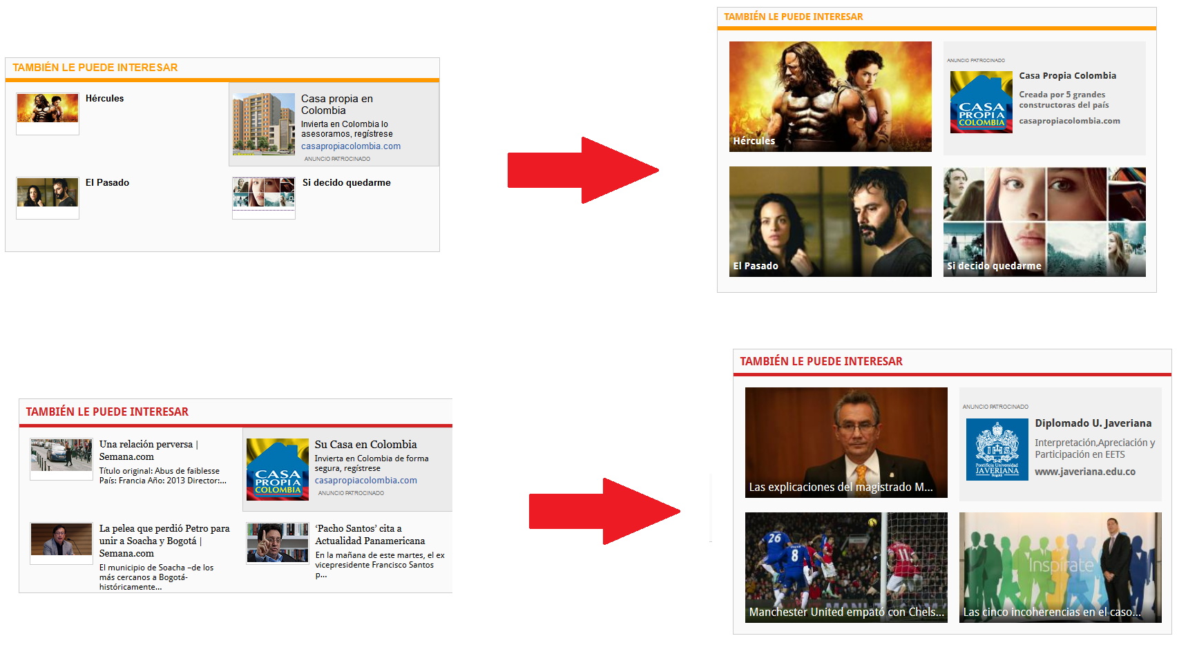
The recommendations from before the improvements look awkward both when they have a short title only (the case above) or when they have both title and body teaser (see below). In both cases it is relatively easy to see why a large image combined with the title only is likely to stimulate more clicks than the versions to the left.
Summing it all up:
-
Size matters: a big picture is better than a small picture, and a small picture is better than no picture
-
Make the text short and simple, just enough to get the idea what it is about across (the title is normally a winner)
Go to Piano Content Recommendation CSS Style Tutorial to learn the details on CSS styling.
What Type of Recommendation are we to Display?
Below we see a list of the configuration options we have when it comes to deciding what type of recommendations a widget is to display.
-
trend - articles popular right now
-
aiTrendBehavioral - articles popular right now, ranked by the user's past interests (AI embeddings-based)
-
contextual - articles similar to the article the user is currently reading
-
aiContextual - articles similar to the article the user is currently reading (AI embeddings-based)
-
aiContextualBehavioral - articles similar to the article the user is currently reading, ranked by the user's past interests (AI embeddings-based)
-
behavioral - articles similar to those the user has read in the past
-
aiBehavioral - articles similar to the user's past interests (AI embeddings-based)
-
collabctx - articles read by others that have also read the article the user is currently reading
-
collabusr - articles read by others with similar interests as the current user
For learning how to set these as well as many other display-related settings, go to Piano Content Recommendation Config Tutorial.