
How to access
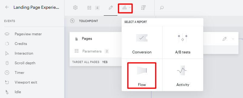
You can access the flow report by clicking the Reports dropdown either when editing an experience:
Or in the Composer overview screen:
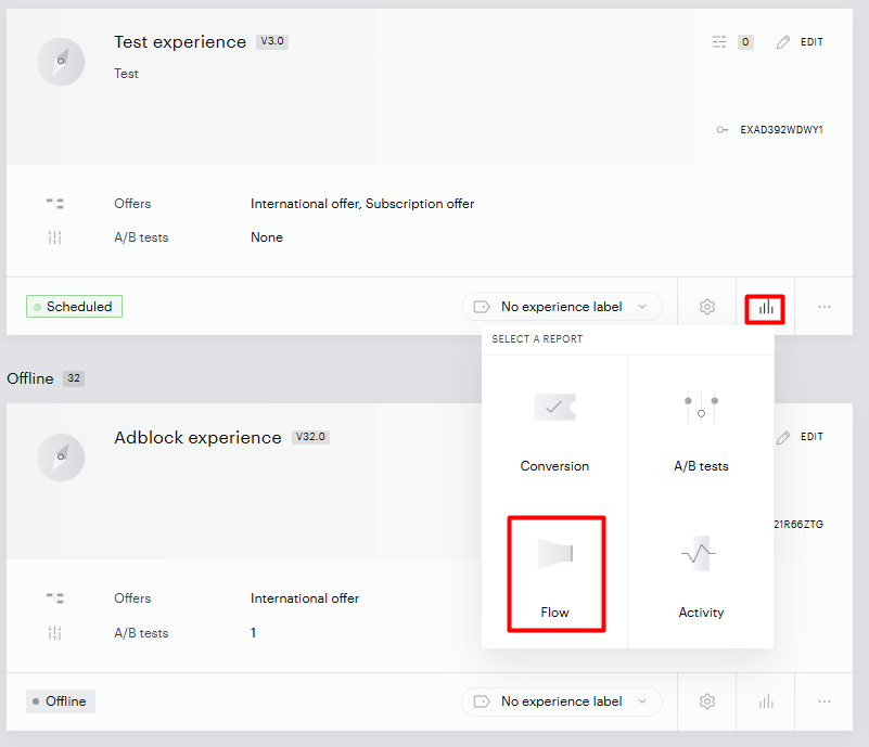
From the dropdown that appears, select Flow.
Main visual
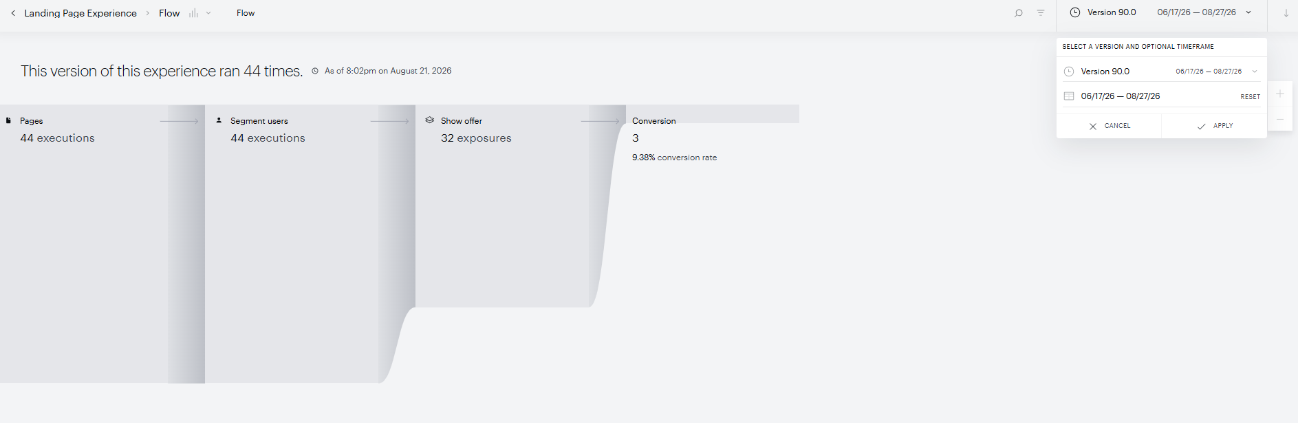
When the Flow report loads, it returns data from the most recent experience version for the full duration that version has been active.
Publishers may occasionally reactivate experiences that were temporarily offline or deactivated for a longer timeframe. It's important to note that our reports are not real-time and do not fetch data for offline experiences. When an experience is reactivated, it may require some time to regenerate all the necessary data to display it accurately.
Time frame and filtering
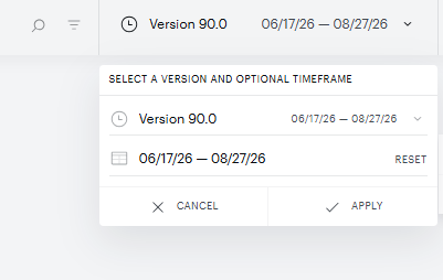
You can choose the specific experience version and timeframe that you would like to explore for the flow report.
Versioning
You can choose to view the user flow for each version of an experience.
Every time a change that modifies the structure of the experience is detected, a minor version is automatically added. So while a user may choose not to save the change as a new version (such as version 1, 2, or 3), Piano will automatically segment these into minor versions (such as version 1.1, 1.2, 1.3, etc). These are necessary because the data of users moving through the experience must be uniform.
Time
Each version of the experience has a time range when it was live, and the report can be further filtered or customized by selecting a subset of these dates.
Additionally, in the main flow visualization, there is a toggle to include 'All experience executions'. This will start the experience flow with the value which represents every session where an experience was triggered across all experiences. This is valuable to understand the percent of an eligible audience that has the opportunity to enter an experience's flow.

Main flow
The flow report is broken down into two sections: the main flow and the card analysis view.
The main flow is a large Sankey diagram in which the width of the bars proportionally represents the traffic that progressed through the experience.
The number for each card represents the number of times the card was executed. Card executions occur when the previous card (or a user landed on a page satisfying the initial experience rules) has its criteria met. Pageview meter cards run multiple times, potentially incrementing for each additional pageview counted towards the meter's expiration.
Hovering over the card titles will reveal the CTR of that card from the previous card and reveal the following options:
-
Analyze this card
-
View on canvas
-
Edit this card
Card analysis
Clicking Analyze this card when hovering on a specific card on the main flow opens the card analysis view.
This view focuses on a single card, showing what percentage and number of executions resulted in actions that led to the card's criteria being satisfied or not. For example, a Show Offer card displays a breakdown of users who converted, clicked on a button or link (micro-conversion) or ignored the offer.
For the pageview meter, the breakdown will be the number of executions resulting in the meter equaling one, two, three, etc.
It's expected that in some cases you will see a higher meter expired count since it's possible that users who already have had their meter expire will visit another article on your site, and this would add another Meter expired execution to the report.
This can also happen if the same meter name is used in a different experience, as the second experience would also increment the meter.
In addition, marked with an "X" you will see what percentage of users fell into a category that is not covered by your experience's pageview meter criteria. Please see the example below for reference:

If the experience contains a pageview meter and the Flow report is set to view the current, up-to-date version, there will be an additional toggle that changes the shown analysis from card executions to live meter levels.
If the experience contains a Show push signup card, you will have the ability to view the following interaction types:
-
Soft enrolls - The number of times the call to opt-in to push notifications was accepted at the moment the push notification sign-up template was shown.
-
Enrolls - The number of times a browser prompt to allow the receipt of push notifications from your domain was accepted.
-
Declines - The number of times a browser prompt to allow the receipt of push notifications from your domain was declined.
-
Closes - The number of times a browser prompt to allow the receipt of push notifications from your domain was closed.
-
-
Soft declines - The number of times the call to opt-in to push notifications was declined at the moment the push notifications sign-up template was shown.
Difference between ESP Analytics and Composer Flow Report
When comparing statistics between the ESP Analytics for Push Campaigns and enrolls in the Composer Flow report in Piano, it's essential to understand that differences may arise due to the distinct events tracked by ESP and Composer. The primary variance lies in the interpretation of actions triggered by Composer and native prompts (a browser-specific event) by ESP.
In scenarios where a user returns with cleaned data in the browser, Composer may show an action again, but ESP, due to prior consent, might not trigger the native push prompt.
This may result in different statistics in Composer and ESP reports or graphs.
Exporting data
At any point, while viewing the main flow or specific card analysis, you can export the results as a CSV by clicking the icon in the upper-right-hand corner of your screen. The CSV will provide the underlying table that powers the visualization.
In column D, you will find the Card ID. This ID is a unique value and can be found when editing any Composer Experience by clicking on the down arrow on the respective card on the Composer canvas and going to Dev tools.
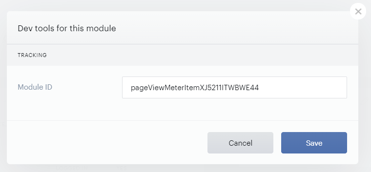
This Module ID can be modified on your end, but please note that it can only contain alphanumeric characters. Also, as this value should be unique, you cannot use the same Module ID for different cards in any Composer Experience.
This Module ID will then be shown as the Card ID in the downloadable CSV file for the Flow report.
In addition, you can also leverage Piano's API to export the Flow report's data via the endpoint /export/schedule/composer/flow. More information is available under the following link.
Template interaction flow report
Overview
The Template interaction experience type currently offers two reports: the Flow Report and the Composer Conversion Report. Both can be accessed via the same icon in the experience navigation bar as the site/app or AMP experience types (see How to Access).
The primary reporting use case for the Template interaction experience is Active churn prevention, with the goal of understanding churn successfully prevented, whether through subscription upgrades or abandonment of the flow, actual churn, or collected cancellation feedback.
In the Conversion Report, you can find a top-level overview of the main KPIs. In the Flow Report, you can analyze the performance of each experience branch and identify opportunities to optimize the experience setup.
Specifics to Flow report canvas structure
The Template interaction experience is a new approach to managing the canvas structure and creating a sequence of action cards based on the experience interaction. With this new approach, we are introducing an updated version of the Flow Report.
Each composer card in the Flow Report has its own card execution KPI (for all cards, except visible client actions such as Show Form, Show Template, Show Offer, etc.) or exposure KPI for visible client actions, such as Show Form, Show Template, Show Offer, etc.
Each card resulting in actions has a related KPI or touchpoint as a next canvas level. For example:
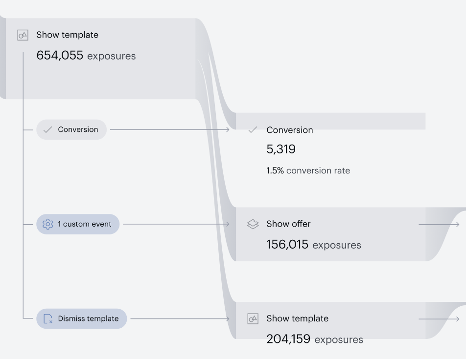
The Show template action card might have:
-
KPI (differentiated as light gray) or
-
Touchpoint (differentiated as dark gray).
One of the most important changes in the Flow Report in the context of Active churn prevention is the Active churn KPI for each action card that resulted in active churn.
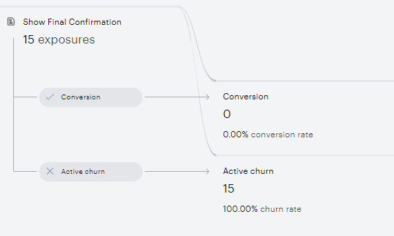
The supported KPIs in the Flow Report (including main flow report canvas and card analysis)
-
Executions: Number of times the card was executed by Composer. Card executions occur when the previous card (or a user landed on a page satisfying the initial experience rules) has its criteria met.
-
Exposures: Number of template, offer, or form exposures. This metric is calculated for actions that can be visibly presented to a website visitor instead of card exposures.
-
Conversions: Number of Management + Billing conversions or conversions logged via Composer's conversion endpoint.
-
Conversion rate: Ratio of conversions to action exposures.
-
Interactions: Number of interactions with an offer, template, or form.
-
Interaction rate: Ratio of interactions to action exposures.
-
Clicks: Number of clicks on a template or offer that do not lead to template closure.
-
Click rate: Ratio of clicks to action exposures.
-
Closes: Number of close button clicks.
-
Closure rate: Ratio of closed button clicks to action exposures.
-
Active churn: Number of subscriptions for which autorenewal was turned off or which were canceled.
-
Active churn rate: Ratio of active churn compared to template exposures.
-
Submitted form: Number of submitted forms.
-
Submission rate: Ratio of submitted forms to form exposures.
-
Logouts: Number of logout events after a user sees the device restriction template indicating they have exceeded the allowed number of logged-in devices.
-
Logout rate: Ratio of logout events to template impressions triggered by the device restriction limit.
Card analysis
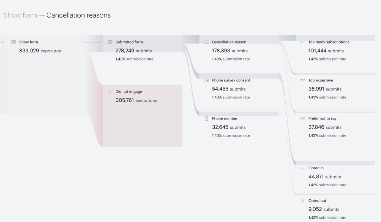
With the new Active churn prevention use case and the new Template interaction experience, we do introduce an updated version of card analysis for the Show form card. This new card analysis will be available for all experience types. Click Analyze this card on the card:
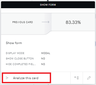
The card analysis will be opened in a new tab with an option to analyze the interactions with the form and collected values from subscribers so you can analyze the responses. Due to UI limitations, we only show collected values for these specific value types: BOOLEAN, SINGLE SELECT LIST, MULTI SELECT LIST. Any remaining collected values can be analyzed via Mine users.
If the number of executions or exposures is lower than the actual number of churn, please check whether you are not whitelisting logExecutionStats.