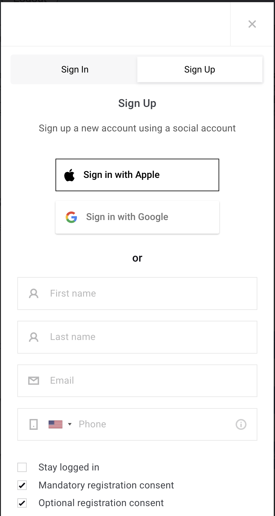
To implement tabs that allow users to switch seamlessly between the Login and Register screens, you’ll need to include a small code snippet at the beginning of the Piano ID login page and Piano ID register page templates. This snippet controls the visibility and behavior of the tab navigation, ensuring that the correct screen is displayed based on user interaction. Adding this code enables a smoother user experience by eliminating the need for full page reloads when toggling between login and registration. Be sure to place the code before any existing content in the templates to ensure proper rendering.
Piano ID login page
<div *hideIfSingleStep class="tabs">
  <button type="button" class="tab active">Sign In</button>
  <button type="button" showScreen="register" class="tab">Sign Up</button>
</div>
...
Piano ID register page
<div *hideIfSingleStep class="tabs">
  <button type="button" showScreen="login" class="tab"><t>Sign In</t></button>
  <button type="button" class="tab active"><t>Sign Up</t></button>
</div>
...
These tabs allow users to toggle between login and registration views without reloading the page. The showScreen directive handles the screen change on click, and *hideIfSingleStep ensures the tabs are hidden in Single-step mode, where only the login screen is supported.
To style the tabs, add the following CSS to the Piano ID layout template’s CSS tab:
.tabs {
    display: flex;
    margin: 0 -10px;
    background-color: rgba(10, 14, 18, 0.03);
    border-radius: 4px;
    box-sizing: border-box;
    padding: 3px;
}

.tab {
    flex: 1;
    padding: 11px;
    background: transparent;
    cursor: pointer;
    border: none;
}

.tab.active {
    background: white;
    box-shadow: rgba(10, 14, 18, 0.1) 0px 2px 5px;
    cursor: default;
}
This setup provides a clean, user-friendly tabbed interface, improving navigation between the login and registration steps. For example, like this: