
Identity Management allows you to add a couple of social login options as listed here. By default, the design of these icons in the Identity Management templates is as follows:
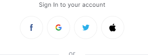
With the help of CSS, you are able to customize the icons for the available social login options.
If you, for example, would like to have social login icons in a rectangular design like this:
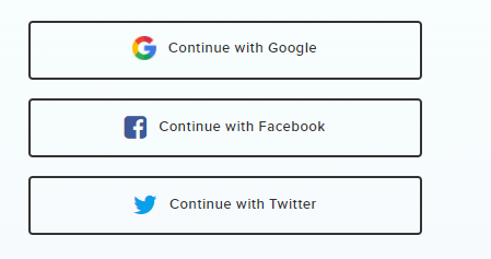
You would need to add the following code under the Piano ID Layout templates CSS tab:
.round-social-button{
      width: 80% !important;
      border-radius: 0% !important;
      margin:5px !important;
}

.round-social-button.google::after{
    content: "Continue with Google" !important;
    padding-left: 50px !important;
}
.round-social-button.google{
    background-repeat: no-repeat !important;
    background-position: 20% !important;
}

.round-social-button.facebook::after{
    content: "Continue with Facebook" !important;
    padding-left: 50px !important;
}
.round-social-button.facebook{
    background-repeat: no-repeat !important;
    background-position: 20% !important;
}


.round-social-button.twitter::after{
    content: "Continue with Twitter" !important;
    padding-left: 50px !important;
}
.round-social-button.twitter{
    background-repeat: no-repeat !important;
    background-position: 20% !important;
}
You can adjust the following values based on your preferences:
background-position - the position of the social icon from left to right
padding-left - the position of the text inside the icon
width - change the width of the social login buttons
margin - change the margin of the social login buttons