
As social login becomes an increasingly popular way for users to sign in to websites, you might be looking for ways to make the process more visually appealing and user-friendly. One way to do this is by customizing the social login buttons to match the overall design of the website and making them larger, so they're easier to see and click on. If you're using Identity Management for social login, in this article, we'll walk you through the steps to customize the buttons for Identity Management's Facebook and Google social login and make them larger.
Example for Rounded Buttons (Type: "rounded")
By default, the 2 round icons look like this:
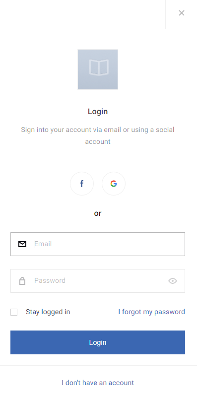
As a first step, you would need to add the below code to the bottom of your Piano ID layout template's CSS tab:
button.round-social-button {
  flex-grow: 1;
  border-radius: 0 !important;
}

.social-button-icon.facebook {
  display: flex;
  justify-content: center;
  align-items: center;
  background-color: #3f5b96 !important;
  background-image: none !important;
}

.social-button-icon.facebook::before {
  display: block;
  content: "";
  width: 20px;
  height: 20px;
  margin-right: 10px;
  background-size: cover;
  background-image: url("data:image/svg+xml,%3Csvg xmlns='http://www.w3.org/2000/svg' xmlns:xlink='http://www.w3.org/1999/xlink' version='1.1' width='60.734' height='60.733' style='' xml:space='preserve'%3E%3Crect id='backgroundrect' width='100%25' height='100%25' x='0' y='0' fill='none' stroke='none'/%3E%3Cg class='currentLayer' style=''%3E%3Ctitle%3ELayer 1%3C/title%3E%3Cg id='svg_1' class='selected' fill='%23ffffff' fill-opacity='1'%3E%3Cpath d='M57.378,0.001H3.352C1.502,0.001,0,1.5,0,3.353v54.026c0,1.853,1.502,3.354,3.352,3.354h29.086V37.214h-7.914v-9.167h7.914 v-6.76c0-7.843,4.789-12.116,11.787-12.116c3.355,0,6.232,0.251,7.071,0.36v8.198l-4.854,0.002c-3.805,0-4.539,1.809-4.539,4.462 v5.851h9.078l-1.187,9.166h-7.892v23.52h15.475c1.852,0,3.355-1.503,3.355-3.351V3.351C60.731,1.5,59.23,0.001,57.378,0.001z' id='svg_2' fill='%23ffffff' fill-opacity='1'/%3E%3C/g%3E%3Cg id='svg_3'%3E%3C/g%3E%3Cg id='svg_4'%3E%3C/g%3E%3Cg id='svg_5'%3E%3C/g%3E%3Cg id='svg_6'%3E%3C/g%3E%3Cg id='svg_7'%3E%3C/g%3E%3Cg id='svg_8'%3E%3C/g%3E%3Cg id='svg_9'%3E%3C/g%3E%3Cg id='svg_10'%3E%3C/g%3E%3Cg id='svg_11'%3E%3C/g%3E%3Cg id='svg_12'%3E%3C/g%3E%3Cg id='svg_13'%3E%3C/g%3E%3Cg id='svg_14'%3E%3C/g%3E%3Cg id='svg_15'%3E%3C/g%3E%3Cg id='svg_16'%3E%3C/g%3E%3Cg id='svg_17'%3E%3C/g%3E%3C/g%3E%3C/svg%3E");
}

.social-button-icon.facebook::after {
  content: "Facebook";
  font: inherit;
  font-weight: 600;
  color: #ffffff;
  text-transform: uppercase;
}

.social-button-icon.google {
  display: flex;
  justify-content: center;
  align-items: center;
  background-color: #4588f1 !important;
  background-image: none !important;
}

.social-button-icon.google::before {
  display: block;
  content: "";
  width: 20px;
  height: 20px;
  margin-right: 10px;
  background-size: cover;
  background-image: url("data:image/svg+xml,%3Csvg xmlns='http://www.w3.org/2000/svg' xmlns:xlink='http://www.w3.org/1999/xlink' width='24' height='24' version='1.1'%3E%3Crect id='backgroundrect' width='100%25' height='100%25' x='0' y='0' fill='none' stroke='none'/%3E%3Ctitle%3Egoogle%3C/title%3E%3Cg class='currentLayer' style=''%3E%3Ctitle%3ELayer 1%3C/title%3E%3Cg id='brand' stroke='none' stroke-width='1' fill='%23ffffff' fill-rule='evenodd' class='selected' fill-opacity='1'%3E%3Cg id='google' fill='%23ffffff' fill-rule='nonzero' fill-opacity='1'%3E%3Cpath d='M11.99,13.9 L11.99,10.18 L21.35,10.18 C21.49,10.81 21.6,11.4 21.6,12.23 C21.6,17.94 17.77,22 12,22 C6.48,22 2,17.52 2,12 C2,6.48 6.48,2 12,2 C14.7,2 16.96,2.99 18.69,4.61 L15.85,7.37 C15.13,6.69 13.87,5.89 12,5.89 C8.69,5.89 5.99,8.64 5.99,12.01 C5.99,15.38 8.69,18.13 12,18.13 C15.83,18.13 17.24,15.48 17.5,13.91 L11.99,13.91 L11.99,13.9 Z' id='Shape' fill='%23ffffff' fill-opacity='1'/%3E%3C/g%3E%3C/g%3E%3C/g%3E%3C/svg%3E");
}

.social-button-icon.google::after {
  content: "Google";
  font: inherit;
  font-weight: 600;
  color: #ffffff;
  text-transform: uppercase;
}
Next, in the Piano ID register page and Piano ID login page templates, you would replace:
<social-sign-in></social-sign-in>
With:
<social-sign-in class="social-buttons-component"></social-sign-in>
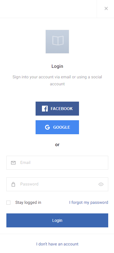
After this, the social login icons for Facebook and Google will be shown as follows:
Example for Branded Buttons (Type: "branded")
Below are steps and examples illustrating how to utilize out-of-the-box branded social login buttons:
1. Selector Modification:
Change the default selector .social-button-icon to .branded-social-button in the Piano ID layout template's CSS. This adjustment is fundamental for applying custom styles to the branded buttons.
For example, a general style would look like this:
.branded-social-button {
  border-width: 4px;
  background-color: #ff3300;
}
2. Removing Unnecessary Selectors:
Eliminate selectors like ::after that are unnecessary for branded buttons. Branded buttons inherently include labels, making these selectors redundant.
3. Specific Provider Styling:
For a more granular approach, you can apply styles specific to each social provider. Here's an example with Google:
.branded-social-button.google {
  font-size: 1.25rem;
  color: #ff3300;
}
A similar approach can be applied to other social login options.
More details about the social login are available here.