
LIGHTWEIGHT TEMPLATES
In general, you add a Lightweight template in the same way as you add a Classic template to the Action card in Piano Composer.
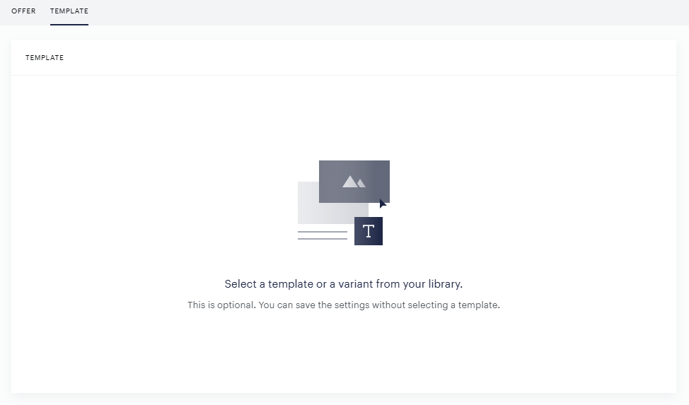
Step 1: In the Action card, click on "Select a template or a variant from your library".
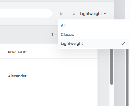
Step 2: In the top right corner of the template selection, you can switch between Classic and Lightweight templates depending on which type you wish to add to the experience.
The system remembers your last template type selection, so when you go back to select, you will arrive at the template type you selected last time.
Piano Composer Action card enhancements
The Composer Action card has been updated. In Lightweight templates, you can now set the appearance of the template from the Action card without the need to change the code. In Classic templates, only the relevant parts are available; all other parts are greyed out.
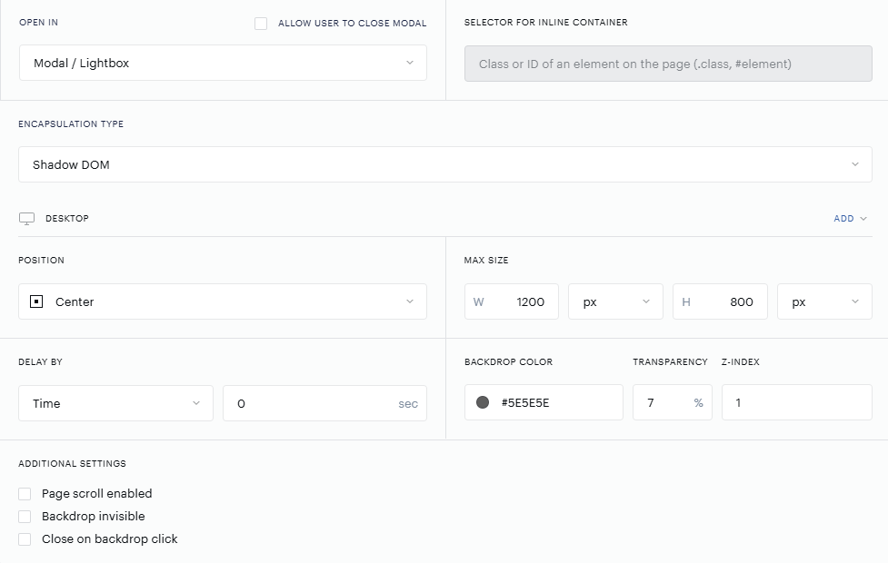
Open in - Modal or Inline. Modal appears "above" the page; an Inline template appears "within" the page and requires a CSS container defined in the "Selector of Inline Container".
Encapsulation type - Shadow DOM, DOM, and iframe. These types are described further in the documentation; choose depending on your needs and preferences. If you don't know, keep it on Shadow DOM.
Position - Center, Left, Right, Top, Bottom, Custom - refers to the placement of a Modal template. In Classic templates, you can place a modal template only in the center of the screen; in Lightweight, you can also set up other positioning. Left, Right, Top, and Bottom show the template "sticky" to the selected position. For example, a Bottom selection sticks it to the bottom, and with full width, it can look similar to a bottom sticky ribbon. We recommend experimenting with the template position.
Max size - Lets you select the width (W) and height (H) of the modal or inline template. Multiple units are supported, such as px, %, em, and vw/vh.
Delay by - Delays the template from being shown, either by time or pixels of scroll depth.
Backdrop color, transparency, and Z-index - These relate to the backdrop (background) of a modal window. You can set the color in HEX code and transparency in %. The lower the % value, the less transparent the backdrop is. Z-index sets the layer order of the backdrop against the other elements on your page. A higher z-index means it can cover the main menu or other elements on your page; a lower z-index means the backdrop appears beneath the main menu. To understand more about z-index, this is a good description.
Additional settings:
-
Page scroll enabled - If this setting is not checked, the page scroll is disabled.
-
Backdrop invisible - Means you don't see the modal backdrop at all. When unchecked, the backdrop is visible.
-
Close on backdrop click - Closes the modal window if the backdrop is clicked by the user.
Template Size Units
The Max size setting controls how much space your template occupies on the page. You can set width (W) and height (H) independently, each using one of four supported units. Choosing the right unit depends on whether you want a fixed size or one that adapts to the reader's screen.
By default, Piano provides the parent container, where the template is 100% width and the height depends on the height of the content.
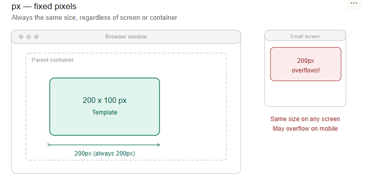
px - Fixed Pixels
Sets the template to an exact pixel size. A width of 600px means the template is always 600 pixels wide, regardless of screen size or where it's placed on the page.
When to use: When you need precise, predictable dimensions - for example, a compact inline banner that should never stretch or shrink.
Keep in mind: A fixed-pixel template won't adapt to smaller screens. On a mobile device, a 600px-wide template may overflow or require scrolling.
% - Percentage of the Parent Container
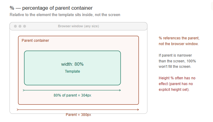
Sets the template size relative to its parent container on the page - not the browser window. A width of 100% means the template fills the full width of the container it sits inside.
When to use: Good for templates that should fill or partially fill their container (e.g., 100% width for a full-width inline offer, 50% for a half-width placement).
Keep in mind:
-
The percentage is calculated against the parent element's dimensions, not the screen. If the parent container is narrower than the screen,
100%won't fill the screen. -
For width, this usually behaves as expected because block containers naturally fill the available width.
-
For height, the result can be unpredictable - if the parent container has no explicit height set, a percentage-based height may have no visible effect.
-
Values above
100%will attempt to exceed the parent container, but internal template styles (such asmax-widthrules) may cap the actual rendered size.
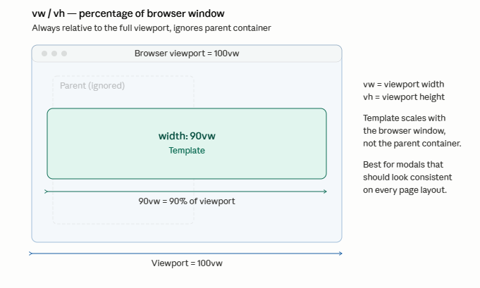
vw / vh - Percentage of the Browser Window
Sets the template size relative to the reader's entire browser viewport, regardless of where the template is placed on the page. 100vw = the full window width. 100vh = the full window height.
Unlike %, these units ignore the parent container entirely and always reference the browser window. This makes them the most reliable choice for proportional sizing.
When to use: Best for modals and overlays where you want the template to scale proportionally with the reader's screen. For example, 90vw width and 80vh height creates a modal that always fills most of the screen on any device.
em - Relative to Font Size
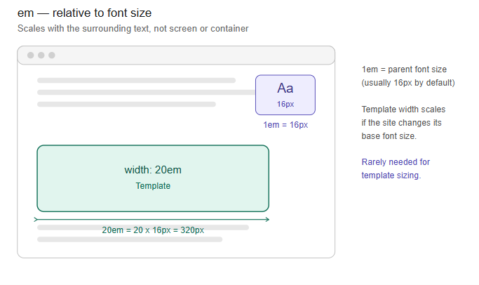
Sets the template size relative to the current font size of the parent element. 1em equals the font size of the parent element - typically 16px by default. A width of 30em would be roughly 480px at the default font size.
When to use: Useful in specific cases where you want the template to scale in proportion with the surrounding text - for example, an inline offer embedded within an article body that should feel proportional to the reading experience.
Keep in mind: Because em depends on the local font size context, the actual rendered size can vary if the page uses non-standard typography. This unit is rarely needed for template sizing.
Important: For all relative values - %, vw, vh - the maximum allowed value is 100. Values greater than 100 will not be accepted; however, your typed value remains in the card. The reason is to prevent errors and misconfigurations. Relative values greater than 100 for modal template formats would exceed the available viewport or container size and break stickiness.
Quick Reference
|
Unit |
Relative To |
Best For |
Example |
|---|---|---|---|
|
|
Nothing (absolute) |
Fixed-size templates |
|
|
|
Parent container |
Filling a specific page section |
|
|
|
Browser window |
Modals, proportional scaling |
|
|
|
Font size |
Text-proportional sizing |
|