
LIGHTWEIGHT TEMPLATES
The Lightweight Template Editor is the section for writing and editing the template code. You can open the editor from any template by clicking on the </> icon, which says "Edit code".
The Template Editor for Lightweight templates leverages the same navigational patterns as the Classic template editor and should be self-explanatory. There are a couple of improvements in the Lightweight parts. The editor supports syntax highlighting, components, snippets, code completion, and types. In the new editor, the HTML tab has been replaced with JSX | HTML — you can now write a template in the new React/SolidJS style using all the advantages of JSX. The new editor also has a JS tab that allows for more flexible interaction with the template.
The Template Editor introduces the following new and updated UI elements:
Sections
While the Classic editor has two sections – HTML and CSS, the Lightweight Template Editor has three sections: HTML/JSX, CSS, and JavaScript.

Components
In addition to the original icon which leads to Content Fields, there is now a new cube icon which opens Content Fields, Components and Snippets.
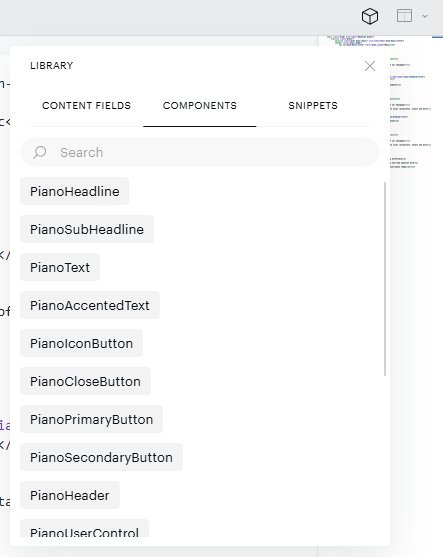
The new icon in the editor opens a panel that provides access to both Components and Snippets. A component is a self-contained, ready-to-use building block that includes its own structure, styling, and behavior out of the box. Rather than writing the logic yourself, you configure the component through a set of options that Piano provides.
For example, a tab selector component only requires you to specify the tab names and, optionally, what should happen when a user selects one; the visual presentation and switching logic are handled for you. Components are best suited for standard interface elements where consistent behavior and faster implementation are priorities. Like snippets, components can be added to the code by dragging them from the panel and dropping them into the editor.
For more details, see the Components article.
Snippets
A snippet is a pre-written block of code that you insert into your template as a starting point. It provides the structure, but the styling and interactive behavior are your responsibility to implement.
For example, a tab selector snippet gives you the underlying markup (the labels, the layout, the grouping) but you will need to define how it looks and what happens when a user clicks a tab. Snippets are best suited for situations where you need full control over appearance and behavior, or where the element you are building does not have a corresponding component available. Snippets can be added to the code by dragging them from the panel and dropping them into the editor.
For more details, see the Snippets article.
How They Work Together
Snippets and components are not mutually exclusive. A snippet can contain one or more components within it, in this case, the snippet serves as a layout template that arranges several ready-made components into a specific configuration. The individual components still function independently; the snippet simply defines how they are composed together.
Snippets
-
Purpose: Speed up coding by avoiding repetitive typing.
-
Granularity: Typically a few lines of code (e.g., a
forloop, an import statement). -
Usage: Triggered manually (e.g., typing
for+ Tab). -
State/Behavior: No logic of their own; they are just text.
Components
-
Purpose: Build UI by composing independent, reusable pieces.
-
Granularity: Can range from a small button to an entire page layout.
-
Usage: Instantiated/imported into other components or pages.
-
State/Behavior: Can have internal state, lifecycle methods, and business logic.
Code completion
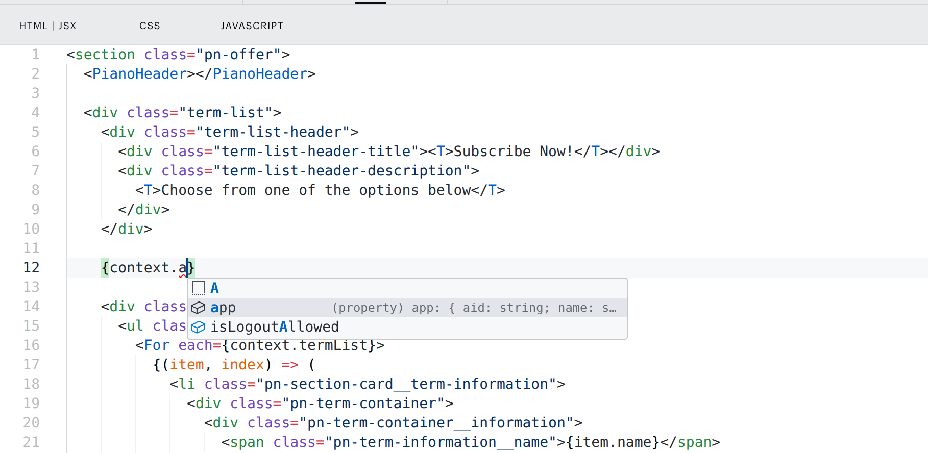
Code completion is an editor feature that automatically predicts and suggests the rest of a code line, including variable names, methods, and keywords, to speed up development and reduce errors.
Types
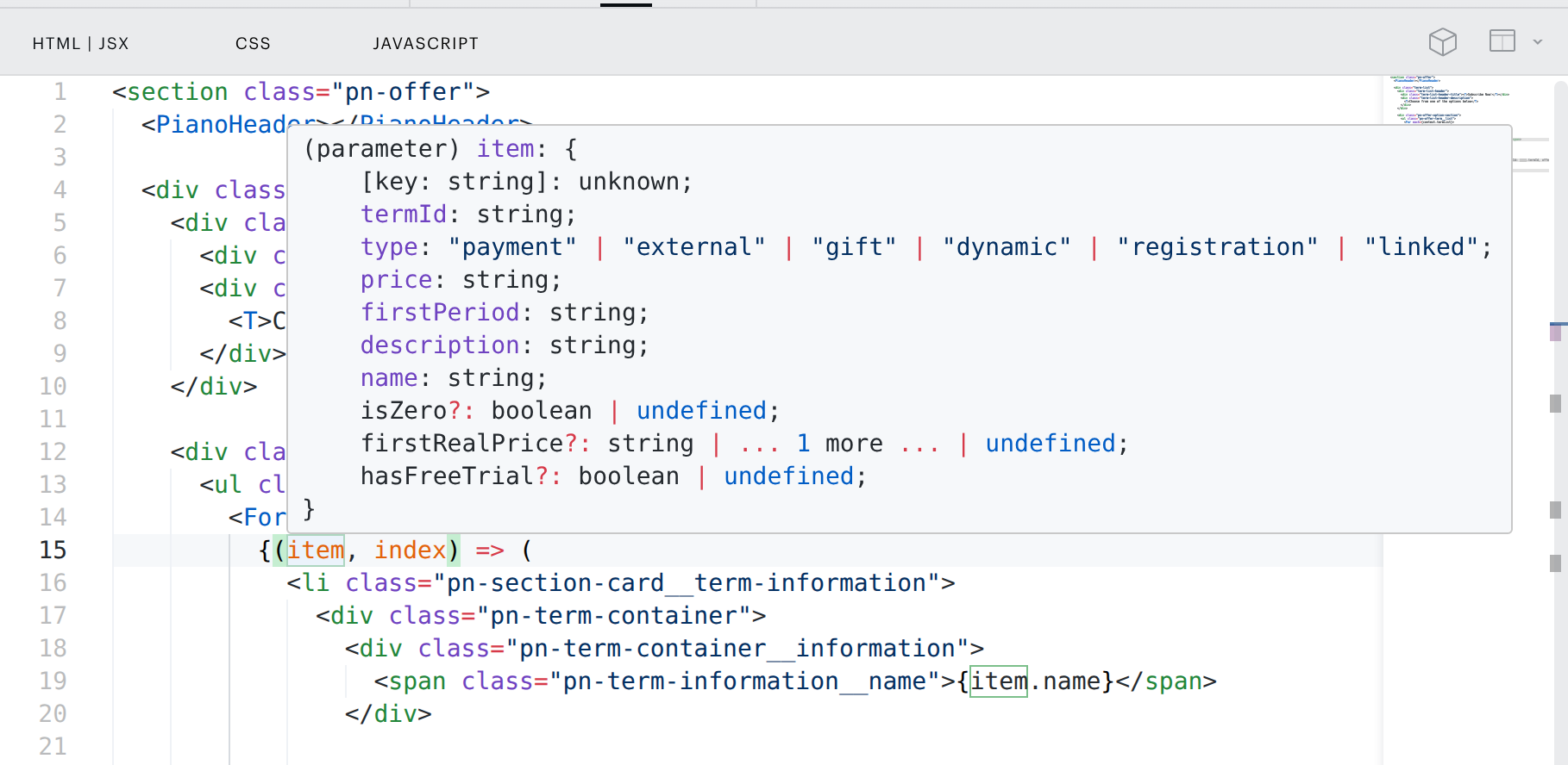
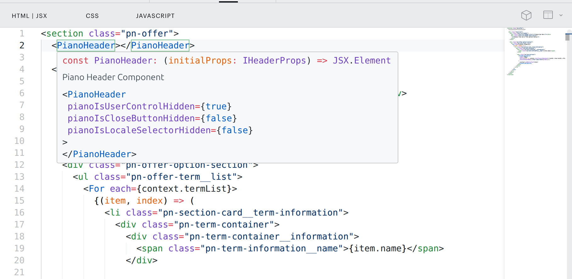
In the new editor, you can view the type of a variable, an object, or a component by simply hovering the mouse over it.
Example: Term list variable type
Example: Piano Header component type
Context
Every boilerplate has set of variables describing the context of the template. For example if a variable is expressed as a string or a as a boolean value (true/false).
Context also describes which kind of template it is, such as Offer or Active Churn Prevention. Context can be common or custom and is included into automated Code Completion within your Template Editor.
Important note on offer template testing:
When you update your existing template or add a new version of a template, it's normal that you test it in your sandbox or a test dashboard. You do it by set the template into an experience and let it show on a testing page.
If you see the old template version or previous update on the testing page and you are sure, that your experience and container settings are correct, it may be connected to caching.
Lightweight templates have certain cache expiration set up:
Cloudflare cache - always when a new template is implemented, this cache is flushed
Local browser cache - is set to 5 minutes by default.
So in order to see your updated template immediately and not after 5 minutes, always disable cache in your browser when testing offer templates. This applies only to updated templates or a changed version of the same template.