
LIGHTWEIGHT TEMPLATES
SolidJS Components
Show
|
Attribute Name |
Type |
Required/Optional |
Default Value |
Description |
|---|---|---|---|---|
|
|
|
Required |
- |
Item display condition. |
|
|
|
Optional |
- |
Renders its content if the condition in |
<Show
  when={context.count > 3}
  fallback={<div>I will be rendered if context.count is <= 3</div>}
>
  <div>I will be rendered if context.count is > 3</div>
</Show>
<Show
  when={context.count > 3}
  fallback={"string also valid"}
>
  <div>I will be rendered if context.count is > 3</div>
</Show>
For
|
Attribute Name |
Type |
Required/Optional |
Default Value |
Description |
|---|---|---|---|---|
|
|
|
Required |
- |
The array you want to expand. |
|
|
|
Optional |
- |
Renders its content if the array is empty. |
<ul>
  <For
    each={context.termList}
    fallback={<div class="term-list-placeholder">Loading</div>}
  >
    {(item, index) => (
        <li class="term-item" onClick={(e) => context.ding(item)}>
          {index() + ". " + JSON.stringify(item.name)}
        </li>
      )
    }
  </For>
</ul>
The function inside For has 2 arguments:
-
item - array item
-
index - getter for index, to get index call
index()
Switch and Match
Switch:
|
Attribute Name |
Type |
Required/Optional |
Default Value |
Description |
|---|---|---|---|---|
|
|
|
Optional |
- |
Renders its content if the condition in |
Match:
|
Attribute Name |
Type |
Required/Optional |
Default Value |
Description |
|---|---|---|---|---|
|
|
|
Required |
- |
Item display condition. |
<Switch fallback={"Noname"}>
  <Match when={context.name === "John"}>
    John
  </Match>
  <Match when={context.name === "Alex"}>
    Alex
  </Match>
</Switch>
Buttons
PianoPrimaryButton
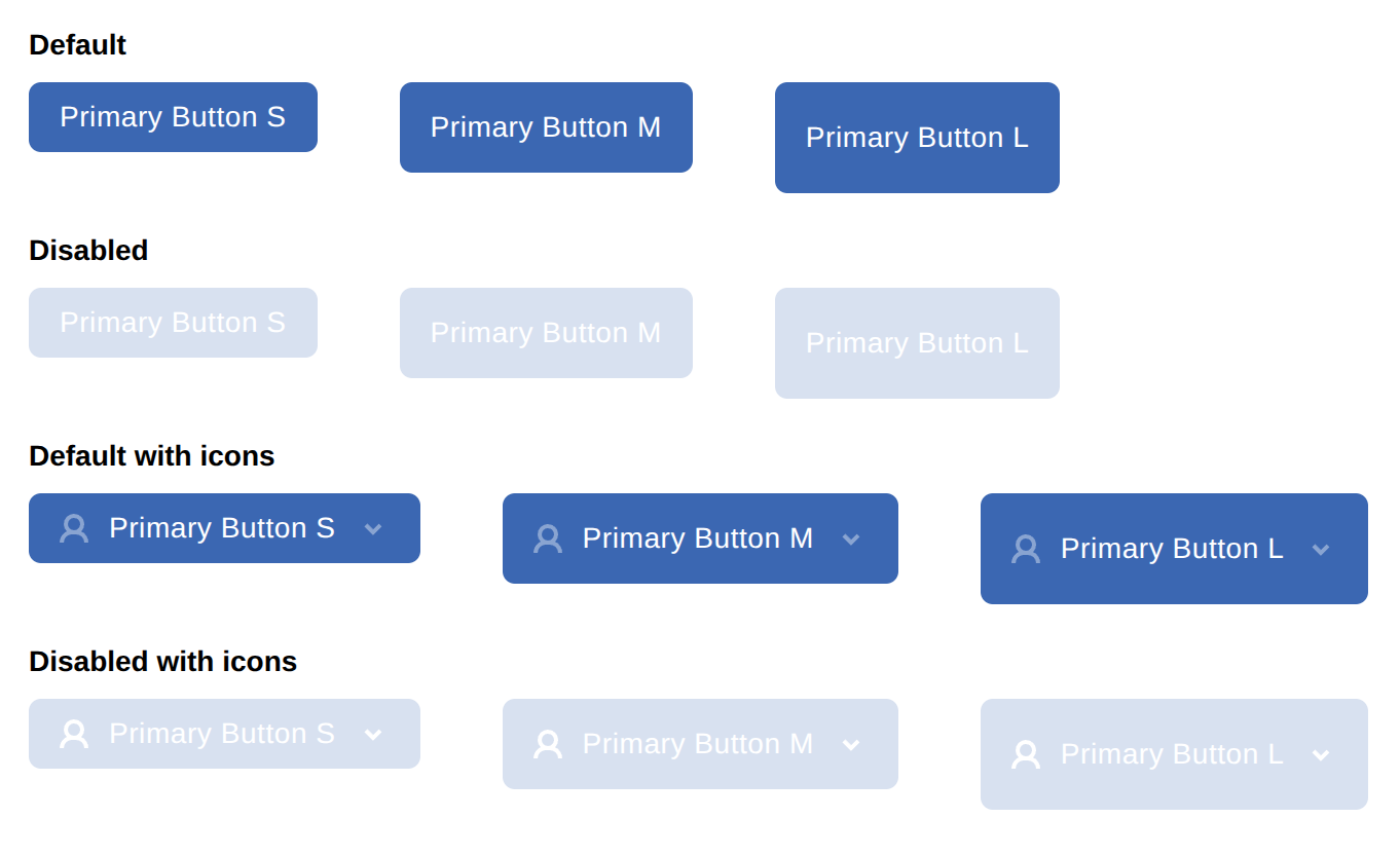
|
Attribute Name |
Type |
Required/Optional |
Default Value |
Description |
|---|---|---|---|---|
|
|
|
Optional |
- |
Optional CSS class name for the button element. |
|
|
|
Optional |
- |
Optional ID for the button element. |
|
|
|
Optional |
- |
Optional object for conditional CSS classes (e.g., |
|
|
|
Optional |
- |
Optional inline styles as a key-value object. |
|
|
|
Required |
- |
The content to be rendered inside the button. |
|
|
|
Required |
- |
Click event handler. Can be synchronous or asynchronous. |
|
|
|
Optional |
- |
Optional name attribute for the button (useful for forms). |
|
|
|
Optional |
- |
Whether the button is disabled. |
|
|
|
Optional |
- |
Optional CSS width value (e.g., |
|
|
|
Optional |
- |
Optional CSS height value. |
|
|
|
Optional |
- |
Optional CSS min-height value. |
|
|
|
Optional |
- |
Optional CSS min-width value. |
|
|
|
Optional |
- |
Optional CSS max-height value. |
|
|
|
Optional |
- |
Optional CSS max-width value. |
|
|
|
Optional |
- |
Optional icon element to display before the children. |
|
|
|
Optional |
- |
Optional icon element to display after the children. |
|
|
|
Optional |
- |
Optional name for an external event (e.g., for analytics tracking). |
|
|
|
Optional |
- |
Optional parameters to accompany the external event. |
|
|
|
Optional |
- |
Optional parameter provides button element. |
<PianoPrimaryButton
  width="200px"
  onClick={(e) => context.ding(item)}
  externalEventName="my-external-event-name"
  externalEventParams={{ param1: 'value', param2: 123 }}
>
  My button
</PianoPrimaryButton>
With dynamic externalEventName, externalEventParams:
<PianoPrimaryButton
  width="200px"
  onClick={(e) => context.ding(item)}
  externalEventName={context.myExternalEventName}
  externalEventParams={context.myExternalEventParams}
>
  My button
</PianoPrimaryButton>
PianoSecondaryButton
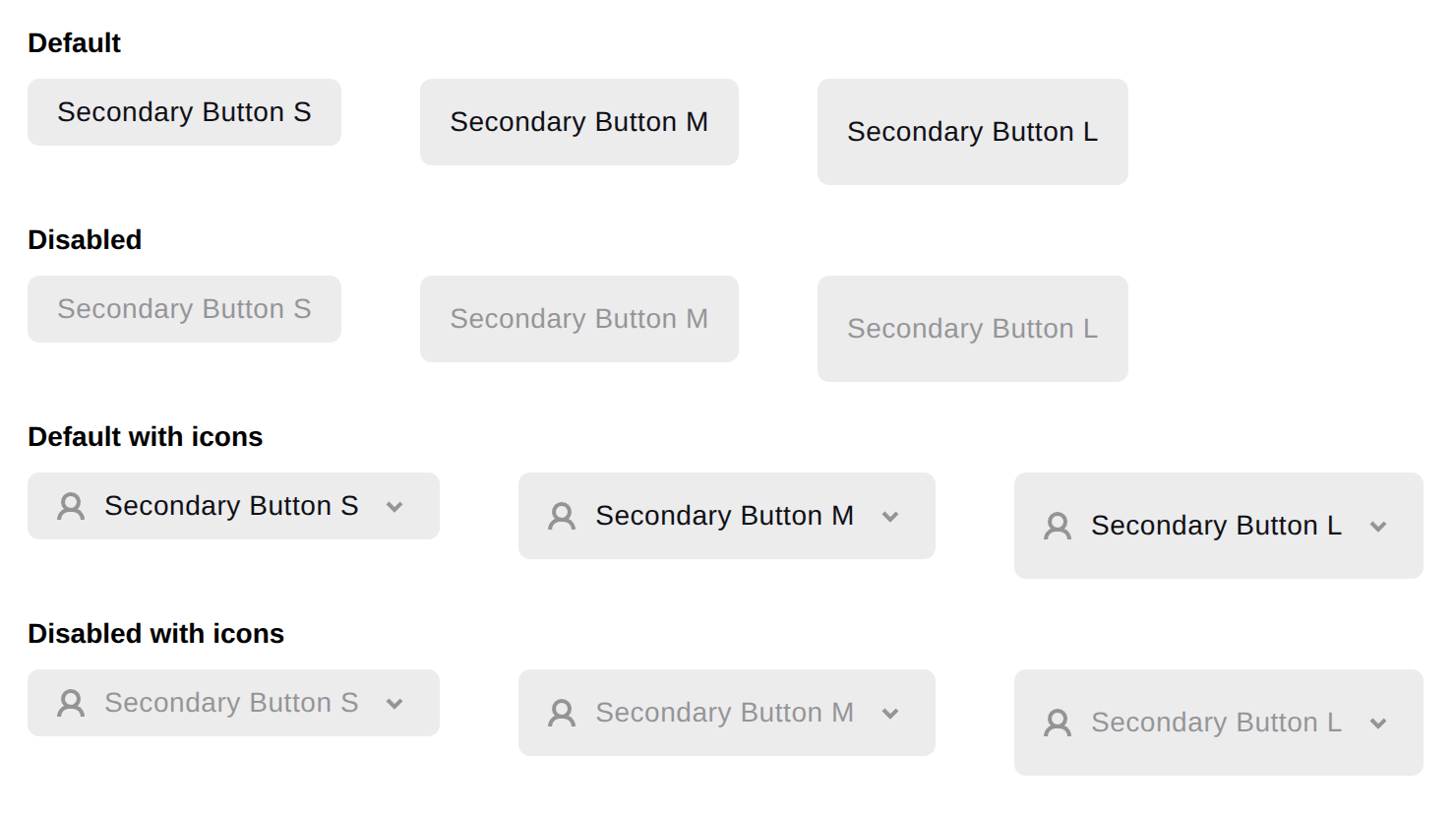
Supports the same properties as the PianoPrimaryButton.
<PianoSecondaryButton
  width="200px"
  onClick={(e) => context.ding(item)}
  externalEventName={context.myExternalEventName}
  externalEventParams={context.myExternalEventParams}
>
  My secondary button
</PianoSecondaryButton>
PianoGhostButton
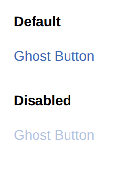
|
Attribute Name |
Type |
Required/Optional |
Default Value |
Description |
|---|---|---|---|---|
|
|
|
Optional |
- |
Optional CSS class name for the button element. |
|
|
|
Optional |
- |
Optional ID for the button element. |
|
|
|
Optional |
- |
Optional object for conditional CSS classes (e.g., |
|
|
|
Optional |
- |
Optional inline styles as a key-value object. |
|
|
|
Required |
- |
The content to be rendered inside the button. |
|
|
|
Required |
- |
Click event handler. Can be synchronous or asynchronous. |
|
|
|
Optional |
- |
Optional name attribute for the button (useful for forms). |
|
|
|
Optional |
- |
Whether the button is disabled. |
|
|
|
Optional |
- |
Optional CSS width value (e.g., |
|
|
|
Optional |
- |
Optional CSS height value. |
|
|
|
Optional |
- |
Optional CSS min-height value. |
|
|
|
Optional |
- |
Optional CSS min-width value. |
|
|
|
Optional |
- |
Optional CSS max-height value. |
|
|
|
Optional |
- |
Optional CSS max-width value. |
|
|
|
Optional |
- |
Optional name for an external event (e.g., for analytics tracking). |
|
|
|
Optional |
- |
Optional parameters to accompany the external event. |
|
|
|
Optional |
- |
Optional parameter provides button element. |
<PianoGhostButton
  width="200px"
  onClick={(e) => context.ding(item)}
  externalEventName="my-external-event-name"
  externalEventParams={{ param1: 'value', param2: 123 }}
>
  My ghost button
</PianoGhostButton>
PianoIconButton
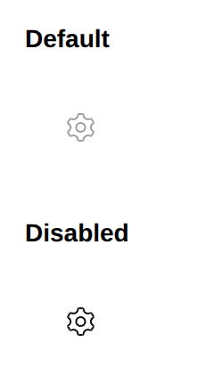
Supports the same properties as the PianoGhostButton.
<PianoIconButton onClick={(e) => handleClick(e)}>
   <svg>...</svg>
</PianoIconButton>
PianoCloseButton
Closes the widget on click and fires the onClose handler.
Supports the same properties as the PianoGhostButton.
<PianoCloseButton name="my button" onClose={(e) => console.log("closed")} />
You can pass your icon to change the default close icon:
<PianoCloseButton onClick={(e) => handleClick(e)}>
   <svg>...</svg>
</PianoCloseButton>
See this article for an explanation of how the "Allow user to close modal" checkbox works for Lightweight templates.
PianoStartCheckoutButton
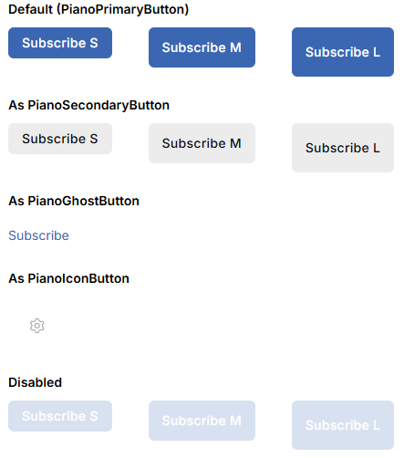
A wrapper component that triggers the classic checkout flow when clicked. Renders one of the supported button components based on the as prop. Supports all props of the rendered button.
|
Attribute Name |
Type |
Required/Optional |
Default Value |
Description |
|---|---|---|---|---|
|
|
|
Optional |
|
Button variant to render. |
|
|
|
Required |
- |
Term for checkout. |
|
|
|
Required |
- |
The content to be rendered inside the button. |
|
|
|
Optional |
- |
Optional callback fired after checkout is triggered. |
|
|
|
Optional |
- |
Optional parameter provides button element. |
|
|
|
Optional |
- |
Optional CSS class name for the button element. |
|
|
|
Optional |
- |
Optional ID for the button element. |
|
|
|
Optional |
- |
Optional object for conditional CSS classes (e.g., |
|
|
|
Optional |
- |
Optional inline styles as a key-value object. |
|
|
|
Optional |
- |
Optional name attribute for the button (useful for forms). |
|
|
|
Optional |
- |
Whether the button is disabled. |
|
|
|
Optional |
- |
Optional CSS width value (e.g., |
|
|
|
Optional |
- |
Optional CSS height value. |
|
|
|
Optional |
- |
Optional CSS min-height value. |
|
|
|
Optional |
- |
Optional CSS min-width value. |
|
|
|
Optional |
- |
Optional CSS max-height value. |
|
|
|
Optional |
- |
Optional CSS max-width value. |
|
|
|
Optional |
- |
Optional name for an external event (e.g., for analytics tracking). |
|
|
|
Optional |
|
Optional parameters to accompany the external event. |
|
|
|
Optional |
- |
Accessible label for screen readers. |
<PianoStartCheckoutButton
  term={term}
  class="pn-offer__subscribe-button"
  externalEventName="offer-subscribe"
>
  <T>Subscribe</T>
</PianoStartCheckoutButton>
With a different button variant:
<PianoStartCheckoutButton
  as="PianoSecondaryButton"
  term={item}
  externalEventName="offer-subscribe"
>
  <T>Subscribe</T>
</PianoStartCheckoutButton>
PianoBuyAsAGiftButton
A wrapper component that triggers the classic checkout flow as a gift when clicked. Renders one of the supported button components based on the as prop. Supports all props of the rendered button.
|
Attribute name |
Type |
Required/Optional |
Default value |
Description |
|
|
|
optional |
|
Button variant to render. |
|
|
|
required |
— |
Term for checkout. |
|
|
|
required |
— |
The content to be rendered inside the button. |
|
|
|
optional |
— |
Optional callback fired after checkout is triggered. |
|
|
|
optional |
— |
Optional parameter provides button element. |
|
|
|
optional |
— |
Optional CSS class name for the button element. |
|
|
|
optional |
— |
Optional ID for the button element. |
|
|
|
optional |
— |
Optional object for conditional CSS classes (e.g., |
|
|
|
optional |
— |
Optional inline styles as a key-value object. |
|
|
|
optional |
— |
Optional name attribute for the button (useful for forms). |
|
|
|
optional |
— |
Whether the button is disabled. |
|
|
|
optional |
— |
Optional CSS width value (e.g., |
|
|
|
optional |
— |
Optional CSS height value. |
|
|
|
optional |
— |
Optional CSS min-height value. |
|
|
|
optional |
— |
Optional CSS min-width value. |
|
|
|
optional |
— |
Optional CSS max-height value. |
|
|
|
optional |
— |
Optional CSS max-width value. |
|
|
|
optional |
— |
Optional name for an external event (e.g., for analytics tracking). |
|
|
|
optional |
|
Optional parameters to accompany the external event. |
|
|
|
optional |
— |
Accessible label for screen readers. |
Example
<PianoBuyAsAGiftButton
  term={term}
  externalEventName="offer-gift"
>
  <T>Buy as a gift</T>
</PianoBuyAsAGiftButton>
Forms
PianoInput
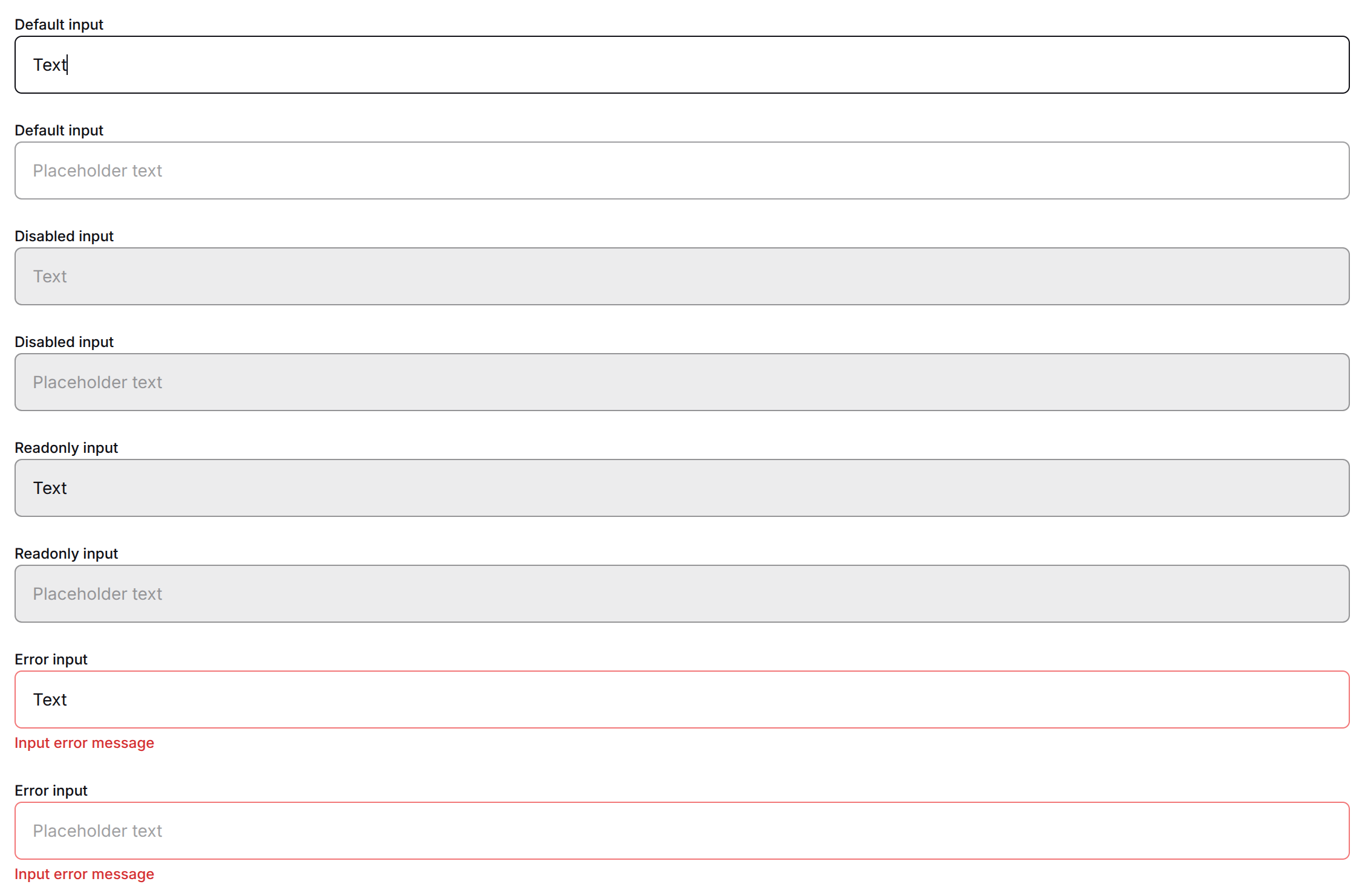
Default view:
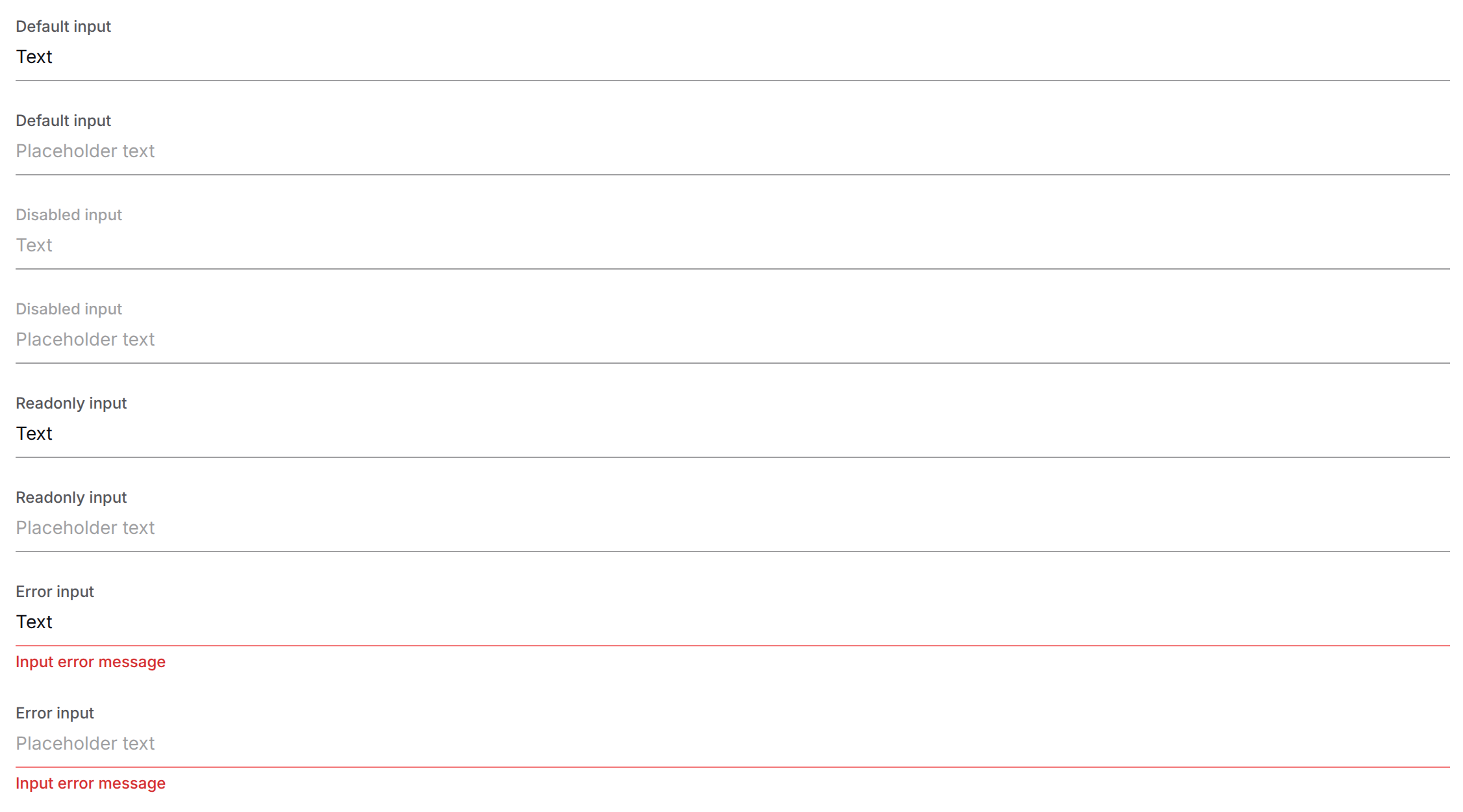
Inline view:
|
Attribute Name |
Type |
Required/Optional |
Default Value |
Description |
|---|---|---|---|---|
|
|
|
Required |
— |
The |
|
|
|
Optional |
|
Callback function triggered when the input value changes. |
|
|
|
Optional |
|
The type of the input (e.g., |
|
|
|
Optional |
|
Placeholder text displayed when the input is empty. |
|
|
|
Optional |
|
Indicates whether the input is in an invalid state. |
|
|
|
Optional |
|
Marks the input as required for form validation. |
|
|
|
Optional |
|
Disables the input, making it non‑interactive. |
|
|
|
Optional |
|
Makes the input read‑only, preventing changes. |
|
|
|
Optional |
|
The current value of the input. |
|
|
|
Optional |
|
Automatically focuses the input when the page loads. |
|
|
|
Optional |
|
Minimum number of characters allowed. |
|
|
|
Optional |
|
Maximum number of characters allowed. |
|
|
|
Optional |
|
Maximum value (for number inputs). |
|
|
|
Optional |
|
Minimum value (for number inputs). |
|
|
|
Optional |
|
Autocomplete hint for the browser (e.g., |
|
|
|
Optional |
|
Custom CSS height value. |
|
|
|
Optional |
|
Text alignment inside the input (e.g., |
|
|
|
Optional |
|
Callback function triggered when the Enter key is pressed while the input is focused. |
|
|
|
Optional |
|
Reference to the underlying HTML input element. |
|
|
|
Optional |
|
Custom CSS width value. |
|
|
|
Optional |
|
Custom CSS padding value. |
|
|
|
Optional |
|
Hint to the browser about the type of virtual keyboard to display. |
|
|
|
Optional |
|
Regular expression pattern for input validation. |
|
|
|
Optional |
|
CSS class name(s) to apply to the input. |
|
|
|
Optional |
|
Object mapping class names to boolean flags for conditional styling. |
|
|
|
Optional |
|
The unique identifier for the input element. |
|
|
|
Optional |
|
Inline styles as a key‑value object. |
|
|
|
Optional |
|
Text label associated with the input. |
|
|
|
Optional |
|
Icon element displayed on the left side of the input. |
|
|
|
Optional |
|
Icon element displayed on the right side of the input. |
|
|
|
Optional |
|
View mode. |
|
|
|
Optional |
|
Error message to display when the input is invalid. |
|
|
|
Optional |
|
Accessible label for screen readers. |
|
|
|
Optional |
|
Native autocorrect attribute. |
|
|
|
Optional |
|
Native autocapitalize attribute. |
|
|
|
Optional |
|
Sets |
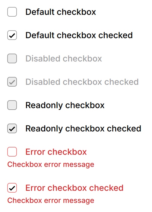
PianoCheckbox
|
Attribute Name |
Type |
Required/Optional |
Default Value |
Description |
|---|---|---|---|---|
|
|
|
Optional |
|
CSS class name(s) to apply to the component. |
|
|
|
Optional |
|
Unique identifier for the element. |
|
|
|
Optional |
|
Object mapping class names to boolean flags for conditional styling. |
|
|
|
Optional |
|
Inline styles as a key‑value object. |
|
|
|
Required |
— |
The |
|
|
|
Optional |
|
Text label associated with the input. |
|
|
|
Optional |
|
Indicates whether the input is in an invalid state. |
|
|
|
Optional |
|
Marks the input as required for form validation. |
|
|
|
Optional |
|
Disables the input, making it non‑interactive. |
|
|
|
Optional |
|
Makes the input read‑only, preventing changes. |
|
|
|
Optional |
|
Indicates whether a checkbox or radio input is checked. |
|
|
|
Optional |
|
Callback function triggered when the input value changes. |
|
|
|
Optional |
|
Maximum width of the input (CSS |
|
|
|
Optional |
|
Error message to display when the input is invalid. |
|
|
|
Optional |
|
ARIA label for accessibility. |
|
|
|
Optional |
|
ID of an element whose text labels the checkbox for screen readers. |
|
|
|
Optional |
|
ID of your own error element, if you render the error message outside this component. Used while |
|
|
|
Optional |
|
Sets |
PianoToggle
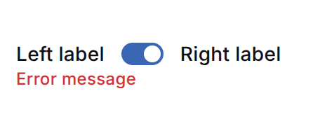
|
Attribute name |
Type |
Required/Optional |
Default value |
Description |
|---|---|---|---|---|
|
|
|
Required |
- |
Form field name; used as input id and label target. |
|
|
|
Optional |
- |
Label rendered before (left of) the toggle. |
|
|
|
Optional |
- |
Label rendered after (right of) the toggle. |
|
|
|
Optional |
|
Initial checked state. |
|
|
|
Optional |
|
Disables interaction and applies disabled styling. |
|
|
|
Optional |
|
Locks the value without the disabled cursor. |
|
|
|
Optional |
|
Marks the field required for form validation. |
|
|
|
Optional |
|
Applies the invalid (danger) outline. |
|
|
|
Optional |
- |
Error message rendered below the toggle. |
|
|
|
Optional |
- |
ARIA label for screen readers when no visible label is set. |
|
|
|
Optional |
- |
Called when the toggle state changes. |
|
|
|
Optional |
- |
CSS class name for the root element. |
|
|
|
Optional |
- |
ID for the root element. |
|
|
|
Optional |
- |
Object for conditional CSS classes. |
|
|
|
Optional |
- |
Inline styles as a key-value object. |
<PianoToggle
  name="darkMode"
  leftLabel="Off"
  rightLabel="On"
  checked={true}
  onChange={(e) => console.log(e)}
/>
PianoTextarea
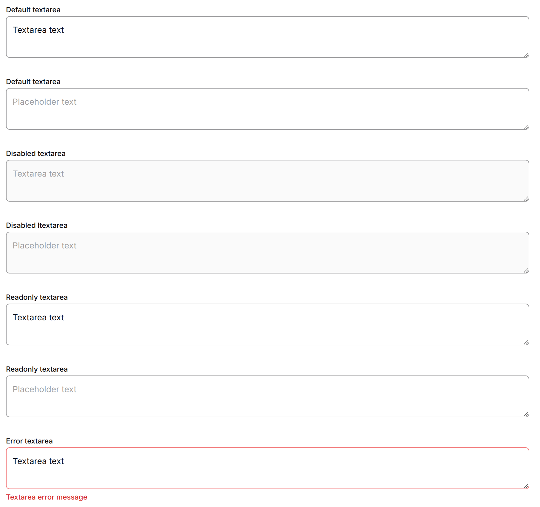
|
Attribute Name |
Type |
Required/Optional |
Default Value |
Description |
|---|---|---|---|---|
|
|
|
Optional |
|
CSS class name(s) to apply to the textarea. |
|
|
|
Optional |
|
Unique identifier for the textarea element. |
|
|
|
Optional |
|
Object mapping class names to boolean flags for conditional styling. |
|
|
|
Optional |
|
Inline styles as a key‑value object. |
|
|
|
Optional |
|
Text label associated with the textarea. |
|
|
|
Optional |
|
Error message to display when the textarea is invalid. |
|
|
|
Required |
— |
The |
|
|
|
Optional |
|
Indicates whether the textarea is in an invalid state. |
|
|
|
Optional |
|
Marks the textarea as required for form validation. |
|
|
|
Optional |
|
Disables the textarea, making it non‑interactive. |
|
|
|
Optional |
|
Makes the textarea read‑only, preventing changes. |
|
|
|
Optional |
|
The current value of the textarea. |
|
|
|
Optional |
|
Callback function triggered when the textarea value changes. |
|
|
|
Required |
— |
Placeholder text displayed when the textarea is empty. |
|
|
|
Optional |
|
Automatically focuses the textarea when the page loads. |
|
|
|
Optional |
|
Minimum number of characters allowed. |
|
|
|
Optional |
|
Maximum number of characters allowed. |
|
|
|
Optional |
|
Number of visible text lines (height in rows). |
|
|
|
Optional |
|
Average character width (width in columns). |
|
|
|
Optional |
|
Maximum width of the textarea (CSS |
|
|
|
Optional |
|
Custom CSS height value. |
|
|
|
Optional |
|
Custom CSS width value. |
|
|
|
Optional |
|
Reference to the underlying HTML textarea element. |
|
|
|
Optional |
|
CSS |
PianoRadioButton
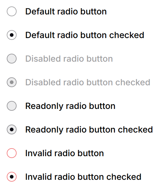
|
Attribute Name |
Type |
Required/Optional |
Default Value |
Description |
|---|---|---|---|---|
|
|
|
Optional |
|
CSS class name(s) to apply to the component. |
|
|
|
Optional |
|
Unique identifier for the input element. |
|
|
|
Optional |
|
Object mapping class names to boolean flags for conditional styling. |
|
|
|
Optional |
|
Inline styles as a key‑value object. |
|
|
|
Required |
— |
The |
|
|
|
Required |
— |
The value associated with this radio option (submitted when the radio is selected). |
|
|
|
Optional |
|
The currently selected value in the radio group. Used to determine if this radio is checked by comparing with |
|
|
|
Optional |
|
Text label displayed next to the radio button. |
|
|
|
Optional |
|
Indicates whether the radio is in an invalid state. |
|
|
|
Optional |
|
Marks the radio group as required (at least one option must be selected). |
|
|
|
Optional |
|
Disables the radio button, making it non‑interactive. |
|
|
|
Optional |
|
Makes the radio read‑only (selection cannot be changed). |
|
|
|
Optional |
|
Explicitly sets the checked state of the radio button. |
|
|
|
Optional |
|
Callback function triggered when the radio selection changes. |
PianoRadioGroup
|
Attribute name |
Type |
Required/Optional |
Default value |
Description |
|---|---|---|---|---|
|
|
|
Required |
- |
Form field name; shared by every radio input in the group. |
|
|
|
Required |
- |
The selectable options ( |
|
|
|
Optional |
- |
Value of the currently selected option. |
|
|
|
Optional |
- |
Group label rendered above the options. |
|
|
|
Optional |
- |
Error message rendered below the options. |
|
|
|
Optional |
|
Disables every option and applies disabled styling. |
|
|
|
Optional |
|
Locks the value without the disabled cursor. |
|
|
|
Optional |
|
Marks the group required for form validation. |
|
|
|
Optional |
|
Applies the invalid (danger) styling and |
|
|
|
Optional |
- |
Called when a different option is selected. |
|
|
|
Optional |
- |
CSS class name for the root element. |
|
|
|
Optional |
- |
ID for the root element. |
|
|
|
Optional |
- |
Object for conditional CSS classes. |
|
|
|
Optional |
- |
Inline styles as a key-value object. |
<PianoRadioButtonGroup
  name="plan"
  label="Choose a plan"
  selected="monthly"
  options={[
    { value: "monthly", label: "Monthly" },
    { value: "yearly", label: "Yearly" },
  ]}
  error="Please choose a plan"
  onChange={(e) => console.log(e.target)}
/>
PianoCheckboxGroup
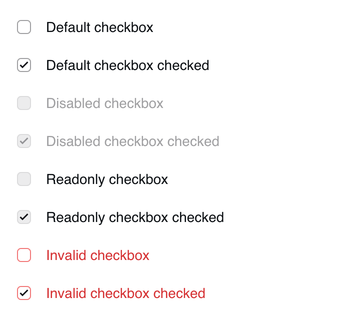
Ready-made checkbox group - the multi-select counterpart of PianoRadioGroup. Every option is visible at once and independently selectable, so each option is its own tab stop. Used by the MULTI_SELECT_LIST custom field when the field's view mode is list (the default dropdown view mode renders PianoMultiSelect; a SINGLE_SELECT_LIST field in list view mode renders PianoRadioGroup).
|
Attribute name |
Type |
Required/Optional |
Default value |
Description |
|---|
|
Attribute name |
Type |
Required/Optional |
Default value |
Description |
|---|---|---|---|---|
|
|
|
Required |
- |
Form field name; shared by every checkbox input in the group. |
|
|
|
Required |
- |
The selectable options ({ value, label, disabled? }). |
|
|
|
Optional |
- |
Values of the currently selected options. |
|
|
|
Optional |
- |
Group label rendered above the options. |
|
|
|
Optional |
- |
Error message rendered below the options. |
|
|
|
Optional |
|
Disables every option and applies disabled styling. |
|
|
|
Optional |
|
Locks the value without the disabled cursor. |
|
|
|
Optional |
|
Marks the group required for form validation. |
|
|
|
Optional |
|
Applies the invalid (danger) styling and |
|
|
|
Optional |
|
Id of an externally rendered error element, used for |
|
|
|
Optional |
- |
Called when an option is toggled with the native checkbox change event: |
|
|
|
Optional |
- |
CSS class name for the root element. |
|
|
|
Optional |
- |
ID for the root element. |
|
|
|
Optional |
- |
Object for conditional CSS classes. |
|
|
|
Optional |
- |
Inline styles as a key-value object. |
<PianoCheckboxGroup
  name="topics"
  label="Pick your topics"
  selected={["news"]}
  options={[
    { value: "news", label: "News" },
    { value: "sport", label: "Sport" },
  ]}
  error="Please pick at least one"
  onChange={(e) => console.log(e.target)}
/>
PianoSelect
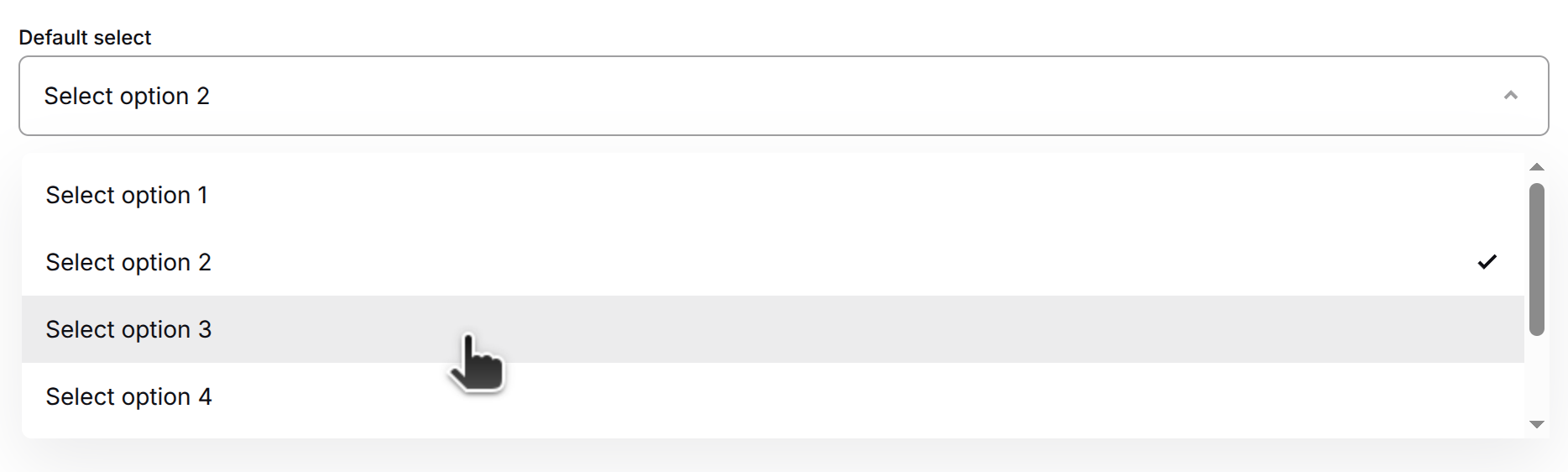
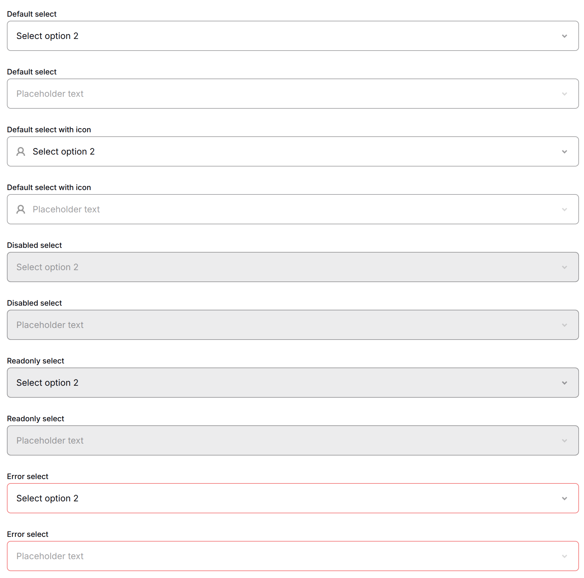
Default view:
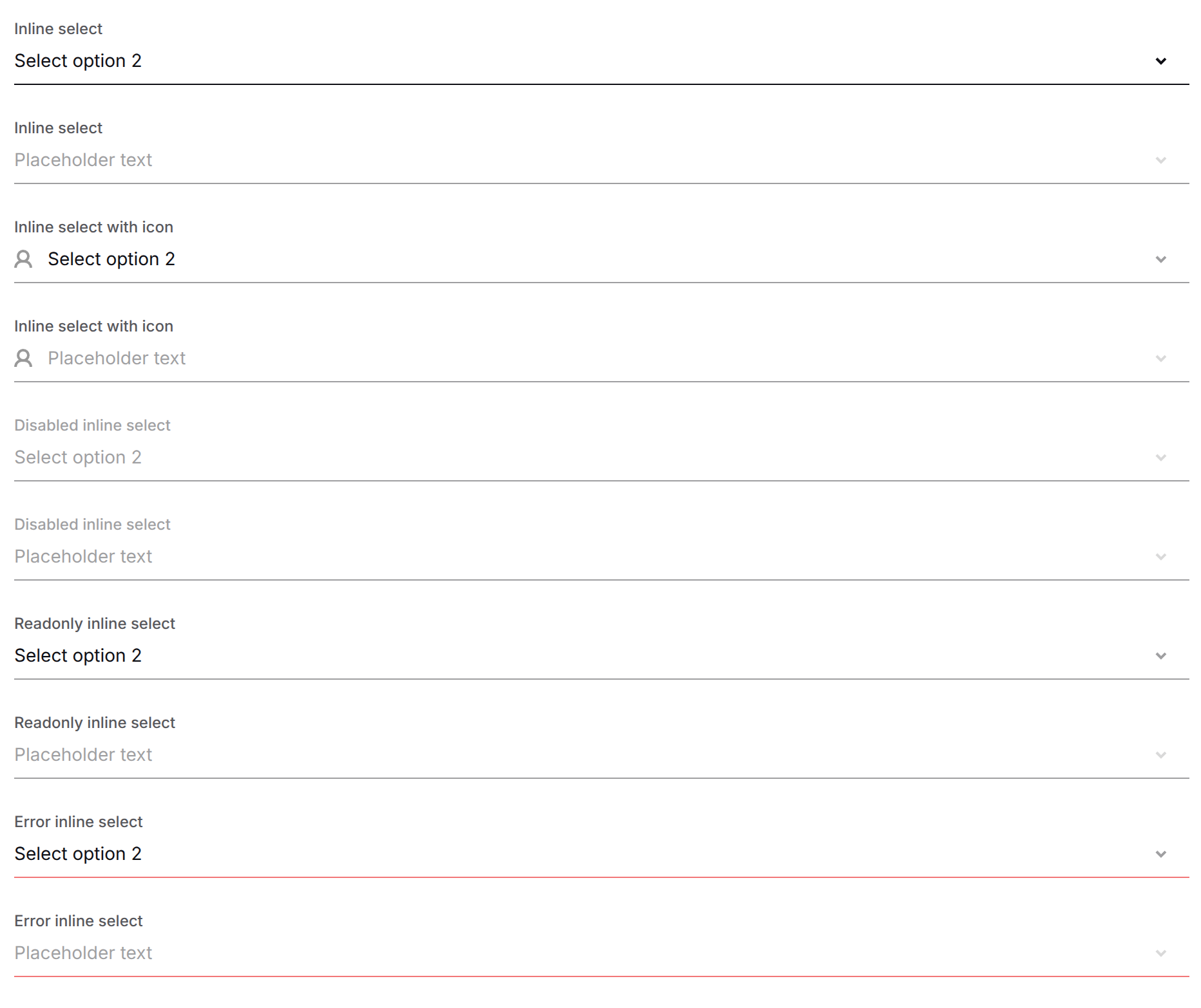
Inline view:
|
Attribute Name |
Type |
Required/Optional |
Default Value |
Description |
|---|---|---|---|---|
|
|
|
Optional |
|
CSS class name(s) to apply to the select component. |
|
|
|
Optional |
|
Unique identifier for the select element. |
|
|
|
Optional |
|
Object mapping class names to boolean flags for conditional styling. |
|
|
|
Optional |
|
Inline styles as a key‑value object. |
|
|
|
Required |
— |
The |
|
|
|
Optional |
|
Text label associated with the select. |
|
|
|
Optional |
|
Indicates whether the select is in an invalid state. |
|
|
|
Optional |
|
Marks the select as required for form validation. |
|
|
|
Optional |
|
Disables the select, making it non‑interactive. |
|
|
|
Optional |
|
Makes the select read‑only (selection cannot be changed). |
|
|
|
Optional |
|
Callback function triggered when the select value changes. |
|
|
|
Required |
— |
Array of options to display in the dropdown. Each option has |
|
|
|
Optional |
|
The |
|
|
|
Optional |
|
Maximum number of visible rows in the dropdown before scrolling. |
|
|
|
Required |
— |
Placeholder text displayed when no option is selected. |
|
|
|
Optional |
|
Maximum width of the select component (CSS |
|
|
|
Optional |
|
Visual variant of the select. |
|
|
|
Optional |
|
Icon element displayed on the left side of the select. |
|
|
|
Optional |
|
Error message to display when the select is invalid. |
Typography
|
Attribute Name |
Type |
Required/Optional |
Default Value |
Description |
|---|---|---|---|---|
|
|
|
Optional |
- |
Optional CSS class name for the element. |
|
|
|
Optional |
- |
Optional ID for the element. |
|
|
|
Optional |
- |
Optional object for conditional CSS classes. |
|
|
|
Optional |
- |
Optional inline styles as a key-value object. |
|
|
|
Required |
- |
The content to be rendered inside the typography component. |
PianoHeadline

<PianoHeadline>Lorem ipsum dolor sit amet</PianoHeadline>
PianoSubHeadline

<PianoSubHeadline>Lorem ipsum dolor sit amet</PianoSubHeadline>
PianoText

<PianoText>Lorem ipsum dolor sit amet</PianoText>
PianoAccentedText

<PianoAccentedText>Lorem ipsum dolor sit amet</PianoAccentedText>
Complex
PianoHeader
|
Attribute name |
type |
required / optional |
default |
description |
|---|---|---|---|---|
|
|
boolean |
optional |
false |
hide user control |
|
|
boolean |
optional |
false |
hide locale selector |
|
|
boolean |
optional |
false |
hide close button |
|
|
boolean |
optional |
false |
hide logout button |
|
|
|
optional |
undefined |
close handler forwarded to PianoCloseButton |
PianoTabs
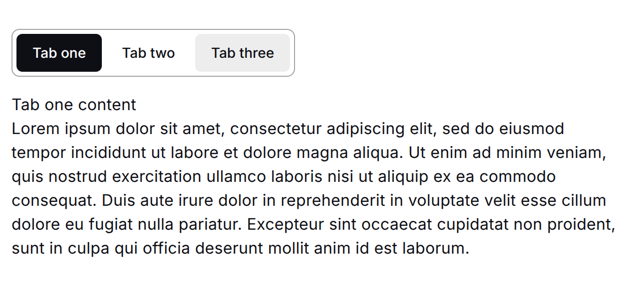
|
Attribute name |
Type |
Required/Optional |
Default value |
Description |
|---|---|---|---|---|
|
|
|
Optional |
- |
Controlled active tab value. When provided, the component is controlled. |
|
|
|
Optional |
- |
Initial active tab value in uncontrolled mode. |
|
|
|
Optional |
- |
Called when the active tab changes via user interaction. |
|
|
|
Required |
- |
|
|
|
|
Optional |
- |
CSS class name for the root element. |
|
|
|
Optional |
- |
ID for the root element. |
|
|
|
Optional |
- |
Object for conditional CSS classes. |
|
|
|
Optional |
- |
Inline styles as a key-value object. |
PianoTab
|
Attribute name |
Type |
Required/Optional |
Default value |
Description |
|---|---|---|---|---|
|
|
|
Required |
- |
Identifier shared by the trigger and its panel. |
|
|
|
Required |
- |
Label rendered inside the tab trigger. |
|
|
|
Optional |
|
When true the tab cannot be activated. |
|
|
|
Required |
- |
Panel content (lazy: created only when the tab is active). |
<PianoTabs defaultValue="account" onChange={(value) => console.log(value)}>
  <PianoTab value="account" label="Account">Account panel</PianoTab>
  <PianoTab value="password" label="Password">Password panel</PianoTab>
</PianoTabs>
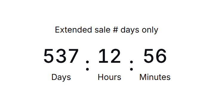
PianoCountdown
|
Attribute name |
Type |
Required/Optional |
Default value |
Description |
|---|---|---|---|---|
|
|
|
Required |
- |
Target date the countdown ticks toward. |
|
|
|
Required |
- |
Colon-separated units to display, e.g. |
|
|
|
Optional |
- |
Called once when the countdown reaches zero. |
|
|
|
Optional |
- |
Pre-translated title rendered above the timer. |
|
|
|
Optional |
- |
CSS class name for the root element. |
|
|
|
Optional |
- |
ID for the root element. |
|
|
|
Optional |
- |
Object for conditional CSS classes. |
|
|
|
Optional |
- |
Inline styles as a key-value object. |
<PianoCountdown
  endDate={new Date("12.31.2026")}
  format="dd:hh:mm:ss"
  onComplete={() => console.log("done")}
>
  Limited offer ends in
</PianoCountdown>
Utility
PianoImg

Renders an image and displays a placeholder during loading.
|
Attribute Name |
Type |
Required/Optional |
Default Value |
Description |
|---|---|---|---|---|
|
|
|
Optional |
- |
Optional CSS class name for the element. |
|
|
|
Optional |
- |
Optional ID for the element. |
|
|
|
Optional |
- |
Optional object for conditional CSS classes. |
|
|
|
Optional |
- |
Optional inline styles as a key-value object. |
|
|
|
Optional |
- |
Source URL of the image. |
|
|
|
Optional |
|
Width of the image (can be a string with units or a number). |
|
|
|
Optional |
|
Height of the image (can be a string with units or a number). |
|
|
|
Optional |
- |
Alternative text for the image (accessibility). |
<PianoImg src="image-src" width="64" height="64" alt="alt-text"></PianoImg>
PianoUserName
Renders Piano user name, full name or email.
|
Attribute Name |
Type |
Required/Optional |
Default Value |
Description |
|---|---|---|---|---|
|
|
|
Optional |
- |
Optional CSS class name for the element. |
|
|
|
Optional |
- |
Optional ID for the element. |
|
|
|
Optional |
- |
Optional object for conditional CSS classes. |
|
|
|
Optional |
- |
Optional inline styles as a key-value object. |
|
|
|
Optional |
- |
Optional content to be rendered inside the component. |
|
|
|
Required |
- |
How the username will be presented. |
|
|
|
Optional |
- |
Rendered if the user does not exist. |
<PianoUserName
  display="name | fullName | email"
  fallback="Lorem ipsum"
  class="username"
>
  My external name(optional)
</PianoUserName>
PianoExternalEvent
Fire external event and sends auto micro conversion on click / submit.
|
Attribute Name |
Type |
Required/Optional |
Default Value |
Description |
|---|---|---|---|---|
|
|
|
Required |
- |
External event name. |
|
|
|
Optional |
|
External event options. |
<PianoExternalEvent name="some-event" params={{ myParam:'my-param-value' }}>
  <button>Test event</button>
</PianoExternalEvent>
To know more how to set up click tracking and reporting of multiple clickable elements e.g. buttons follow this FAQ.
A
Adds _ptid to the href and sends an auto micro conversion when the link is clicked.
Important: Do not change to . Our conversion-tracking implementation relies on the uppercase tag and will not track conversions otherwise.
Lowercase a is the standard HTML element without tracking, while uppercase A is our component with tracking.
|
Attribute Name |
Type |
Required/Optional |
Default Value |
Description |
|---|---|---|---|---|
|
|
|
Optional |
- |
CSS class name for the element. |
|
|
|
Optional |
- |
Unique identifier for the element. |
|
|
|
Optional |
- |
Optional object for conditional CSS classes. |
|
|
|
Optional |
- |
Optional inline styles as a key-value object. |
|
|
|
Required |
- |
Child elements to render inside the component. |
|
|
|
Optional |
- |
If true, prevents link tracking. |
|
|
|
Optional |
- |
The URL to navigate to when the link is clicked. |
|
|
|
Optional |
- |
Specifies where to open the linked document (e.g., |
|
Other tag attributes |
- |
Optional |
- |
Standard HTML anchor attributes: |
<A href="my-external-link">
  link text
</A>
PianoLocaleSelector

Renders the locale selector.
|
Attribute Name |
Type |
Required/Optional |
Default Value |
Description |
|---|---|---|---|---|
|
|
|
Optional |
- |
CSS class name for the element. |
|
|
|
Optional |
- |
Unique identifier for the element. |
|
|
|
Optional |
- |
Optional object for conditional CSS classes. |
|
|
|
Optional |
- |
Optional inline styles as a key-value object. |
<PianoLocaleSelector></PianoLocaleSelector>
PianoUserControl
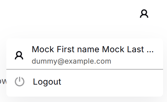
Renders a user control menu.
|
Attribute Name |
Type |
Required/Optional |
Default Value |
Description |
|---|---|---|---|---|
|
|
|
Optional |
- |
CSS class name for the element. |
|
|
|
Optional |
- |
Unique identifier for the element. |
|
|
|
Optional |
- |
Optional object for conditional CSS classes. |
|
|
|
Optional |
- |
Optional inline styles as a key-value object. |
<PianoUserControl></PianoUserControl>
T (Translate)
Translates the passed string. See the Localization section for more details.
|
Attribute Name |
Type |
Required/Optional |
Default Value |
Description |
|---|---|---|---|---|
|
|
|
Optional |
- |
The context from which translations will be taken. |
|
|
|
Optional |
- |
Inserts variables into the translated string. |
<T>string to translate</T>
<T context="offer.component">string to translate</T>
<T
  template={{ templateVariable: item, otherTemplateVariable: userName }}
>
  string to translate [[templateVariable]] with template [[otherTemplateVariable]]
</T>
MediaQuery
Conditionally renders its children based on the viewport or widget container width.
|
Attribute name |
Type |
Required/Optional |
Default value |
Description |
|---|---|---|---|---|
|
class |
|
optional |
|
CSS class name for the root element. |
|
id |
|
optional |
|
ID for the root element. |
|
classList |
|
optional |
|
Object for conditional CSS classes. |
|
style |
|
optional |
|
Inline styles as a key-value object. |
|
layout |
|
optional |
|
Source of the measured width: |
|
bound |
|
required |
|
Comparison direction: |
|
width |
|
required |
|
Width threshold in pixels. |
|
children |
|
required |
|
Content gated by the width condition. |
<MediaQuery layout="viewport" bound="min" width={800}>
  Visible when viewport is at least 800px wide
</MediaQuery>
Primitives
Header
The header bar (root). A flex row that lays out its groups with space-between, so the first group sits at the start and the last at the end. It is purely structural - it holds no state; the visible parts are composed from Header.Group with controls placed directly inside.
A Header.Group is reused for either side - its position (start / end) is determined by the order it appears in the header and the root's space-between layout, not by the group itself.
|
Primitive |
Description |
|---|---|
|
|
Root flex row that lays out its groups with |
|
|
A flex group of controls inside |
Header primitive
|
Attribute name |
Type |
Required/Optional |
Default value |
Description |
|---|---|---|---|---|
|
|
|
Required |
- |
|
|
|
|
Optional |
- |
CSS class name for the root element. |
|
|
|
Optional |
- |
ID for the root element. |
|
|
|
Optional |
- |
Object for conditional CSS classes. |
|
|
|
Optional |
- |
Inline styles as a key-value object. |
Header.Group primitive
|
Attribute name |
Type |
Required/Optional |
Default value |
Description |
|---|---|---|---|---|
|
|
|
Required |
- |
The controls to render (buttons, selectors, etc.). |
|
|
|
Optional |
- |
CSS class name for the group element. |
|
|
|
Optional |
- |
ID for the group element. |
|
|
|
Optional |
- |
Object for conditional CSS classes. |
|
|
|
Optional |
- |
Inline styles as a key-value object. |
<Header>
  <Header.Group>
    <PianoLocaleSelector />
  </Header.Group>
  <Header.Group>
    <PianoUserControl />
    <PianoCloseButton />
  </Header.Group>
</Header>
CloseButton
Compound close button. On click, it first calls the optional onClose , then dispatches the global closeButtonClicked signal. The icon (CloseButton.Icon, the default close icon, overridable via children) is composed as a child.
|
Primitive |
Description |
|---|---|
|
|
Root interactive button. Dispatches the global close signal and calls |
|
|
The decorative icon ( |
CloseButton primitive
|
Attribute name |
Type |
Required/Optional |
Default value |
Description |
|---|---|---|---|---|
|
|
|
Optional |
- |
Called after the close signal is dispatched. |
|
|
|
Optional |
|
Visual shape: |
|
|
|
Optional |
|
Explicit accessible label. |
|
|
|
Optional |
- |
Name attribute for the button. |
|
|
|
Optional |
|
Whether the button is disabled. |
|
|
|
Optional |
- |
CSS width value. |
|
|
|
Optional |
- |
CSS height value. |
|
|
|
Optional |
- |
CSS min-width value. |
|
|
|
Optional |
- |
CSS min-height value. |
|
|
|
Optional |
- |
CSS max-width value. |
|
|
|
Optional |
- |
CSS max-height value. |
|
|
|
Optional |
- |
CSS opacity value. |
|
|
|
Optional |
- |
External event name (analytics). |
|
|
|
Optional |
- |
External event params (analytics). |
|
|
|
Optional |
- |
Ref to the button element. |
|
|
|
Required |
- |
|
|
|
|
Optional |
- |
CSS class name for the button element. |
|
|
|
Optional |
- |
ID for the button element. |
|
|
|
Optional |
- |
Object for conditional CSS classes. |
|
|
|
Optional |
- |
Inline styles as a key-value object. |
CloseButton.Icon primitive
|
Attribute name |
Type |
Required/Optional |
Default value |
Description |
|---|---|---|---|---|
|
|
|
Optional |
Built-in close icon |
Optional custom icon. |
|
|
|
Optional |
- |
CSS class name for the icon wrapper. |
|
|
|
Optional |
- |
Object for conditional CSS classes. |
|
|
|
Optional |
- |
Inline styles as a key-value object. |
<CloseButton onClose={(e) => handleClose(e)}>
  <CloseButton.Icon />
</CloseButton>
<CloseButton onClose={(e) => handleClose(e)}>
  <CloseButton.Icon>
    <svg xmlns="http://www.w3.org/2000/svg" width="24" height="24" viewBox="0 0 24 24" fill="none" stroke="currentColor" stroke-width="2" stroke-linecap="round" stroke-linejoin="round" class="lucide lucide-circle-x-icon lucide-circle-x"><circle cx="12" cy="12" r="10"/><path d="m15 9-6 6"/><path d="m9 9 6 6"/></svg>
  </CloseButton.Icon>
</CloseButton>
Countdown
Counts down toward endDate. The visible parts (title, timer, units, separators) are composed as children; each Countdown.Unit reads its value from context. When the countdown reaches zero, onComplete is fired once and the whole component unmounts itself.
The remaining time is recomputed from Date.now() on every tick, so it stays accurate even if the tab was throttled in the background. Pass a stable endDate reference.
|
Primitive |
Description |
|---|---|
|
|
Root. Ticks toward |
|
|
The heading rendered above the timer. |
|
|
Row wrapper laying out |
|
|
A single time unit: the two-digit value above its label. |
|
|
The decorative divider placed between units ( |
Countdown primitive
|
Attribute name |
Type |
Required/Optional |
Default value |
Description |
|---|---|---|---|---|
|
|
|
Required |
- |
Target date the countdown ticks toward. |
|
|
|
Optional |
- |
Called once when the countdown reaches zero. |
|
|
|
Required |
- |
|
|
|
|
Optional |
- |
CSS class name for the root element. |
|
|
|
Optional |
- |
ID for the root element. |
|
|
|
Optional |
- |
Object for conditional CSS classes. |
|
|
|
Optional |
- |
Inline styles as a key-value object. |
Countdown.Title primitive
|
Attribute name |
Type |
Required/Optional |
Default value |
Description |
|---|---|---|---|---|
|
|
|
Required |
- |
Title content. |
|
|
|
Optional |
- |
CSS class name for the title element. |
|
|
|
Optional |
- |
ID for the title element. |
|
|
|
Optional |
- |
Object for conditional CSS classes. |
|
|
|
Optional |
- |
Inline styles as a key-value object. |
Countdown.Timer primitive
|
Attribute name |
Type |
Required/Optional |
Default value |
Description |
|---|---|---|---|---|
|
|
|
Required |
- |
|
|
|
|
Optional |
- |
CSS class name for the timer element. |
|
|
|
Optional |
- |
ID for the timer element. |
|
|
|
Optional |
- |
Object for conditional CSS classes. |
|
|
|
Optional |
- |
Inline styles as a key-value object. |
Countdown.Unit primitive
|
Attribute name |
Type |
Required/Optional |
Default value |
Description |
|---|---|---|---|---|
|
|
|
Required |
- |
Which time unit to display. |
|
|
|
Optional |
Translated unit name |
Optional label override. |
|
|
|
Optional |
- |
CSS class name for the unit element. |
|
|
|
Optional |
- |
ID for the unit element. |
|
|
|
Optional |
- |
Object for conditional CSS classes. |
|
|
|
Optional |
- |
Inline styles as a key-value object. |
Countdown.Separator primitive
|
Attribute name |
Type |
Required/Optional |
Default value |
Description |
|---|---|---|---|---|
|
|
|
Optional |
|
Optional separator content. |
|
|
|
Optional |
- |
CSS class name for the separator element. |
|
|
|
Optional |
- |
ID for the separator element. |
|
|
|
Optional |
- |
Object for conditional CSS classes. |
|
|
|
Optional |
- |
Inline styles as a key-value object. |
<Countdown endDate={new Date("12.12.2027")}>
  <Countdown.Title>Extended sale # days only</Countdown.Title>
  <Countdown.Timer>
    <Countdown.Unit unit="dd" />
    <Countdown.Separator />
    <Countdown.Unit unit="hh" />
    <Countdown.Separator />
    <Countdown.Unit unit="mm" />
  </Countdown.Timer>
</Countdown>
Tabs
A set of layered sections of content - known as tab panels - displayed one at a time. The component is composed from Tabs.List / Tabs.Trigger / Tabs.Content, matched to each other by their value. Inactive panels are not mounted (lazy rendering).When no tab is active on mount, the first enabled trigger is auto-selected.
|
Primitive |
Description |
|---|---|
|
|
Root. Holds the active-tab state and wires the primitives together by |
|
|
Container with |
|
|
A tab button ( |
|
|
A tab panel ( |
Tabs primitive
|
Attribute name |
Type |
Required/Optional |
Default value |
Description |
|---|---|---|---|---|
|
|
|
Optional |
- |
Controlled active tab value. When provided, the component is controlled. |
|
|
|
Optional |
- |
Initial active tab value in uncontrolled mode. |
|
|
|
Optional |
- |
Called when the active tab changes via user interaction. |
|
|
|
Required |
- |
|
|
|
|
Optional |
- |
CSS class name for the root element. |
|
|
|
Optional |
- |
ID for the root element. |
|
|
|
Optional |
- |
Object for conditional CSS classes. |
|
|
|
Optional |
- |
Inline styles as a key-value object. |
Tabs.List primitive
|
Attribute name |
Type |
Required/Optional |
Default value |
Description |
|---|---|---|---|---|
|
|
|
Required |
- |
|
|
|
|
Optional |
- |
CSS class name for the root element. |
|
|
|
Optional |
- |
ID for the root element. |
|
|
|
Optional |
- |
Object for conditional CSS classes. |
|
|
|
Optional |
- |
Inline styles as a key-value object. |
Tabs.Trigger primitive
|
Attribute name |
Type |
Required/Optional |
Default value |
Description |
|---|---|---|---|---|
|
|
|
Required |
- |
Identifier matching a |
|
|
|
Optional |
|
When true the trigger cannot be activated. |
|
|
|
Required |
- |
Label rendered inside the button. |
|
|
|
Optional |
- |
CSS class name for the button element. |
|
|
|
Optional |
- |
Object for conditional CSS classes. |
|
|
|
Optional |
- |
Inline styles as a key-value object. |
Tabs.Content primitive
|
Attribute name |
Type |
Required/Optional |
Default value |
Description |
|---|---|---|---|---|
|
|
|
Required |
- |
Identifier matching a |
|
|
|
Required |
- |
Panel content. |
|
|
|
Optional |
- |
CSS class name for the panel element. |
|
|
|
Optional |
- |
Object for conditional CSS classes. |
|
|
|
Optional |
- |
Inline styles as a key-value object. |
<Tabs defaultValue="account" onChange={(value) => console.log(value)}>
  <Tabs.List>
    <Tabs.Trigger value="account">Account</Tabs.Trigger>
    <Tabs.Trigger value="password">Password</Tabs.Trigger>
  </Tabs.List>
  <Tabs.Content value="account">Account panel</Tabs.Content>
  <Tabs.Content value="password">Password panel</Tabs.Content>
</Tabs>
Toggle
A compound on/off switch. The root holds the form-field state (name, checked, validation flags) and shares it via context; the visible parts - the switch control, label(s), and error message - are composed as children. Two labels can be placed around the control (e.g. "Off" / "On"). Validation styling (invalid) is applied to the control, and an ariaLabel provides an accessible name when no visible label is composed.
|
Primitive |
Description |
|---|---|
|
|
Root. Owns the toggle state (name, checked, disabled/readonly/required/invalid) and change handler. |
|
|
The visual switch track with a sliding thumb. |
|
|
Label for the toggle (can appear on either side of the control). |
|
|
Error message for the toggle. |
Toggle primitive
|
Attribute name |
Type |
Required/Optional |
Default value |
Description |
|---|---|---|---|---|
|
|
|
Required |
- |
Form field name; used as input id and label target. |
|
|
|
Optional |
|
Initial checked state. |
|
|
|
Optional |
|
Disables interaction and applies disabled styling. |
|
|
|
Optional |
|
Locks the value without the disabled cursor. |
|
|
|
Optional |
|
Marks the field required for form validation. |
|
|
|
Optional |
|
Applies the invalid (danger) outline. |
|
|
|
Optional |
- |
ARIA label for screen readers when no visible label is composed. |
|
|
|
Optional |
- |
Called when the toggle state changes. |
|
|
|
Required |
- |
|
|
|
|
Optional |
- |
CSS class name for the root element. |
|
|
|
Optional |
- |
ID for the root element. |
|
|
|
Optional |
- |
Object for conditional CSS classes. |
|
|
|
Optional |
- |
Inline styles as a key-value object. |
Toggle.Control primitive
Toggle.Control takes no props - it renders the switch track and thumb and reads the toggle state from context.
Toggle.Label primitive
|
Attribute name |
Type |
Required/Optional |
Default value |
Description |
|---|---|---|---|---|
|
|
|
Optional |
- |
ARIA label override. |
|
|
|
Required |
- |
Label content. |
|
|
|
Optional |
- |
CSS class name for the label element. |
|
|
|
Optional |
- |
ID for the label element. |
|
|
|
Optional |
- |
Object for conditional CSS classes. |
|
|
|
Optional |
- |
Inline styles as a key-value object. |
Toggle.Error primitive
|
Attribute name |
Type |
Required/Optional |
Default value |
Description |
|---|---|---|---|---|
|
|
|
Required |
- |
Error message content. |
|
|
|
Optional |
- |
CSS class name for the error element. |
|
|
|
Optional |
Control's aria error id |
ID for the error element. |
|
|
|
Optional |
- |
Object for conditional CSS classes. |
|
|
|
Optional |
- |
Inline styles as a key-value object. |
<Toggle name="darkMode" checked onChange={(e) => console.log(e)}>
  <Toggle.Label>Off</Toggle.Label>
  <Toggle.Control />
  <Toggle.Label>On</Toggle.Label>
  <Toggle.Error>Error message</Toggle.Error>
</Toggle>
Input
A compound text input field. The visible parts - label, the underlying <input>, and the error message - are composed as children. Validation styling (invalid) and aria-invalid are applied to the field, and the label, input, and error are wired together with the matching id / for / aria attributes.
|
Primitive |
Description |
|---|---|
|
|
Root. Owns the field state (name, value, disabled/readonly/required/invalid) and change handlers. |
|
|
Label for the input. |
|
|
Renders the underlying |
|
|
Error message for the input. |
Input primitive
|
Attribute name |
Type |
Required/Optional |
Default value |
Description |
|---|---|---|---|---|
|
|
|
Required |
- |
Form field name; used as input id and label target. |
|
|
|
Optional |
- |
Controlled input value. |
|
|
|
Optional |
|
Disables interaction and applies disabled styling. |
|
|
|
Optional |
|
Locks the value without the disabled cursor. |
|
|
|
Optional |
|
Marks the field required for form validation. |
|
|
|
Optional |
|
Applies the invalid (danger) styling and |
|
|
|
Optional |
- |
Called when the input value changes. |
|
|
|
Optional |
- |
Called when the user presses Enter inside the input. |
|
|
|
Required |
- |
|
|
|
|
Optional |
- |
CSS class name for the root element. |
|
|
|
Optional |
- |
ID for the root element. |
|
|
|
Optional |
- |
Object for conditional CSS classes. |
|
|
|
Optional |
- |
Inline styles as a key-value object. |
Input.Label primitive
|
Attribute name |
Type |
Required/Optional |
Default value |
Description |
|---|---|---|---|---|
|
|
|
Optional |
- |
Visual label variant forwarded to InputLabel. |
|
|
|
Optional |
- |
ARIA label override. |
|
|
|
Required |
- |
Label content. |
|
|
|
Optional |
- |
CSS class name for the label element. |
|
|
|
Optional |
- |
ID for the label element. |
|
|
|
Optional |
- |
Object for conditional CSS classes. |
|
|
|
Optional |
- |
Inline styles as a key-value object. |
Input.Field primitive
|
Attribute name |
Type |
Required/Optional |
Default value |
Description |
|---|---|---|---|---|
|
|
|
Required |
- |
Native input type (e.g. |
|
|
|
Optional |
- |
Placeholder text. |
|
|
|
Optional |
|
When true the input is focused on mount. |
|
|
|
Optional |
- |
Native autocomplete attribute. |
|
|
|
Optional |
- |
Native minlength attribute. |
|
|
|
Optional |
- |
Native maxlength attribute. |
|
|
|
Optional |
- |
Native min attribute (numeric inputs). |
|
|
|
Optional |
- |
Native max attribute (numeric inputs). |
|
|
|
Optional |
- |
CSS height applied as inline style. |
|
|
|
Optional |
- |
CSS width applied as inline style. |
|
|
|
Optional |
- |
CSS padding applied as inline style. |
|
|
|
Optional |
- |
CSS text-align applied as inline style. |
|
|
|
Optional |
- |
Native inputmode hint. |
|
|
|
Optional |
- |
Native pattern attribute. |
|
|
|
Optional |
|
When true reserves padding for a left icon. |
|
|
|
Optional |
|
When true reserves padding for a right icon. |
|
|
|
Optional |
- |
Ref to the underlying input element. |
|
|
|
Optional |
- |
Accessible label for screen readers. |
|
|
|
Optional |
- |
Native autocorrect attribute. |
|
|
|
Optional |
- |
Native autocapitalize attribute. |
|
|
|
Optional |
- |
Sets |
|
|
|
Optional |
Field |
ID for the input element. |
|
|
|
Optional |
- |
CSS class for the input element. |
|
|
|
Optional |
- |
Conditional CSS classes for the input element. |
|
|
|
Optional |
- |
Inline styles merged with the field's internal style. |
Input.Error primitive
|
Attribute name |
Type |
Required/Optional |
Default value |
Description |
|---|---|---|---|---|
|
|
|
Required |
- |
Error message content. |
|
|
|
Optional |
- |
CSS class name for the error element. |
|
|
|
Optional |
Input's aria error id |
ID for the error element. |
|
|
|
Optional |
- |
Object for conditional CSS classes. |
|
|
|
Optional |
- |
Inline styles as a key-value object. |
<Input name="email" onChange={(e) => console.log(e.target)}>
  <Input.Label>Email</Input.Label>
  <Input.Field type="email" placeholder="you@example.com" />
  <Input.Error>Invalid email</Input.Error>
</Input>
Checkbox
A compound checkbox. The visible parts - the box control, label, and error message - are composed as children. The label is natively associated with the input via for (clicking it toggles the control) and can be placed before or after the control to render it on the left or right. Validation styling (invalid) is applied to the control, and an ariaLabel provides an accessible name when no visible label is composed.
|
Primitive |
Description |
|---|---|
|
|
Root. Owns the field state (name, checked, disabled/readonly/required/invalid) and change handler. |
|
|
The visual checkbox box, showing the tick icon when checked. |
|
|
Label for the checkbox, natively associated with the input via |
|
|
Error message for the checkbox. Rendered in place; nothing is shown while empty. |
Checkbox primitive
|
Attribute name |
Type |
Required/Optional |
Default value |
Description |
|---|---|---|---|---|
|
|
|
Required |
- |
Form field name; used as input id and label target. |
|
|
|
Optional |
|
Initial checked state. |
|
|
|
Optional |
|
Disables interaction and applies disabled styling. |
|
|
|
Optional |
|
Locks the value without the disabled cursor. |
|
|
|
Optional |
|
Marks the field required for form validation. |
|
|
|
Optional |
|
Applies the invalid (danger) border. |
|
|
|
Optional |
- |
ARIA label for screen readers when no visible label is composed. |
|
|
|
Optional |
- |
ID of an element whose text labels the checkbox for screen readers. |
|
|
|
Optional |
- |
ID of your own error element, if you render the error message outside this component. Used while |
|
|
|
Optional |
- |
Sets |
|
|
|
Optional |
- |
Called when the checked state changes. |
|
|
|
Required |
- |
|
|
|
|
Optional |
- |
CSS class name for the root element. |
|
|
|
Optional |
- |
ID for the root element. |
|
|
|
Optional |
- |
Object for conditional CSS classes. |
|
|
|
Optional |
- |
Inline styles as a key-value object. |
Checkbox.Control primitive
Checkbox.Control takes no props - it renders the box (with the tick icon when checked) and reads the checkbox state from context.
Checkbox.Label primitive
|
Attribute name |
Type |
Required/Optional |
Default value |
Description |
|---|---|---|---|---|
|
|
|
Optional |
- |
ARIA label override. |
|
|
|
Required |
- |
Label content. |
|
|
|
Optional |
- |
CSS class name for the label element. |
|
|
|
Optional |
- |
ID for the label element. |
|
|
|
Optional |
- |
Object for conditional CSS classes. |
|
|
|
Optional |
- |
Inline styles as a key-value object. |
Checkbox.Error primitive
|
Attribute name |
Type |
Required/Optional |
Default value |
Description |
|---|---|---|---|---|
|
|
|
Required |
- |
Error message content. |
|
|
|
Optional |
- |
CSS class name for the error element. |
|
|
|
Optional |
Control's aria error id |
ID for the error element. |
|
|
|
Optional |
- |
Object for conditional CSS classes. |
|
|
|
Optional |
- |
Inline styles as a key-value object. |
<Checkbox name="acceptTerms" required onChange={(e) => console.log(e)}>
  <Checkbox.Control />
  <Checkbox.Label>I accept the terms</Checkbox.Label>
  <Checkbox.Error>This field is required</Checkbox.Error>
</Checkbox>
Textarea
A compound multi-line text field.The visible parts - label, the underlying <textarea>, and the error message - are composed as children. Validation styling (invalid) and aria-invalid are applied to the field, and the label, textarea, and error are wired together with the matching id / for / aria attributes.
|
Primitive |
Description |
|---|---|
|
|
Root. Owns the field state (name, value, disabled/readonly/required/invalid) and change handler. |
|
|
Label for the textarea. |
|
|
Renders the underlying |
|
|
Error message for the textarea. |
Textarea primitive
|
Attribute name |
Type |
Required/Optional |
Default value |
Description |
|---|---|---|---|---|
|
|
|
Required |
- |
Form field name; used as textarea id and label target. |
|
|
|
Optional |
- |
Controlled textarea value. |
|
|
|
Optional |
|
Disables interaction and applies disabled styling. |
|
|
|
Optional |
|
Locks the value without the disabled cursor. |
|
|
|
Optional |
|
Marks the field required for form validation. |
|
|
|
Optional |
|
Applies the invalid (danger) styling and |
|
|
|
Optional |
- |
Called when the textarea value changes. |
|
|
|
Required |
- |
|
|
|
|
Optional |
- |
CSS class name for the root element. |
|
|
|
Optional |
- |
ID for the root element. |
|
|
|
Optional |
- |
Object for conditional CSS classes. |
|
|
|
Optional |
- |
Inline styles as a key-value object. |
Textarea.Label primitive
|
Attribute name |
Type |
Required/Optional |
Default value |
Description |
|---|---|---|---|---|
|
|
|
Optional |
- |
Visual label variant forwarded to InputLabel. |
|
|
|
Optional |
- |
ARIA label override. |
|
|
|
Required |
- |
Label content. |
|
|
|
Optional |
- |
CSS class name for the label element. |
|
|
|
Optional |
- |
ID for the label element. |
|
|
|
Optional |
- |
Object for conditional CSS classes. |
|
|
|
Optional |
- |
Inline styles as a key-value object. |
Textarea.Field primitive
|
Attribute name |
Type |
Required/Optional |
Default value |
Description |
|---|---|---|---|---|
|
|
|
Required |
- |
Placeholder text. |
|
|
|
Optional |
|
When true the textarea is focused on mount. |
|
|
|
Optional |
- |
Native minlength attribute. |
|
|
|
Optional |
- |
Native maxlength attribute. |
|
|
|
Optional |
- |
Native rows attribute. |
|
|
|
Optional |
- |
Native cols attribute. |
|
|
|
Optional |
- |
CSS max-width applied as inline style. |
|
|
|
Optional |
- |
CSS height applied as inline style. |
|
|
|
Optional |
- |
CSS width applied as inline style. |
|
|
|
Optional |
- |
CSS resize behaviour applied as inline style. |
|
|
|
Optional |
- |
Ref to the underlying textarea element. |
|
|
|
Optional |
- |
CSS class for the textarea element. |
|
|
|
Optional |
- |
Conditional CSS classes for the textarea element. |
Textarea.Error primitive
|
Attribute name |
Type |
Required/Optional |
Default value |
Description |
|---|---|---|---|---|
|
|
|
Required |
- |
Error message content. |
|
|
|
Optional |
- |
CSS class name for the error element. |
|
|
|
Optional |
Textarea's aria error id |
ID for the error element. |
|
|
|
Optional |
- |
Object for conditional CSS classes. |
|
|
|
Optional |
- |
Inline styles as a key-value object. |
<Textarea name="comment" onChange={(e) => console.log(e.target)}>
  <Textarea.Label>Your comment</Textarea.Label>
  <Textarea.Field placeholder="Type here..." rows={4} />
  <Textarea.Error>This field is required</Textarea.Error>
</Textarea>
Select
A compound dropdown select. The root holds the form-field state (name, options, selection, validation flags) and shares it via context. The visible parts - label, the clickable trigger box, the dropdown listbox, and the error message - are composed as children. The options are provided to the root as data (options), and Select.Content renders them. Validation styling (invalid) is applied to the control, and label / trigger / error are wired together with the matching id / aria attributes.
|
Primitive |
Description |
|---|---|
|
|
Root. Owns the field state (name, options, selected, disabled/readonly/required/invalid, view, sizing). |
|
|
Label for the select. |
|
|
The clickable selector box (selected text / placeholder + chevron) that opens the dropdown. |
|
|
The dropdown listbox of options (rendered from the Select's |
|
|
Error message for the select. |
Select primitive
|
Attribute name |
Type |
Required/Optional |
Default value |
Description |
|---|---|---|---|---|
|
|
|
Required |
- |
Form field name. |
|
|
|
Required |
- |
The selectable options ( |
|
|
|
Optional |
- |
Id of the currently selected option. |
|
|
|
Optional |
|
Disables the control and applies disabled styling. |
|
|
|
Optional |
|
Locks the value without the disabled cursor. |
|
|
|
Optional |
|
Marks the field required for form validation. |
|
|
|
Optional |
|
Applies the invalid (danger) styling. |
|
|
|
Optional |
|
Visual variant: |
|
|
|
Optional |
|
Max options visible before the dropdown scrolls. |
|
|
|
Optional |
- |
CSS max-width applied to the root. |
|
|
|
Optional |
- |
Called when a different option is selected. |
|
|
|
Required |
- |
|
|
|
|
Optional |
- |
CSS class name for the root element. |
|
|
|
Optional |
- |
ID for the root element. |
|
|
|
Optional |
- |
Object for conditional CSS classes. |
|
|
|
Optional |
- |
Inline styles as a key-value object. |
Select.Label primitive
|
Attribute name |
Type |
Required/Optional |
Default value |
Description |
|---|---|---|---|---|
|
|
|
Optional |
- |
ARIA label override. |
|
|
|
Required |
- |
Label content. |
|
|
|
Optional |
- |
CSS class name for the label element. |
|
|
|
Optional |
- |
ID for the label element. |
|
|
|
Optional |
- |
Object for conditional CSS classes. |
|
|
|
Optional |
- |
Inline styles as a key-value object. |
Select.Trigger primitive
|
Attribute name |
Type |
Required/Optional |
Default value |
Description |
|---|---|---|---|---|
|
|
|
Required |
- |
Text shown when nothing is selected. |
|
|
|
Optional |
- |
Icon rendered on the left of the box. |
Select.Content primitive
Select.Content takes no props - it renders the dropdown listbox.
Select.Error primitive
|
Attribute name |
Type |
Required/Optional |
Default value |
Description |
|---|---|---|---|---|
|
|
|
Required |
- |
Error message content. |
|
|
|
Optional |
- |
CSS class name for the error element. |
|
|
|
Optional |
Select's aria error id |
ID for the error element. |
|
|
|
Optional |
- |
Object for conditional CSS classes. |
|
|
|
Optional |
- |
Inline styles as a key-value object. |
<Select name="country" options={options} onChange={(e) => console.log(e.target)}>
  <Select.Label>Country</Select.Label>
  <Select.Trigger placeholder="Select a country" />
  <Select.Content />
  <Select.Error>Required</Select.Error>
</Select>
RadioGroup
A compound group of mutually exclusive radio options. The visible parts - a group label, the option rows (each with its control and label), and an error message - are composed as children. Every option shares the group's name. Validation styling (invalid) and aria-invalid are applied to the group, the group label is referenced via aria-labelledby, and each option label is natively associated with its radio input via for.
|
Primitive |
Description |
|---|---|
|
|
Root. Owns the group state (name, selected, disabled/readonly/required/invalid) and change handler. |
|
|
Group-level label (the question), referenced by the group's |
|
|
A single option row. Owns the option |
|
|
The radio dot. |
|
|
Per-option label, natively associated with its radio input via |
|
|
Group-level error message. |
RadioGroup primitive
|
Attribute name |
Type |
Required/Optional |
Default value |
Description |
|---|---|---|---|---|
|
|
|
Required |
- |
Form field name; shared by every radio input in the group. |
|
|
|
Optional |
- |
Value of the currently selected option. |
|
|
|
Optional |
|
Disables every option and applies disabled styling. |
|
|
|
Optional |
|
Locks the value without the disabled cursor. |
|
|
|
Optional |
|
Marks the group required for form validation. |
|
|
|
Optional |
|
Applies the invalid (danger) styling and |
|
|
|
Optional |
- |
Called when a different option is selected. |
|
|
|
Required |
- |
|
|
|
|
Optional |
- |
CSS class name for the root element. |
|
|
|
Optional |
- |
ID for the root element. |
|
|
|
Optional |
- |
Object for conditional CSS classes. |
|
|
|
Optional |
- |
Inline styles as a key-value object. |
RadioGroup.Label primitive
|
Attribute name |
Type |
Required/Optional |
Default value |
Description |
|---|---|---|---|---|
|
|
|
Required |
- |
Label content. |
|
|
|
Optional |
- |
CSS class name for the label element. |
|
|
|
Optional |
- |
ID for the label element. |
|
|
|
Optional |
- |
Object for conditional CSS classes. |
|
|
|
Optional |
- |
Inline styles as a key-value object. |
RadioGroup.Item primitive
|
Attribute name |
Type |
Required/Optional |
Default value |
Description |
|---|---|---|---|---|
|
|
|
Required |
- |
Value submitted when this option is selected. |
|
|
|
Optional |
|
Disables this option only. |
|
|
|
Required |
- |
|
|
|
|
Optional |
- |
CSS class name for the row element. |
|
|
|
Optional |
- |
ID for the row element. |
|
|
|
Optional |
- |
Object for conditional CSS classes. |
|
|
|
Optional |
- |
Inline styles as a key-value object. |
RadioGroup.Control primitive
RadioGroup.Control takes no props - it renders the radio dot and reads name / selected / disabled / readonly / invalid from the group context and value from the enclosing RadioGroup.Item.
RadioGroup.ItemLabel primitive
|
Attribute name |
Type |
Required/Optional |
Default value |
Description |
|---|---|---|---|---|
|
|
|
Optional |
- |
ARIA label override. |
|
|
|
Required |
- |
Label content. |
|
|
|
Optional |
- |
CSS class name for the label element. |
|
|
|
Optional |
- |
ID for the label element. |
|
|
|
Optional |
- |
Object for conditional CSS classes. |
|
|
|
Optional |
- |
Inline styles as a key-value object. |
RadioGroup.Error primitive
|
Attribute name |
Type |
Required/Optional |
Default value |
Description |
|---|---|---|---|---|
|
|
|
Required |
- |
Error message content. |
|
|
|
Optional |
- |
CSS class name for the error element. |
|
|
|
Optional |
Group's aria error id |
ID for the error element. |
|
|
|
Optional |
- |
Object for conditional CSS classes. |
|
|
|
Optional |
- |
Inline styles as a key-value object. |
<RadioGroup name="plan" selected="monthly" onChange={(e) => console.log(e.target)}>
  <RadioGroup.Label>Choose a plan</RadioGroup.Label>
  <RadioGroup.Item value="monthly">
    <RadioGroup.Control />
    <RadioGroup.ItemLabel>Monthly</RadioGroup.ItemLabel>
  </RadioGroup.Item>
  <RadioGroup.Item value="yearly">
    <RadioGroup.Control />
    <RadioGroup.ItemLabel>Yearly</RadioGroup.ItemLabel>
  </RadioGroup.Item>
  <RadioGroup.Error>Please choose a plan</RadioGroup.Error>
</RadioGroup>
CheckboxGroup
A compound group of independently selectable checkbox options - the multi-select counterpart of RadioGroup. The visible parts - a group label, the option rows (each with its control and label), and an error message - are composed as children. Every option shares the group's name but keeps its own checkbox input, so each option is its own tab stop and the root is a labelled group (role="group") rather than a single composite widget. Validation styling (invalid) and aria-invalid are applied to the group, the group label is referenced via aria-labelledby, and each option label is natively associated with its checkbox input via for.
|
Primitive |
Description |
|---|---|
|
|
Root. Owns the group state (name, selected, disabled/readonly/required/invalid) and change handler. |
|
|
Group-level label (the question), referenced by the group's |
|
|
A single option row. Owns the option value for its control and label. |
|
|
The checkbox box with the tick icon, backed by a visually hidden |
|
|
Per-option label, natively associated with its checkbox input via |
|
|
Group-level error message. |
CheckboxGroup primitive
|
Attribute name |
Type |
Required/Optional |
Default value |
Description |
|---|---|---|---|---|
|
|
|
Required |
- |
Form field name; shared by every checkbox input in the group. |
|
|
|
Optional |
- |
Values of the currently selected options. |
|
|
|
Optional |
|
Disables every option and applies disabled styling. |
|
|
|
Optional |
|
Locks the value without the disabled cursor. |
|
|
|
Optional |
|
Marks the group required for form validation. |
|
|
|
Optional |
|
Applies the invalid (danger) styling and |
|
|
|
Optional |
|
Id of an externally rendered error element, used for |
|
|
|
Optional |
- |
Called when an option is toggled with the native checkbox change event: |
|
|
|
Required |
- |
|
|
|
|
Optional |
- |
CSS class name for the root element. |
|
|
|
Optional |
- |
ID for the root element. |
|
|
|
Optional |
- |
Object for conditional CSS classes. |
|
|
|
Optional |
- |
Inline styles as a key-value object. |
CheckboxGroup.Label primitive
|
Attribute name |
Type |
Required/Optional |
Default value |
Description |
|---|---|---|---|---|
|
|
|
Required |
- |
Label content. |
|
|
|
Optional |
- |
CSS class name for the label element. |
|
|
|
Optional |
- |
ID for the label element. |
|
|
|
Optional |
- |
Object for conditional CSS classes. |
|
|
|
Optional |
- |
Inline styles as a key-value object. |
CheckboxGroup.Item primitive
|
Attribute name |
Type |
Required/Optional |
Default value |
Description |
|---|---|---|---|---|
|
|
|
Required |
- |
Value submitted when this option is selected. |
|
|
|
Optional |
|
Disables this option only (the option is also disabled when the whole group is). |
|
|
|
Required |
- |
|
|
|
|
Optional |
- |
CSS class name for the row element. |
|
|
|
Optional |
- |
ID for the row element. |
|
|
|
Optional |
- |
Object for conditional CSS classes. |
|
|
|
Optional |
- |
Inline styles as a key-value object. |
CheckboxGroup.Control primitive
CheckboxGroup.Control takes no props - it renders the checkbox box (with the tick icon when checked) backed by a real, visually hidden <input type="checkbox">, and reads name / selected / disabled / readonly / invalid from the group context and value from the enclosing CheckboxGroup.Item. Clicking the visual box forwards the activation to the hidden input, so the group's onChange always receives a standard change event.
CheckboxGroup.ItemLabel primitive
|
Attribute name |
Type |
Required/Optional |
Default value |
Description |
|---|---|---|---|---|
|
|
|
Optional |
- |
ARIA label override. |
|
|
|
Required |
- |
Label content. |
|
|
|
Optional |
- |
CSS class name for the label element. |
|
|
|
Optional |
- |
ID for the label element. |
|
|
|
Optional |
- |
Object for conditional CSS classes. |
|
|
|
Optional |
- |
Inline styles as a key-value object. |
CheckboxGroup.Error primitive
|
Attribute name |
Type |
Required/Optional |
Default value |
Description |
|---|---|---|---|---|
|
|
|
Required |
- |
Error message content. |
|
|
|
Optional |
- |
CSS class name for the error element. |
|
|
|
Optional |
Group's aria error id |
ID for the error element. |
|
|
|
Optional |
- |
Object for conditional CSS classes. |
|
|
|
Optional |
- |
Inline styles as a key-value object. |
<CheckboxGroup name="topics" selected={["news"]} onChange={(e) => console.log(e.target)}>
  <CheckboxGroup.Label>Pick your topics</CheckboxGroup.Label>
  <CheckboxGroup.Item value="news">
    <CheckboxGroup.Control />
    <CheckboxGroup.ItemLabel>News</CheckboxGroup.ItemLabel>
  </CheckboxGroup.Item>
  <CheckboxGroup.Item value="sport">
    <CheckboxGroup.Control />
    <CheckboxGroup.ItemLabel>Sport</CheckboxGroup.ItemLabel>
  </CheckboxGroup.Item>
  <CheckboxGroup.Error>Please pick at least one</CheckboxGroup.Error>
</CheckboxGroup>