
LIGHTWEIGHT TEMPLATES
Snippets are ready-to-use code blocks within Lightweight Templates which implement some UI functionality. Snippets can contain any HTML/CSS/JS code.
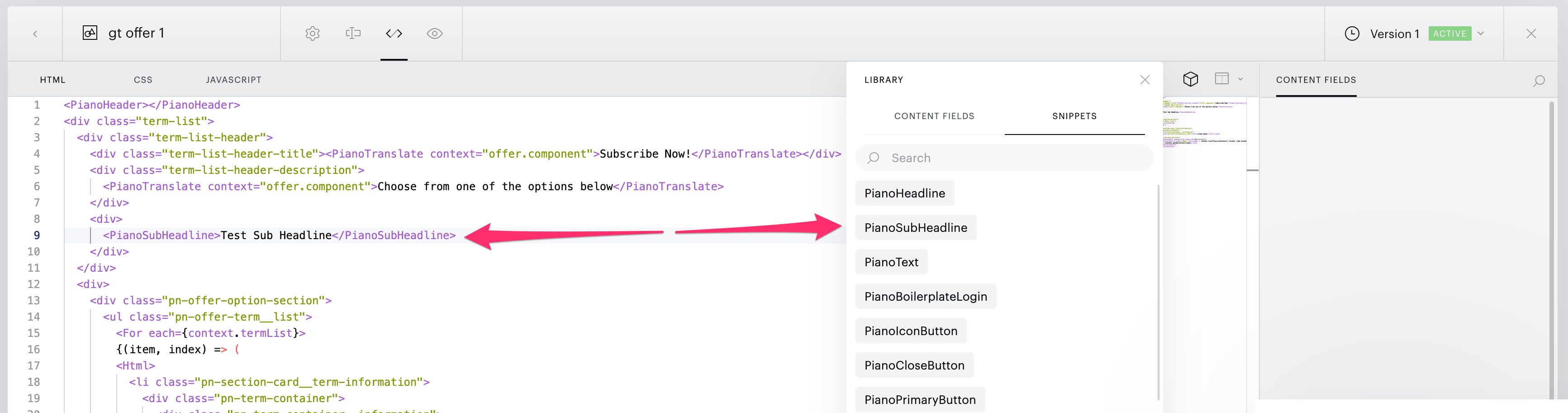
Snippets can be dragged and dropped onto the code canvas from the Library Snippets dropdown element:
Snippets can also be added from the context menu:
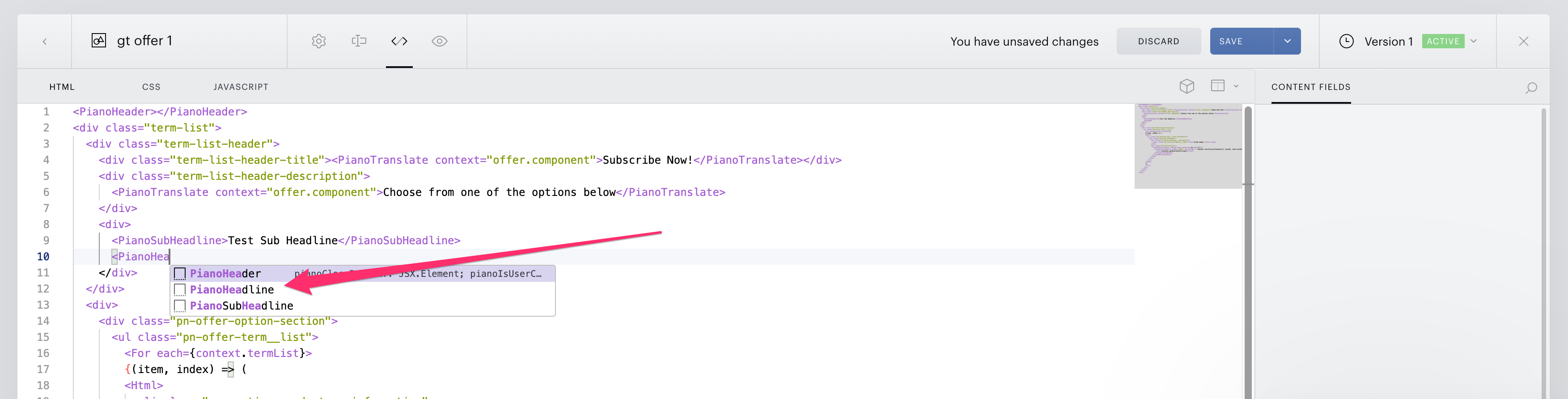
Snippets can also be added with code completion: start typing a snippet name (for example ViewsLeft) in the editor and select it from the suggestion list.
As a result, we have styled code in the template:

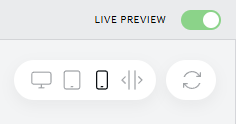
To see a snippet immediately in your template, make sure you have the Live preview in your Editor switched on. The Live preview toggle is shown in the image below.
Custom snippets
Besides the built-in snippets, you can create your own snippets and components right in the template editor and reuse them across your templates. A custom snippet belongs to your application: it is available in every template of that application, to everyone on your team who works with it.
Where to find them
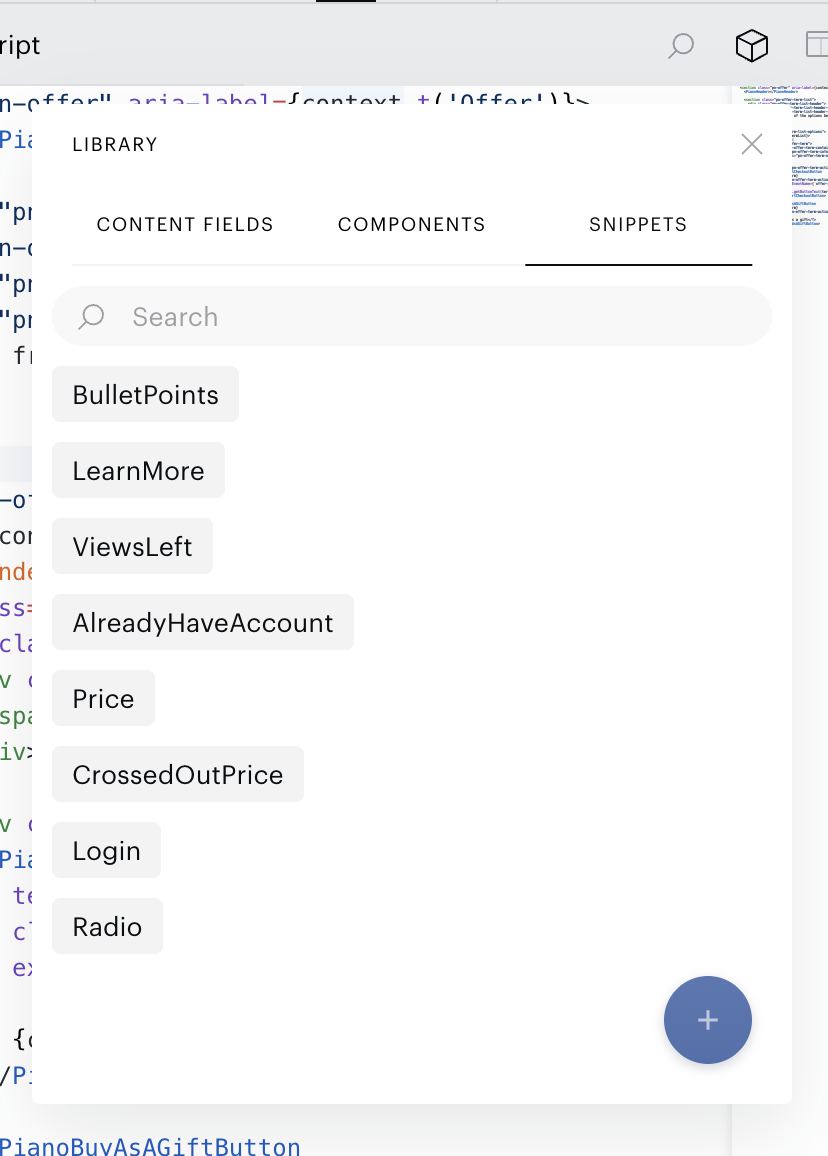
Custom snippets are in the same Library as the built-in ones, both in the drag-and-drop panel and in the context menu:
-
Components tab: available when the JSX tab of the editor is open.
-
Snippets tab: available on the JSX, CSS and JS tabs.
A snippet belongs to the editor tab it was created on: a snippet created while the CSS tab is open is a CSS snippet and is offered only on the CSS tab. Custom snippets are listed together with the built-in ones, in alphabetical order, and you add them to a template the same three ways: drag and drop, the context menu, or code completion by name.
Create a snippet
-
Open the editor tab you need (JSX, CSS or JS).
-
In the Library, open the Components or Snippets tab and click the + button at the bottom of the list.
-
Enter a name and the code, then click Save.
Edit or delete a snippet
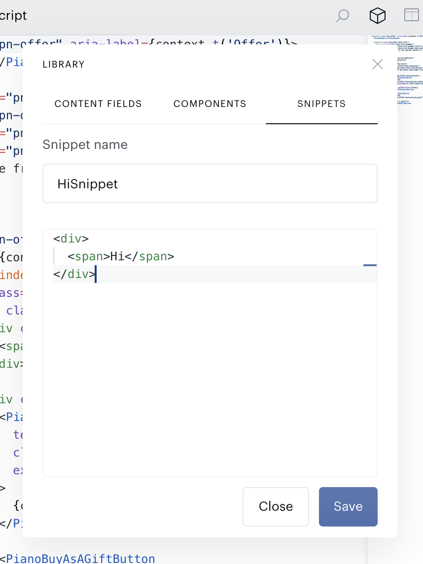
-
Your own snippets have a pencil icon next to their name. Click it to change the name or the code, then click Save. Built-in snippets cannot be edited.
-
To delete a snippet, open it for editing, click Delete, then click Confirm delete within 3 seconds.
A snippet stays on the tab and in the language it was created in. To move it to another tab, create a new snippet there and delete the old one.
Naming and size
-
The name is required and can be up to 100 characters long. It cannot start or end with a space.
-
The name must be unique within your application. Upper and lower case count as the same:
Bannerandbannerare one name. -
The name cannot be the same as a built-in snippet or component, for example
PriceorPianoButton. -
The code is required and can be up to 65,536 characters long.
A snippet is pasted as a copy. When you edit or delete a custom snippet, templates where it was already added stay as they are.
A custom component is a piece of JSX, not a new tag. Adding it pastes its code into the template, the same as a snippet. The only difference is that it is listed on the Components tab.
Some built-in snippets and components are offered only in certain templates, for example ID components only in ID templates. Custom snippets are offered in every template of your application.
List of Available Snippets
The snippets below are offered on the JSX tab of the editor. The JS and CSS tabs have their own sets, listed further down.
BulletPoints
Creates a bullet point list.
<ol class="bullet-points" style="list-style-type: disc">
  <For each={["Lorem ipsum 1", "Lorem ipsum 2"]}>
    {(item, index) => <li class="bullet-points-item">{item}</li>}
  </For>
</ol>
LearnMore
Creates a learn more link.
<A href="" class="learn-more">Learn more</A>
ViewsLeft
Creates a div element that shows how many views are left.
<div class="views-left">{context.viewsLeft()}</div>
AlreadyHaveAccount
Creates an "Already have an account?" section.
<Show when={!context.user()}>
  <PianoText>
    <T>Already have an account?</T>
    <PianoGhostButton underlined={true} onClick={(e) => context.login()}>
      <T>Login</T>
    </PianoGhostButton>.
  </PianoText>
</Show>
Price
Shows the price of the first term in context.termList.
<div class="price">{context.termList?.[0]?.price}</div>
context.termList may be in the process of loading. Use the ? operator for secure access to termList properties.
CrossedOutPrice
Shows a discounted price (price shown at discounts with a strikethrough on the original price).
<div class="crossed-out-price">
  <span style={{ "margin-right": '5px', "text-decoration": "line-through" }}>$10</span>
  $7
</div>
Login
Shows a login ghost button if the user is not logged in.
<Show when={!context.user()}>
  <PianoGhostButton onClick={(e) => context.login()}>
    <T>Login</T>
  </PianoGhostButton>
</Show>
Radio
Creates a radio input.
<input type="radio" name="radio" style={{ width: "14px", height: "14px" }} />
Built-in JS snippets
Offered on the JS tab of the editor. createSignal, onMount and the other SolidJS functions are available in the template's JS without imports.
ForOf
Creates a for...of loop over a collection
for (const item of items) {
}
ForLoop
Creates an index-based for loop
for (let i = 0; i < items.length; i++) {
}
IfElse
Creates an if / else block
if (condition) {
} else {
}
Signal
Declares a SolidJS signal: a getter and a setter for a value that updates the template when it changes
const [value, setValue] = createSignal(initialValue);
OnMount
Runs code once, after the template is rendered
onMount(() => {
});
Built-in CSS snippets
Offered on the CSS tab of the editor. FlexCenter, Grid and TextEllipsis contain only properties: insert them inside the braces of a CSS rule.
MediaMobile
Creates a media query for mobile screens (up to 767px wide)
@media (max-width: 767px) {
}
FlexCenter
Centers the content horizontally and vertically with flexbox
display: flex;
align-items: center;
justify-content: center;
Grid
Lays the content out in a two-column grid
display: grid;
grid-template-columns: repeat(2, 1fr);
gap: 16px;
TextEllipsis
Cuts single-line text that does not fit and ends it with an ellipsis
overflow: hidden;
text-overflow: ellipsis;
white-space: nowrap;
FadeIn
Declares a fade-in keyframes animation; apply it with animation: fade-in 0.3s;
@keyframes fade-in {
  from { opacity: 0; }
  to { opacity: 1; }
}